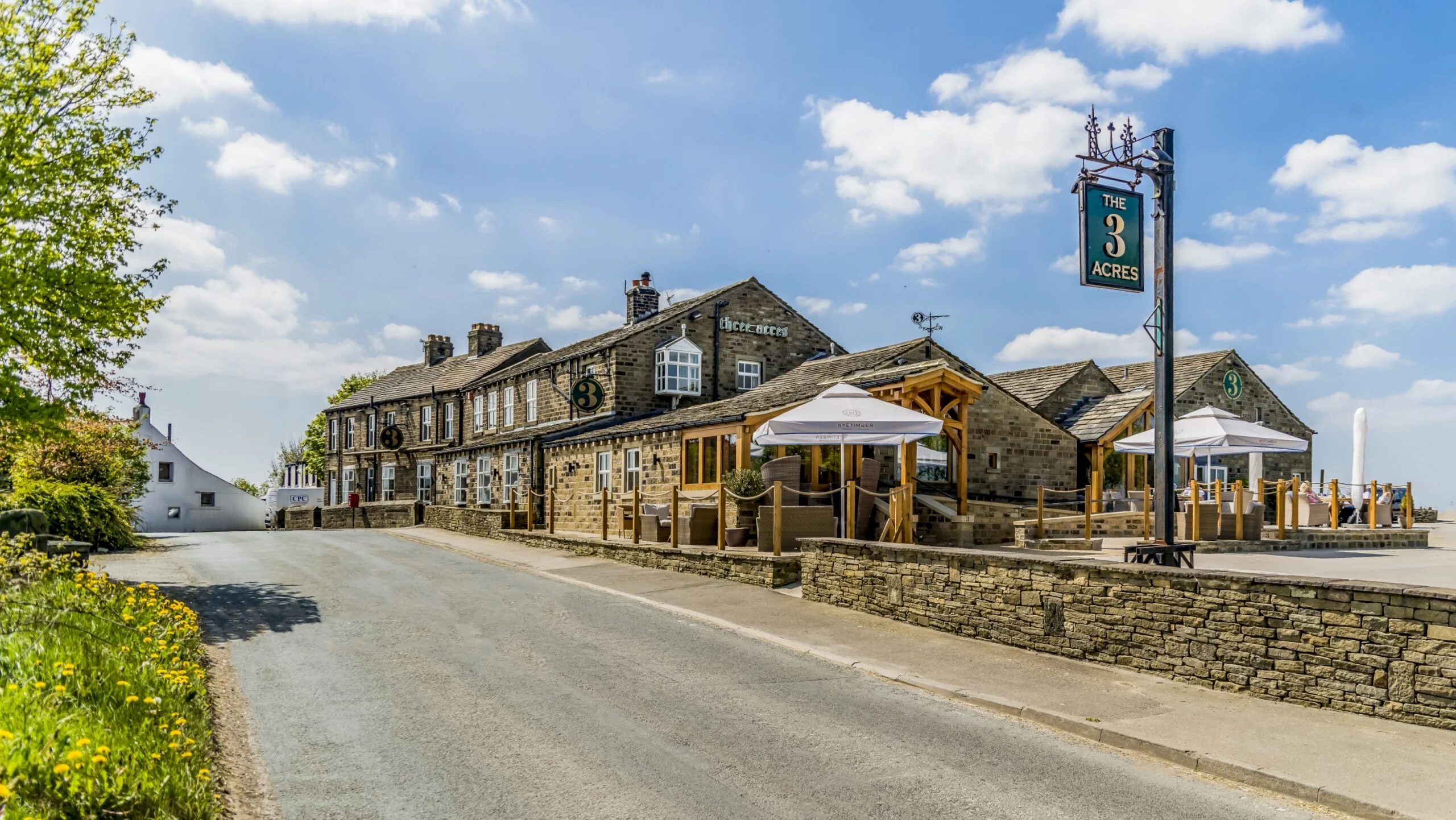
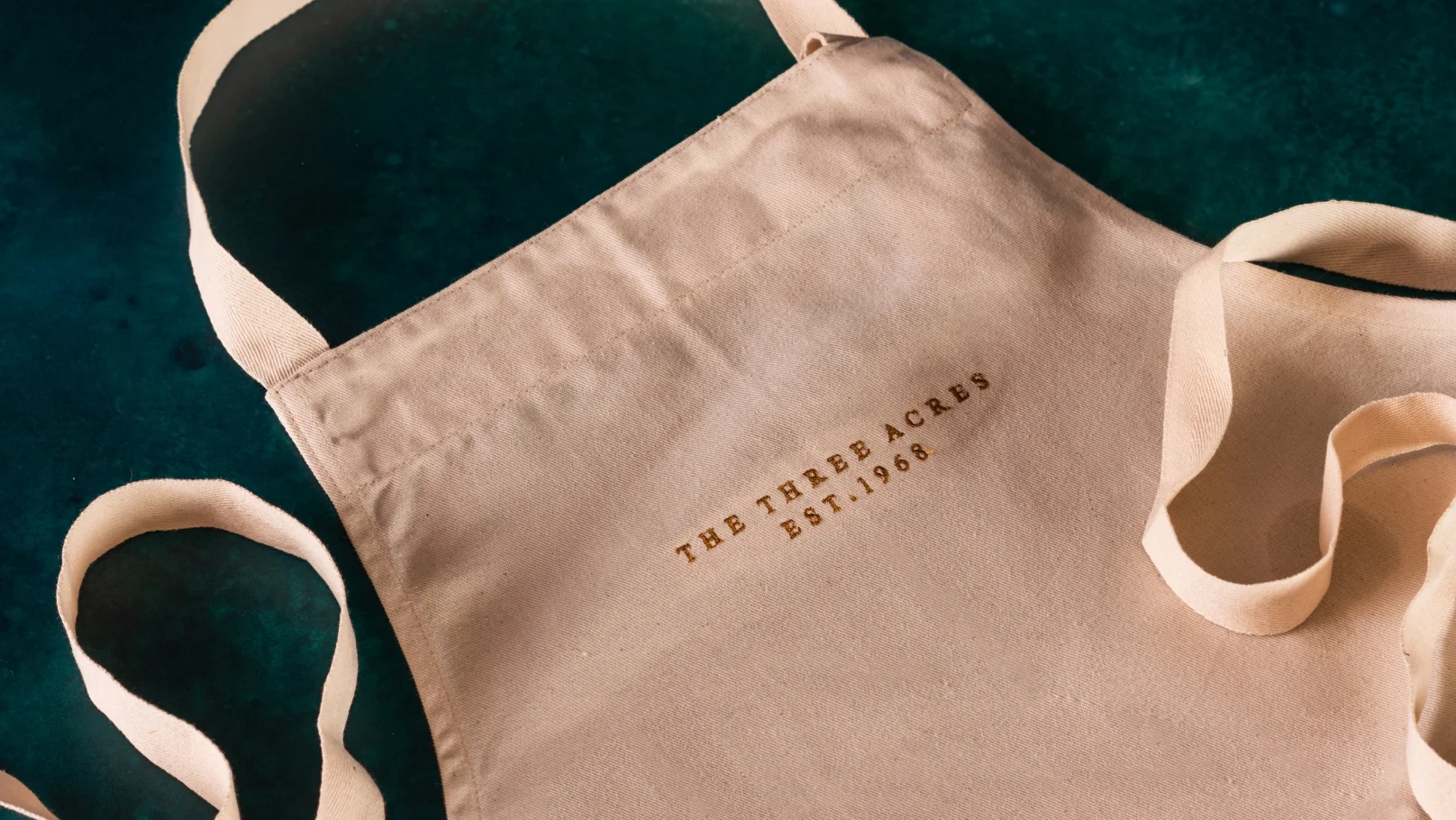
The 3 Acres
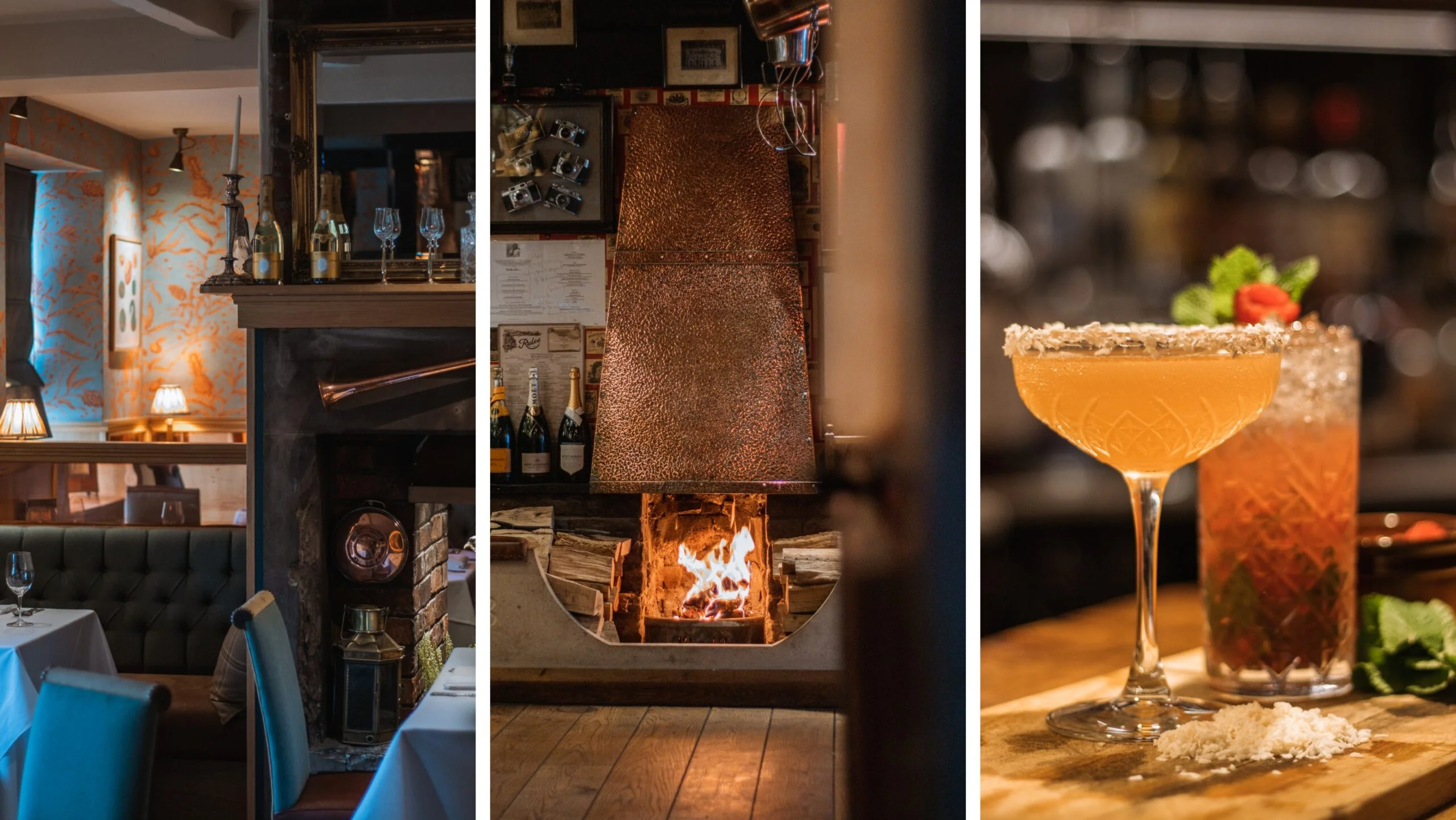
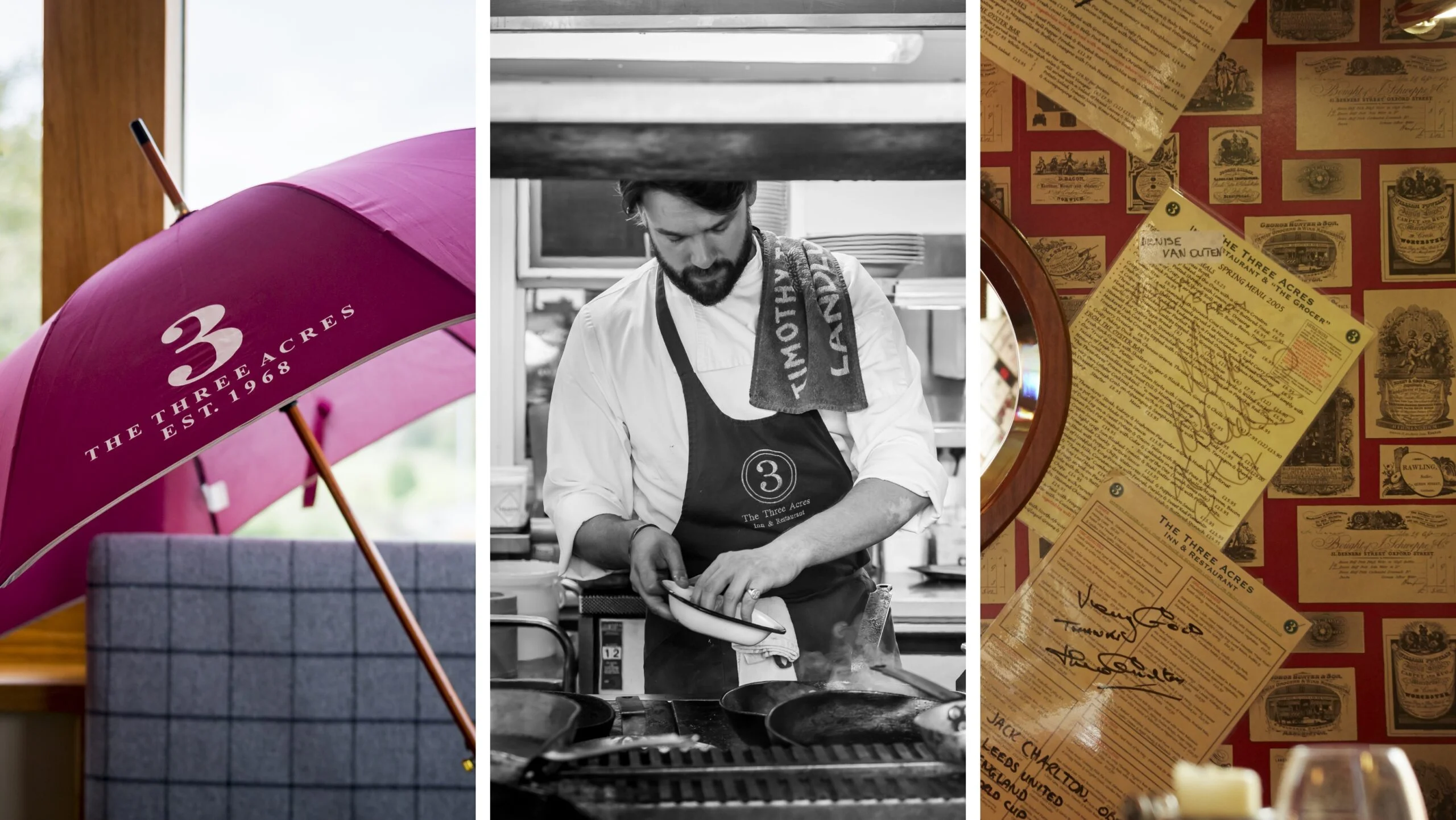
HospitalityThe 3 Acres Inn has been a renowned institution of delectable food and first-class service for more than 50 years and we’re hononoured to have worked together for a decade. Initially we polished the branding by iconising the ‘3’ symbol and taking influence from the warm copper tones found in the restaurant. As brand has developed over time, we introduced a stylised gun cartridge aesthetic carrying the ’50 years’ mark, alongside a design toolkit of tweed patterns and a refined classic colour palette of heritage greens. All work in beautiful synergy in a nod to the country setting and luxurious brand values.
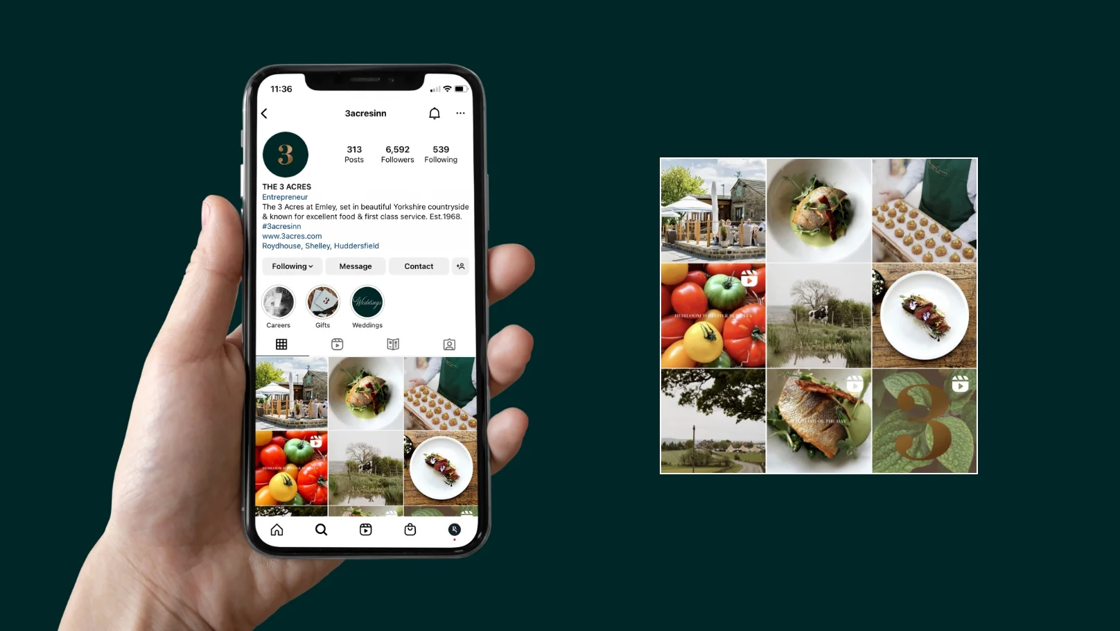
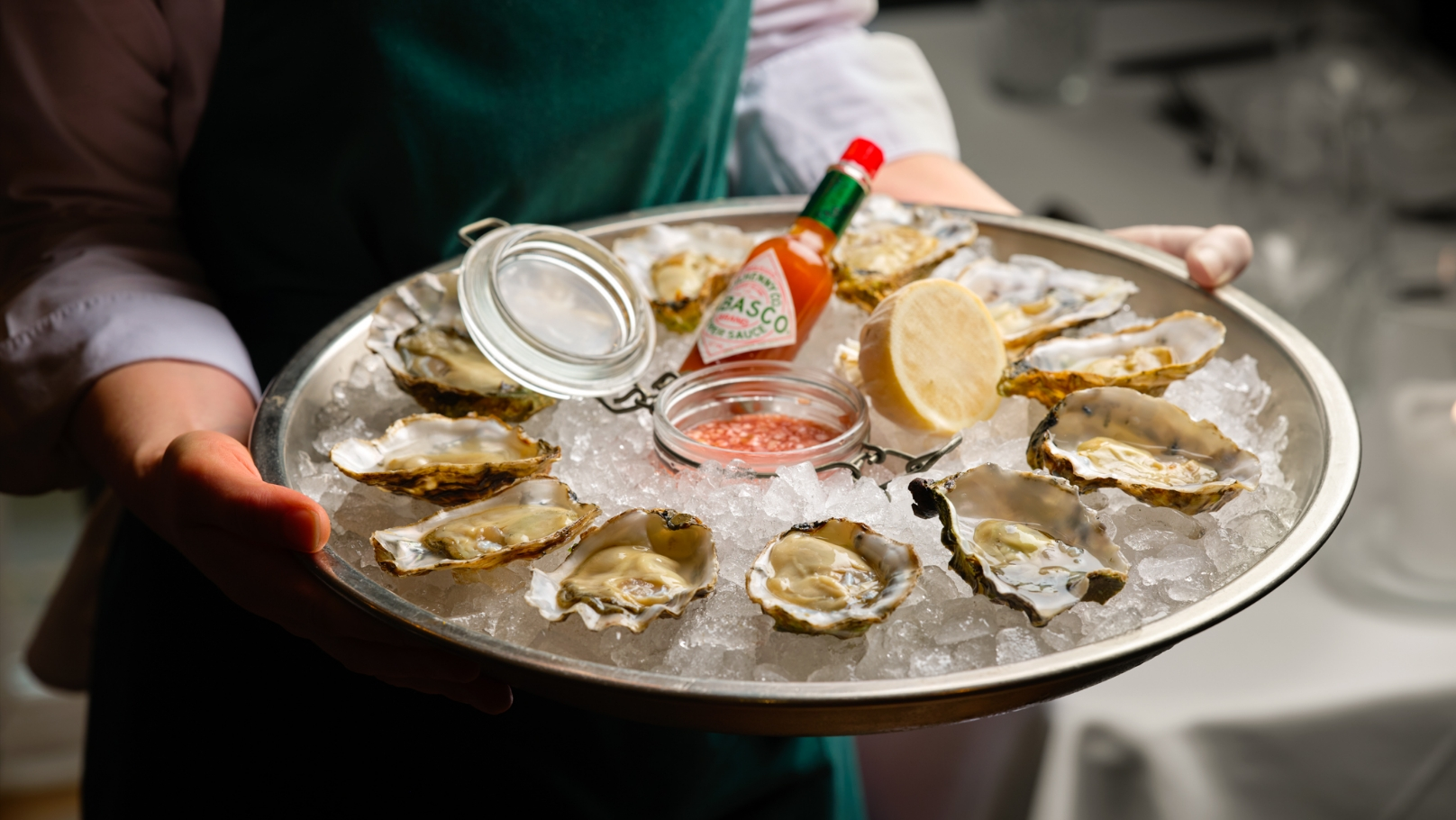
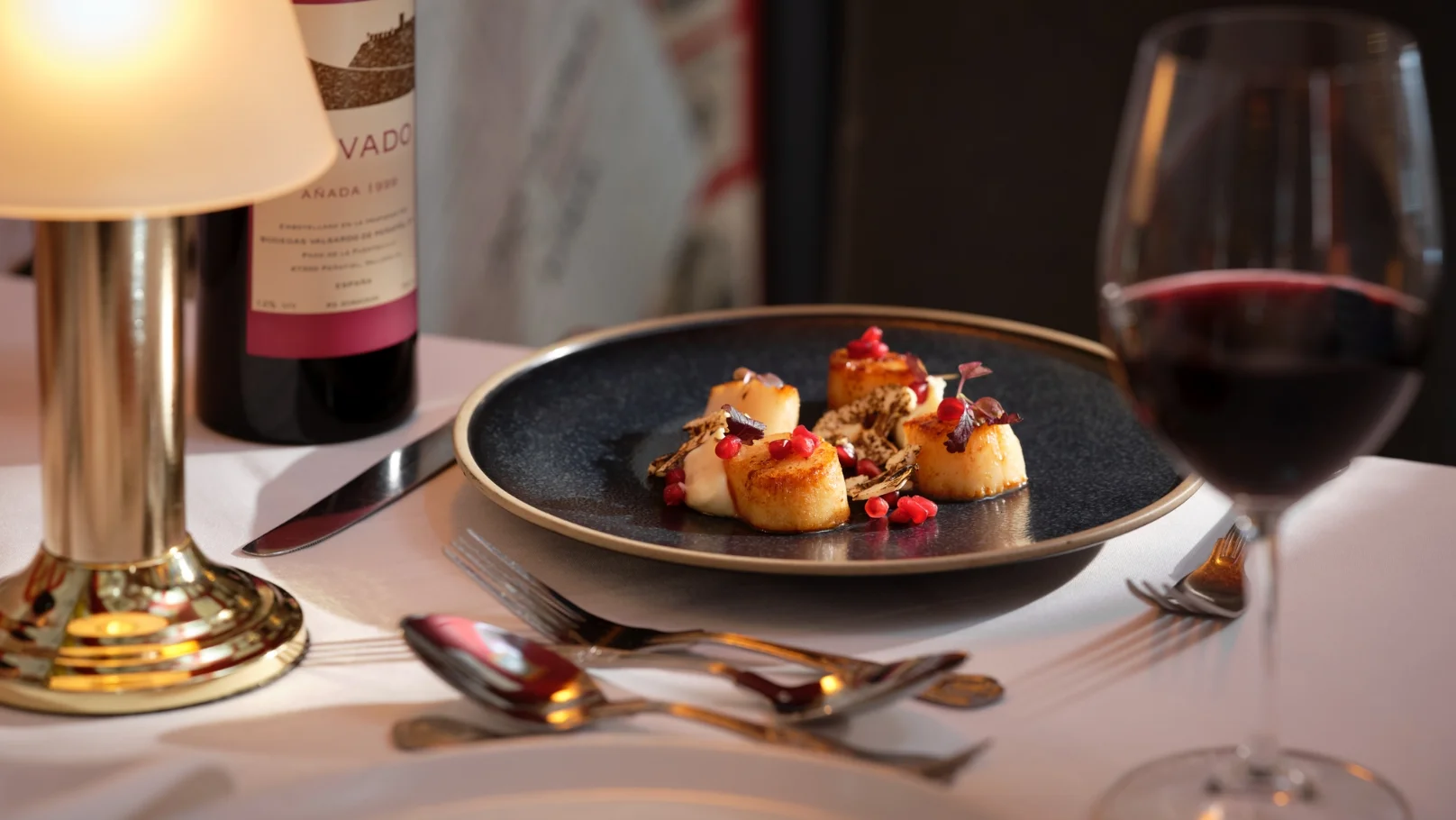
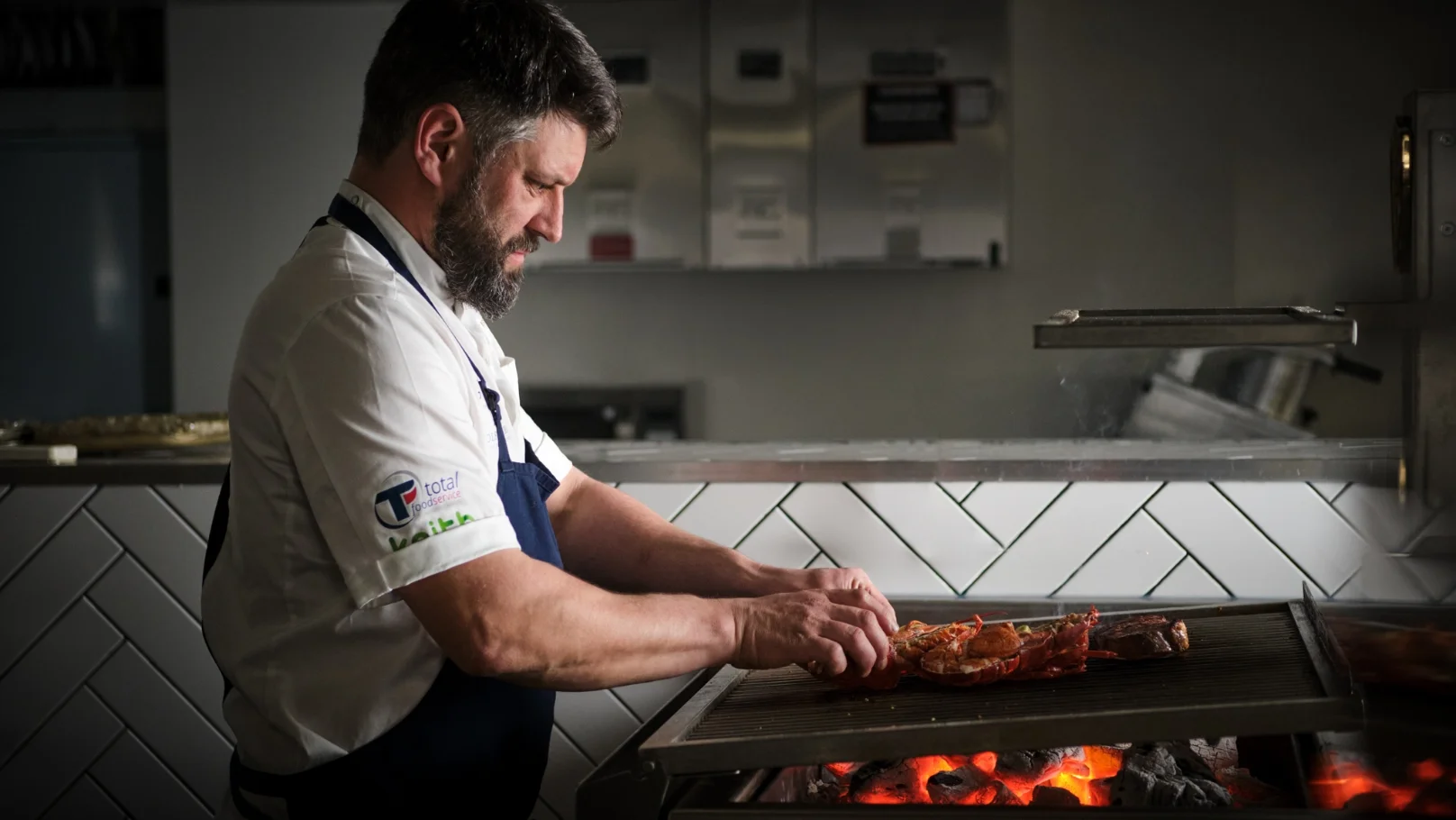
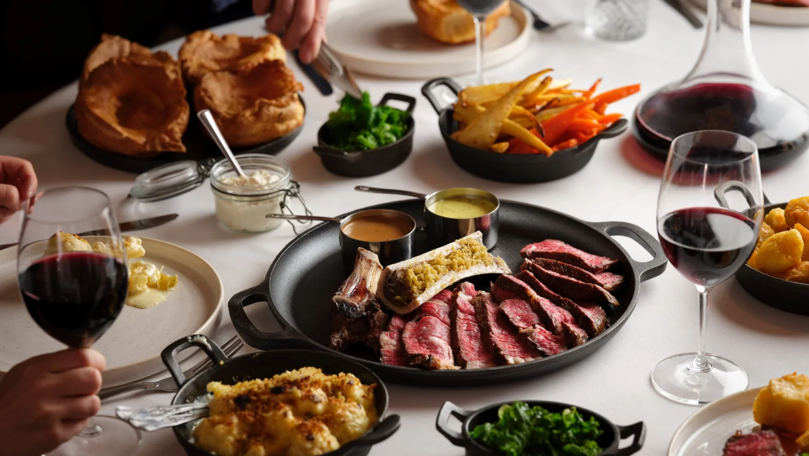
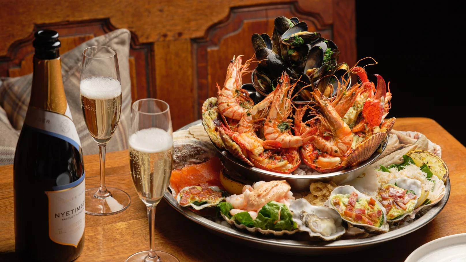
As part of our continued work, we create content for the Acres, building narratives of their people, food and setting, to depict all aspects of the lifestyle offering. Content is used across social media platforms, website and printed seasonal brochures, staying true to the country feel and the passion for food and provenance.
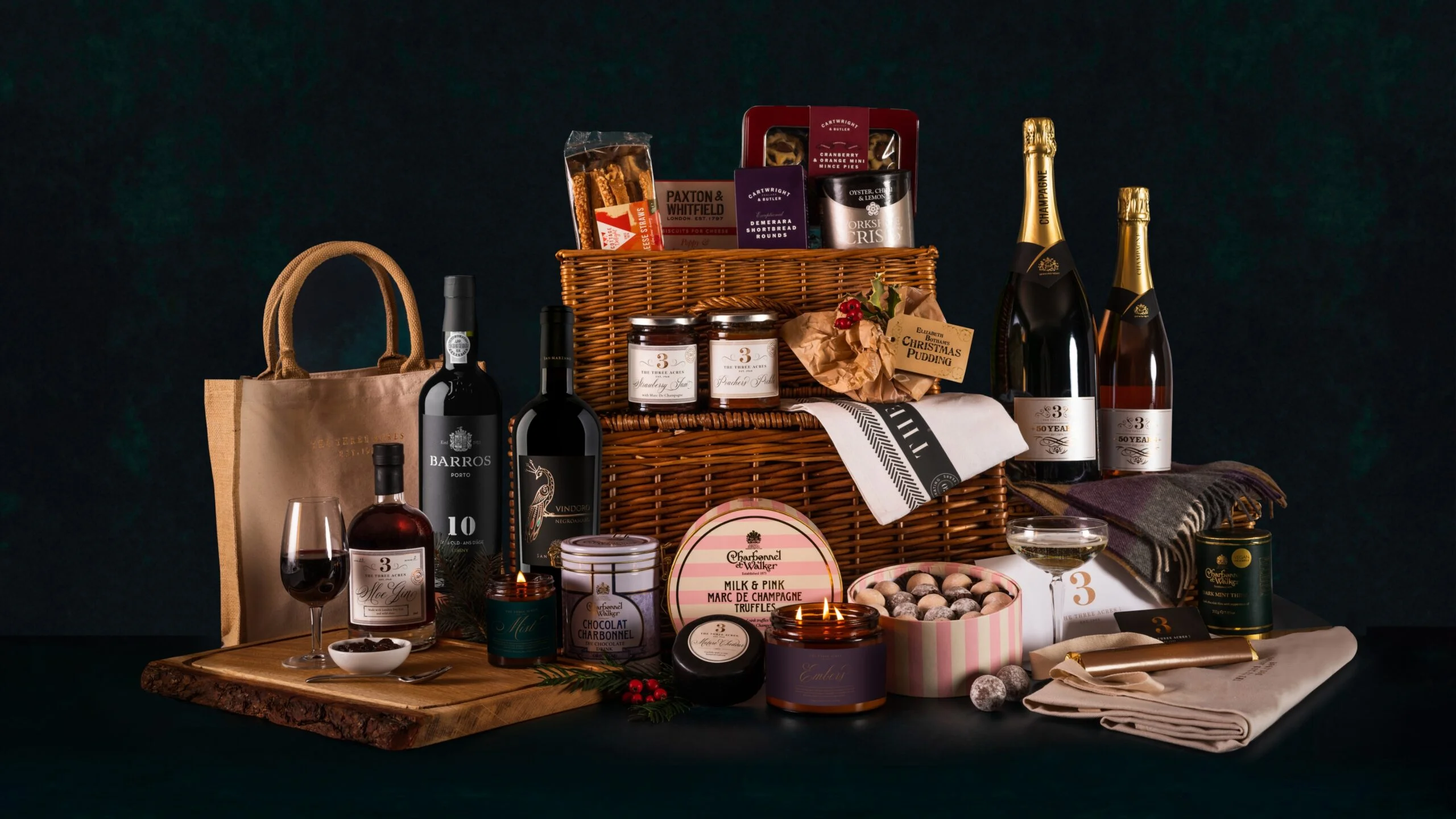
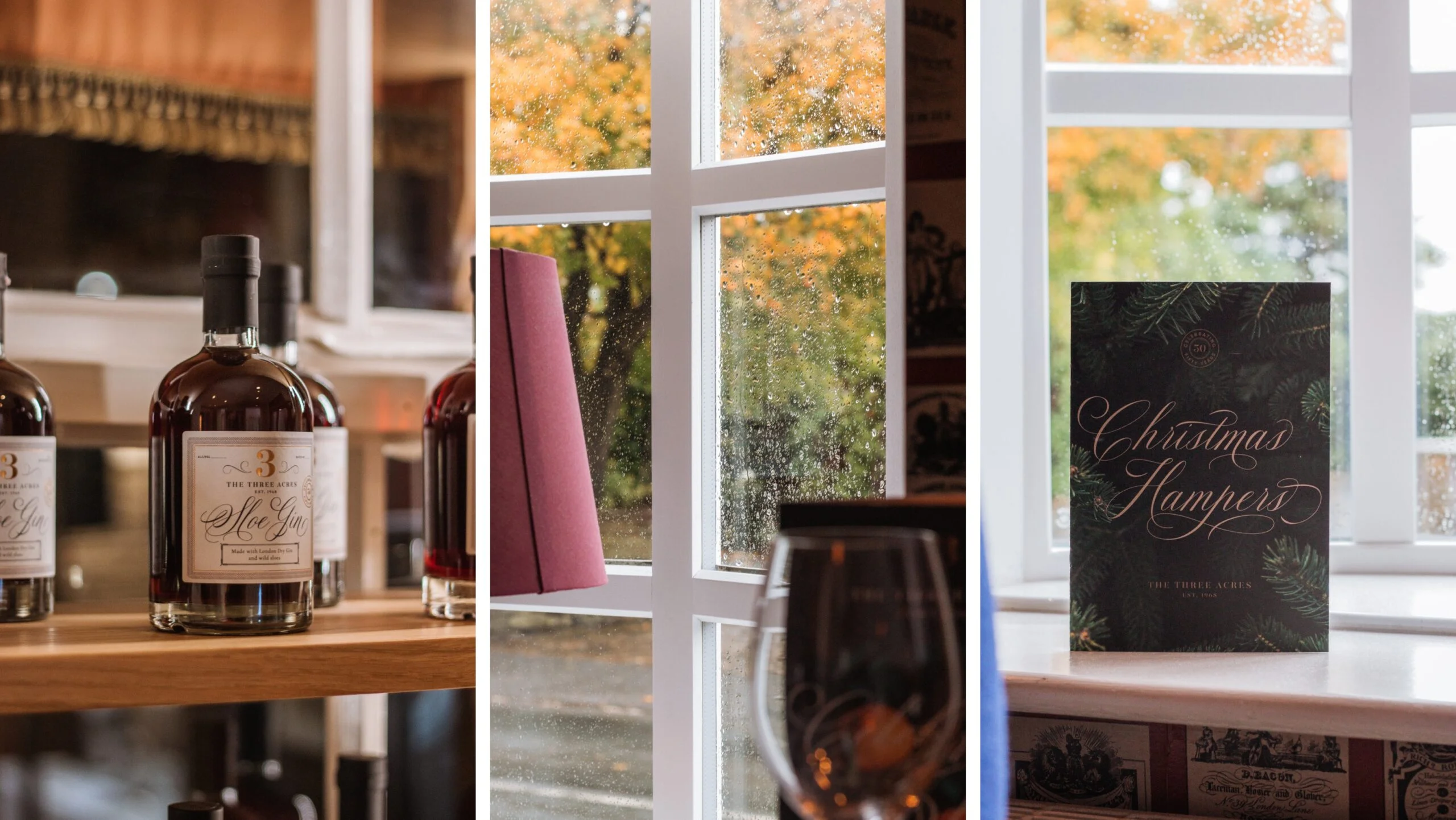
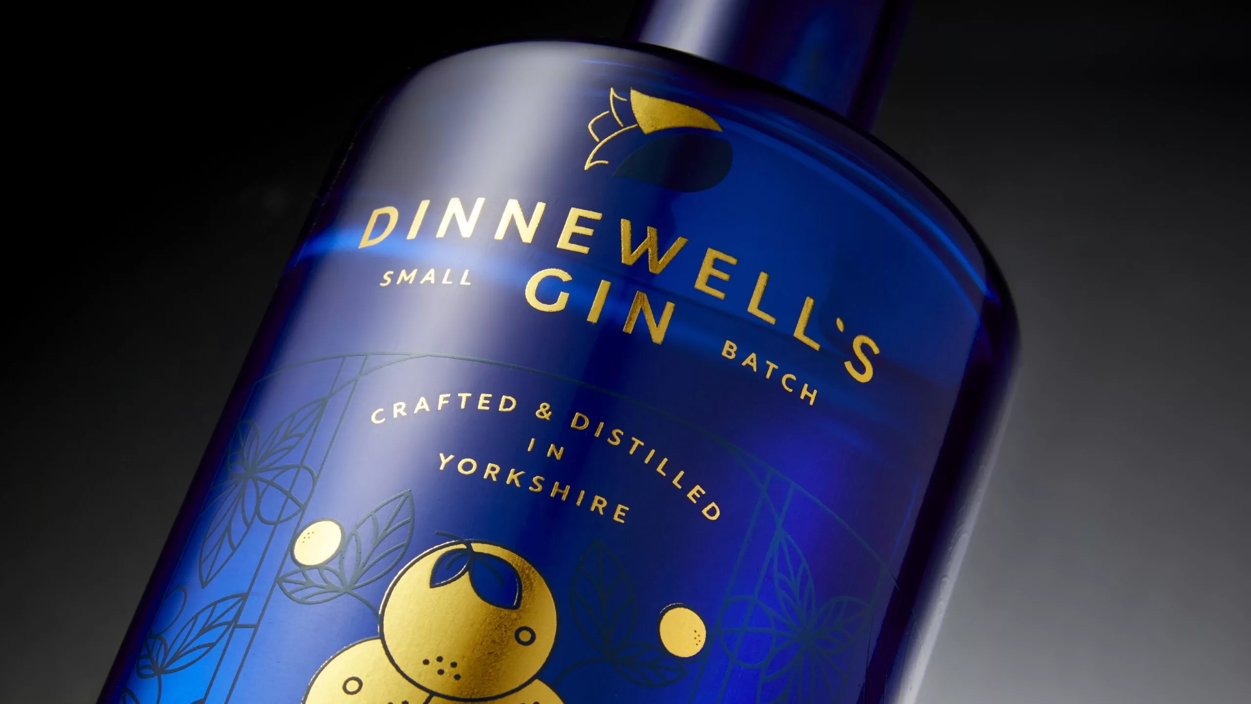
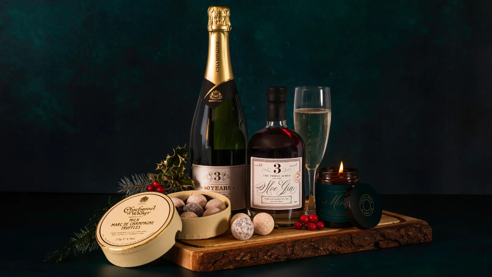
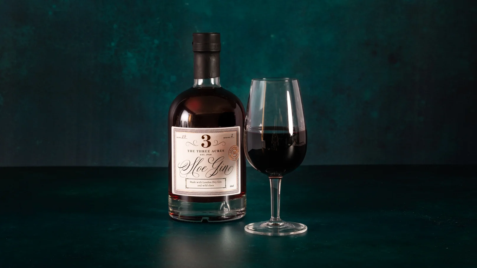
In more recent years The 3 Acres has begun to produce its own retail items, including Champagne, sloe gin, candles, chocolates, cheese and jams to showcase in hampers. Picture Smiths worked closely with the Acres to build a portfolio of timeless and on-brand packaging design for these goods, each recognisable with foiled copper ‘3’ and printed embellishments in ornate script fonts.
Photographic and videographic content has been captured and managed for posts, carousels, stories and reels, to communicate key areas of business across social media channels, in a clear brand tone of voice.