Triline
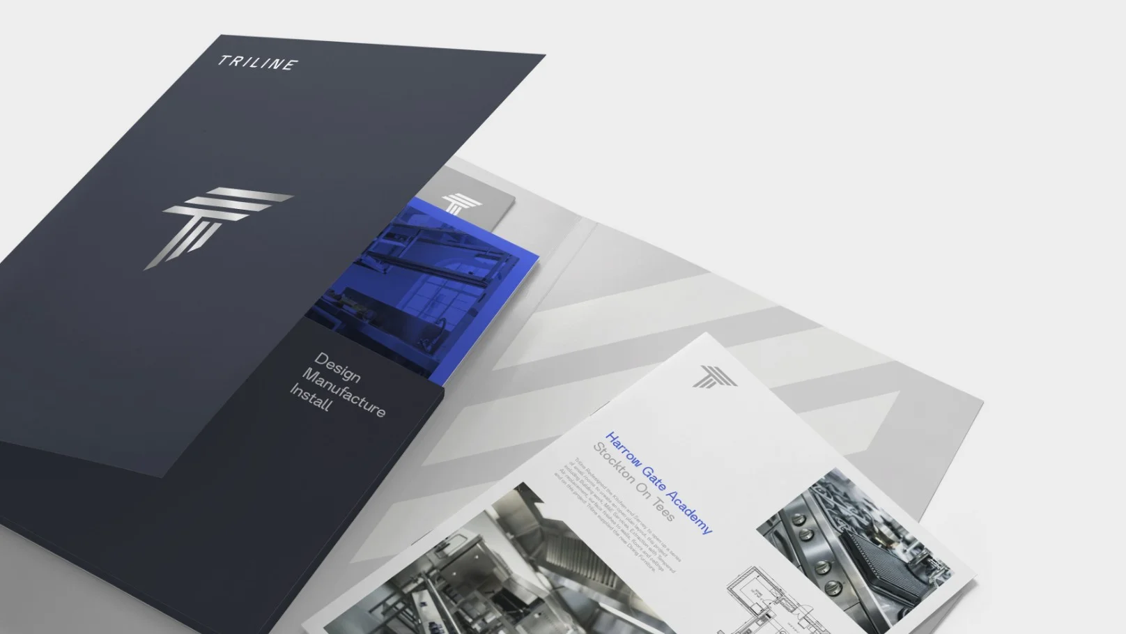
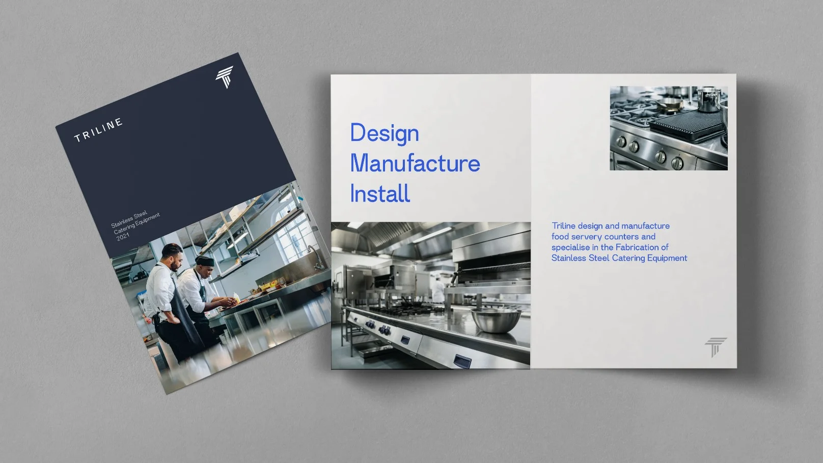
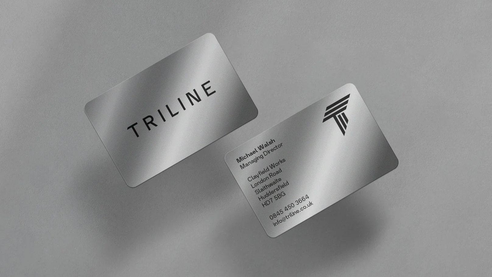
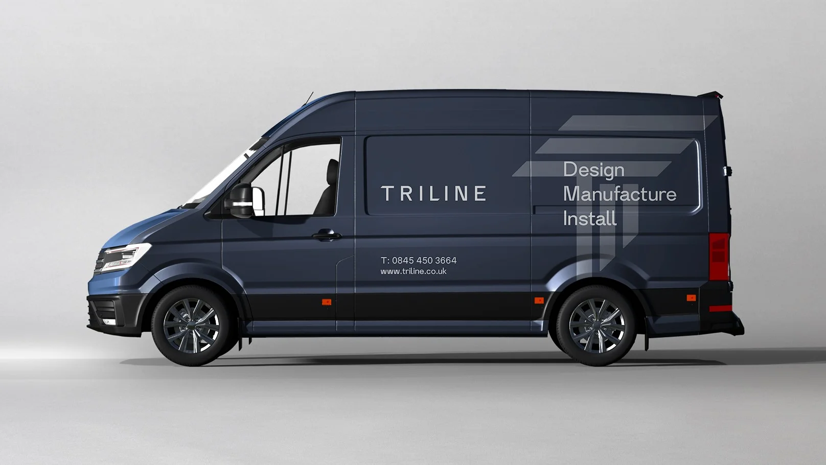
Design Services ManufacturerThe rebrand for engineering company Triline, works to elevate and modernise the business and its professional presence in a b2b marketplace. The previous logo used 3 parallel lines, which we evolved into a stylised ’T’ symbol for Triline and to represent three core areas of expertise; design, manufacture and installation. This symbol acts as a brand character and stamp of endorsement across branded material.
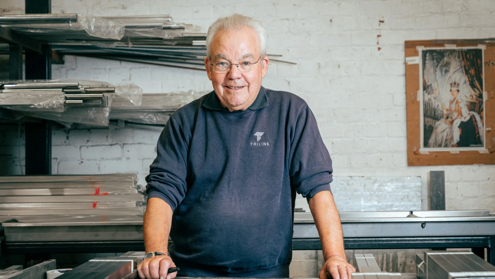
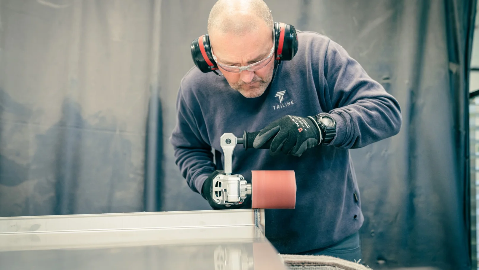
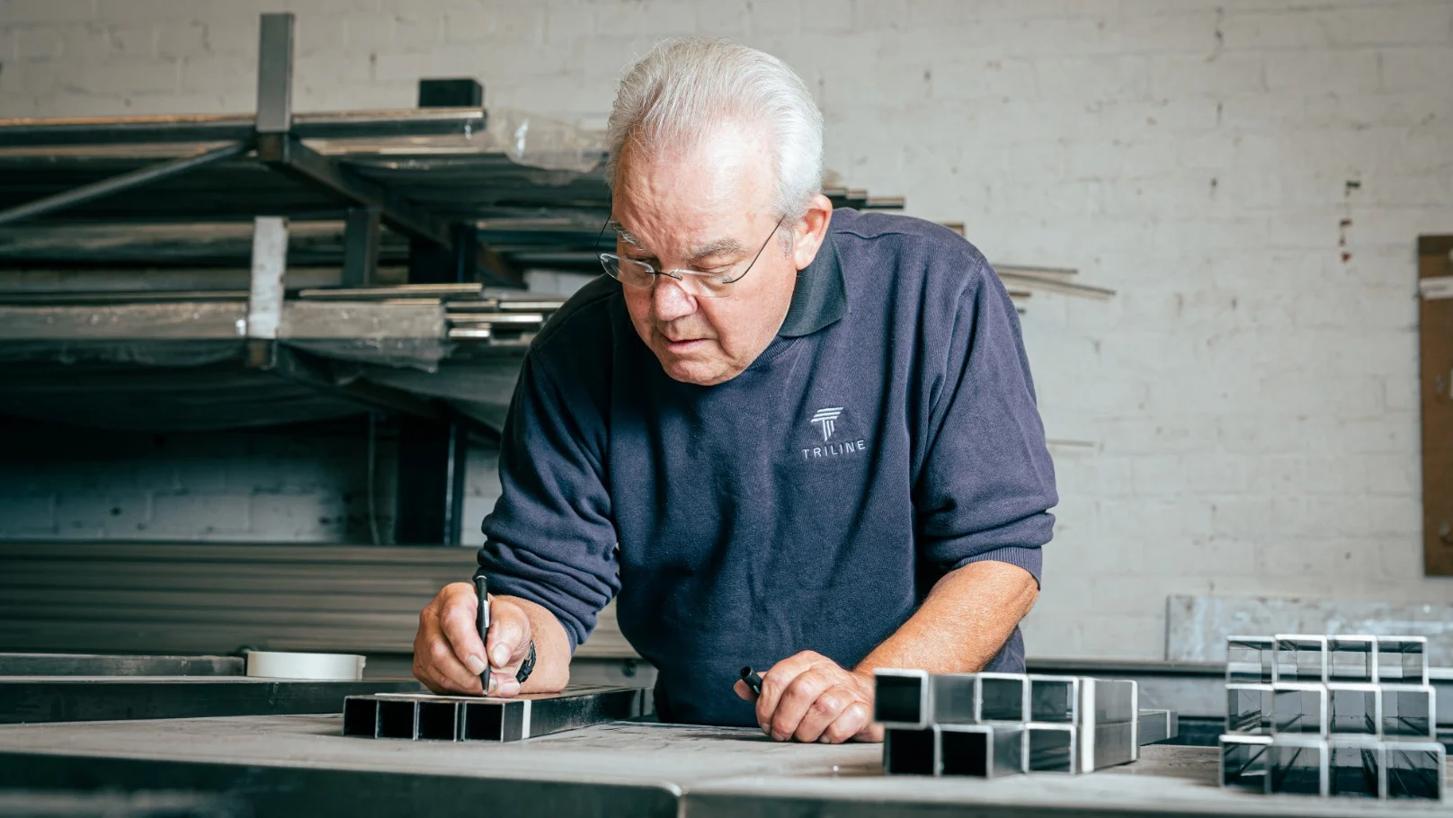
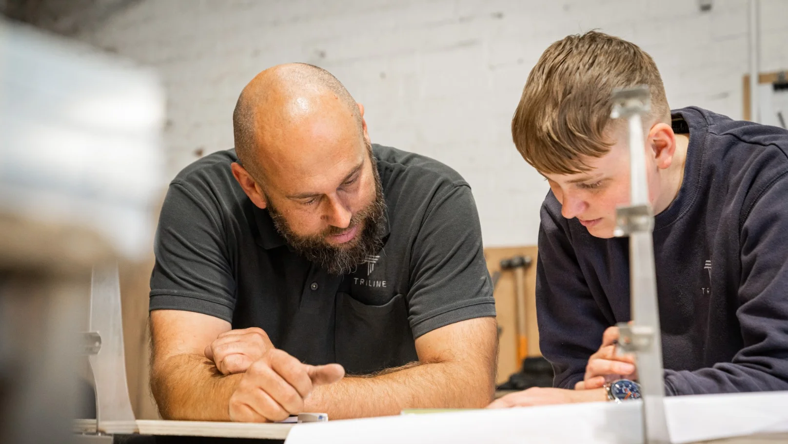
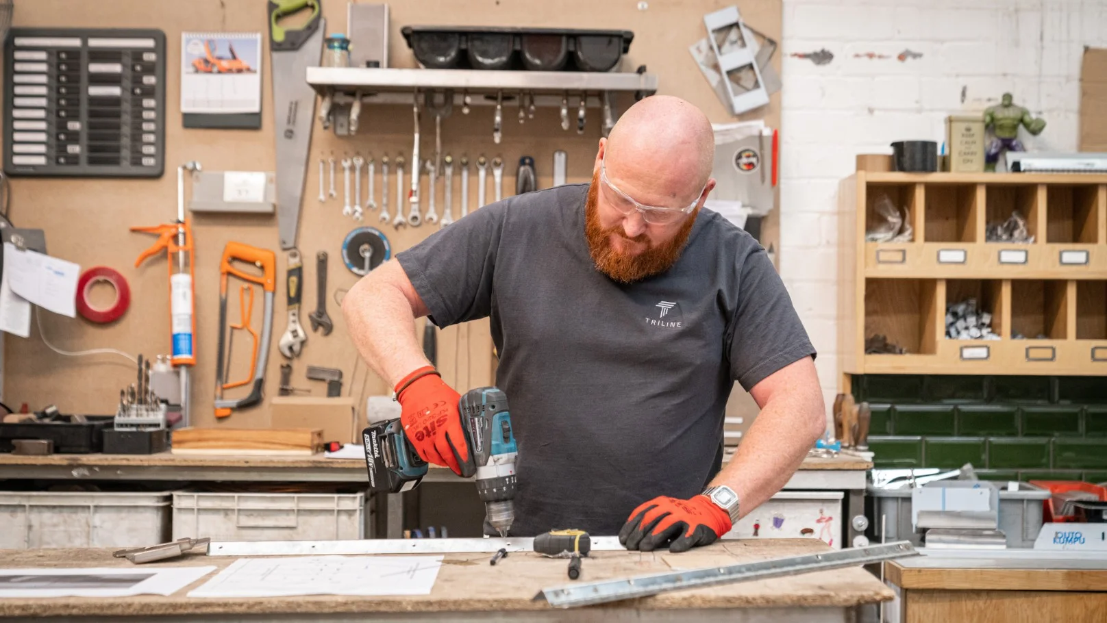
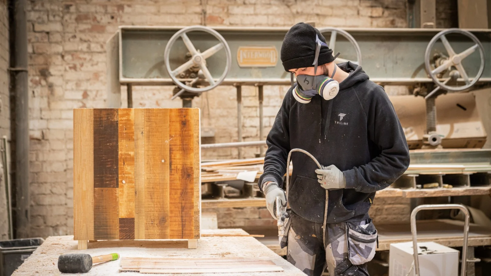
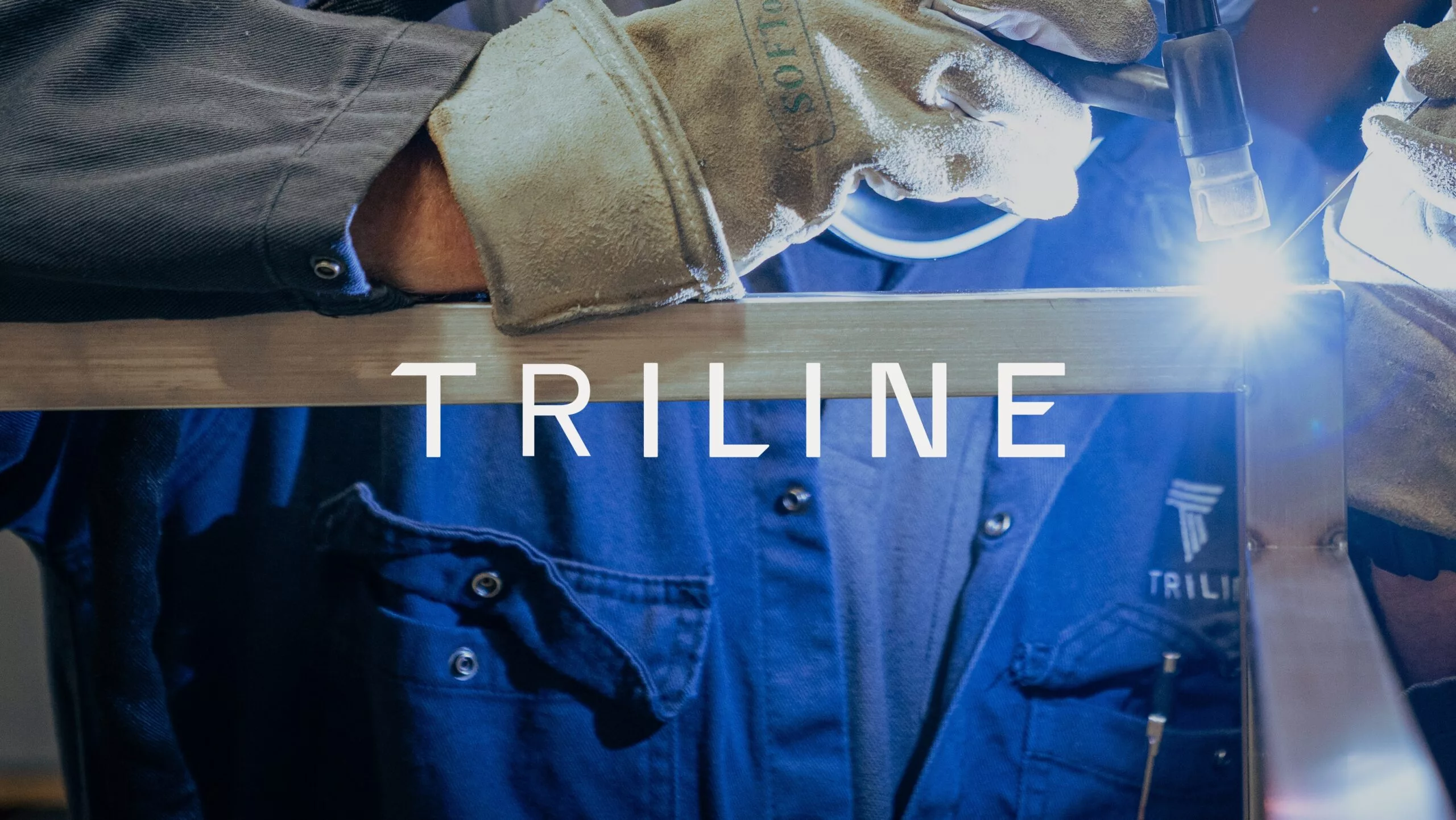
In delivery of a photographic layer to the brand, we art directed a shoot to bring an authentic glimpse to the workmanship and personality of the team. Specialisms and services are now depicted with style and personality and the imagery has been applied to the newly designed website; triline.co.uk. Finally, branded literature, marketing materials, merchandise, new signage and vehicle signage have now been updated for an eye-catching and beautifully consistent set.