Finkle Hill
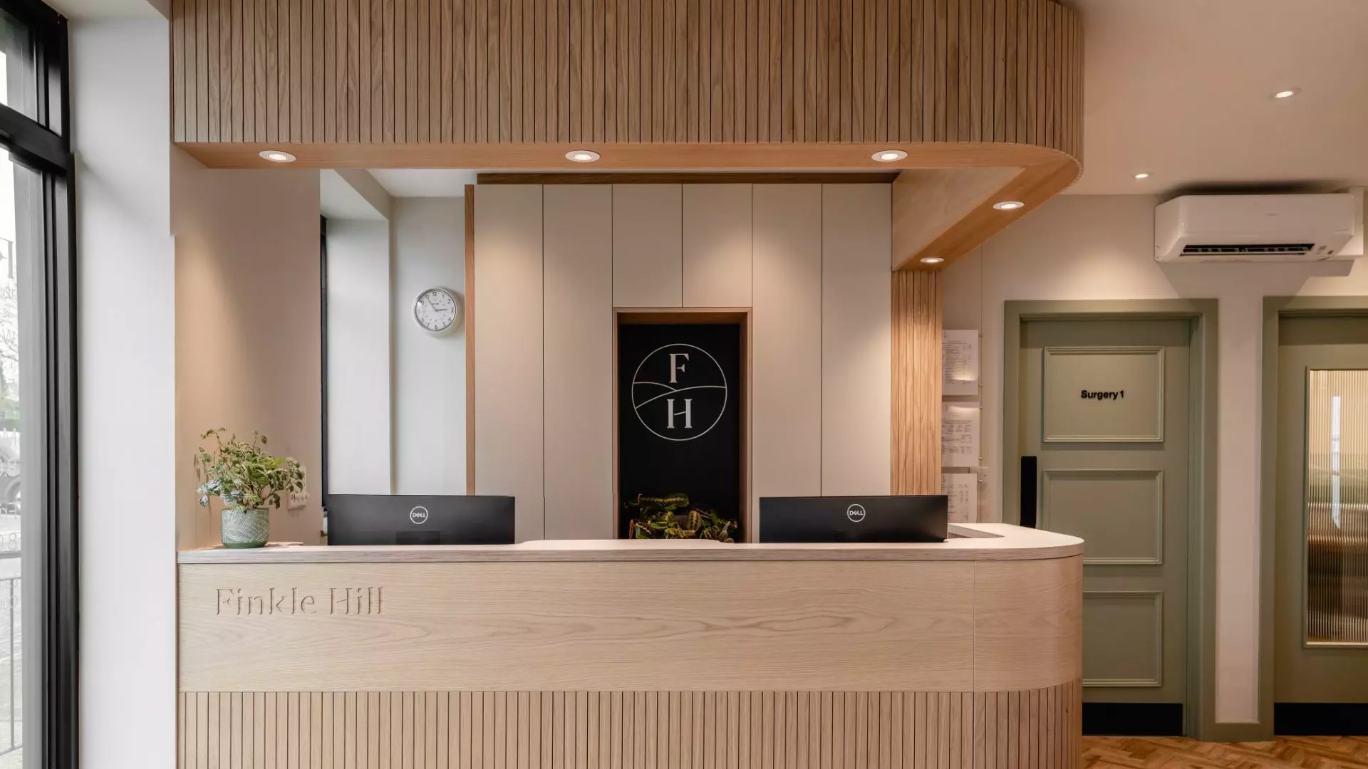
Finkle Hill Dental rebrand pairs with the new refurbishment of the practice and the fresh objectives set out in its business plan. We created a rebrand positioned with greater focus on private dentistry and aesthetics, whilst taking care not to alienate the current family audience.
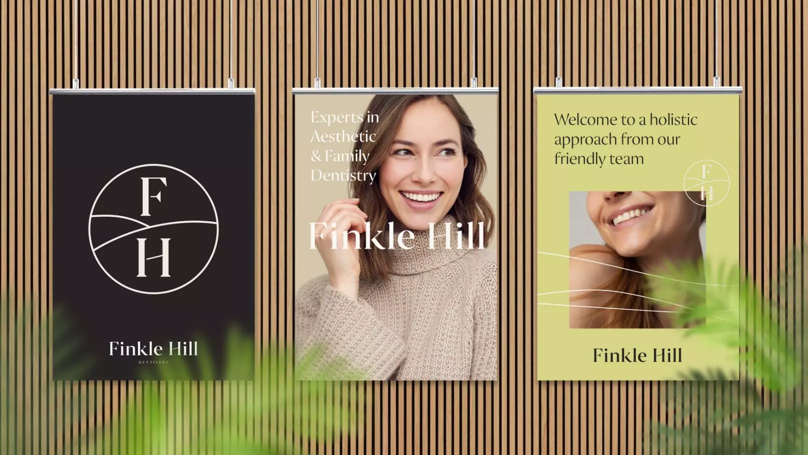
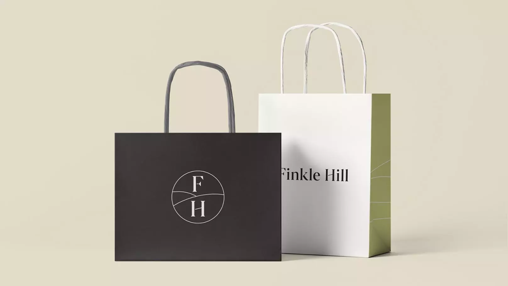
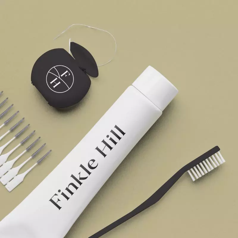
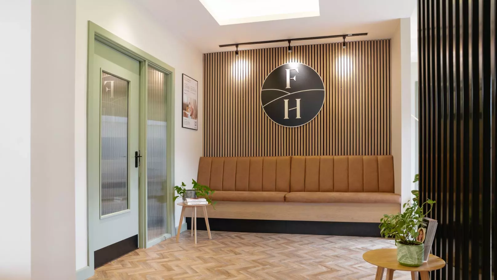
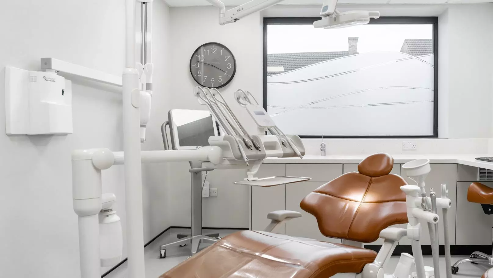
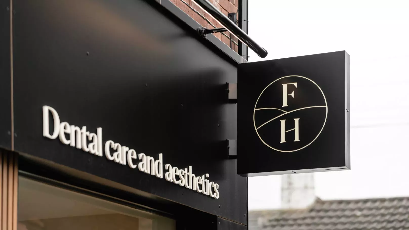
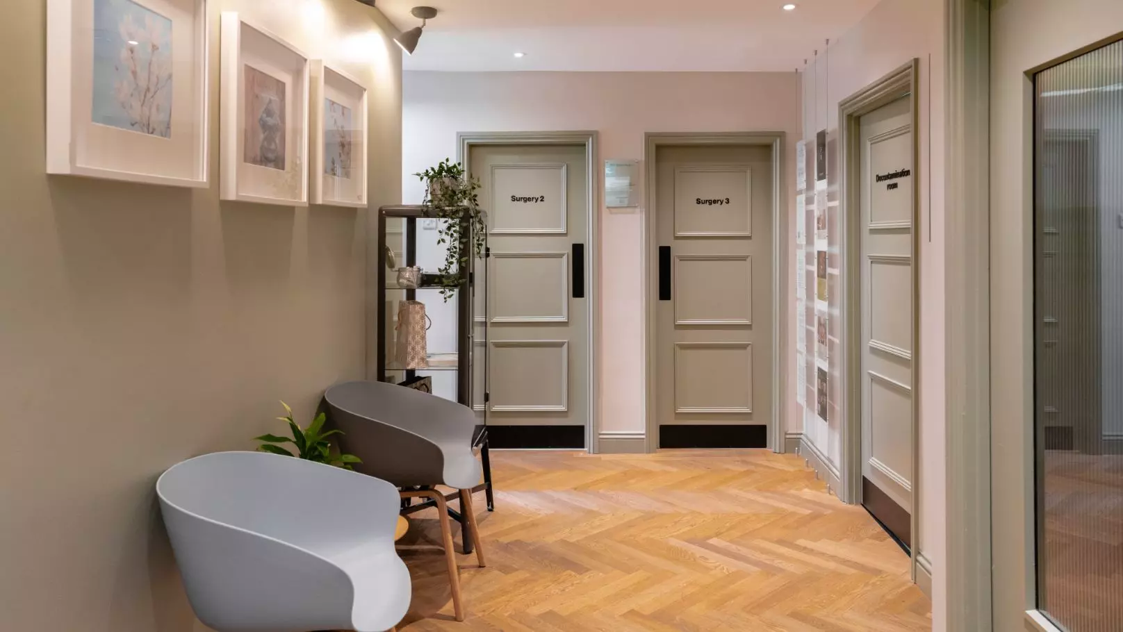
Beautiful new architectural interiors couple with a brand that is welcoming, reassured and denotes quality in a modern, calming way. Brandmark is beautifully simple yet very personable. A careful, neutral palette accents with a hint of muted green to add a little distinction in identity and a layer of abstract waves or ‘hills’ play a hint to the surrounding Yorkshire hills of its location. Photography is used in this brand to soften the product areas, in purposefully chosen neutral tones to complement the design toolkit.


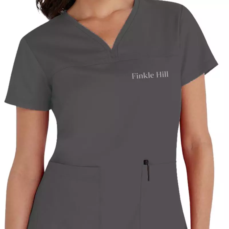
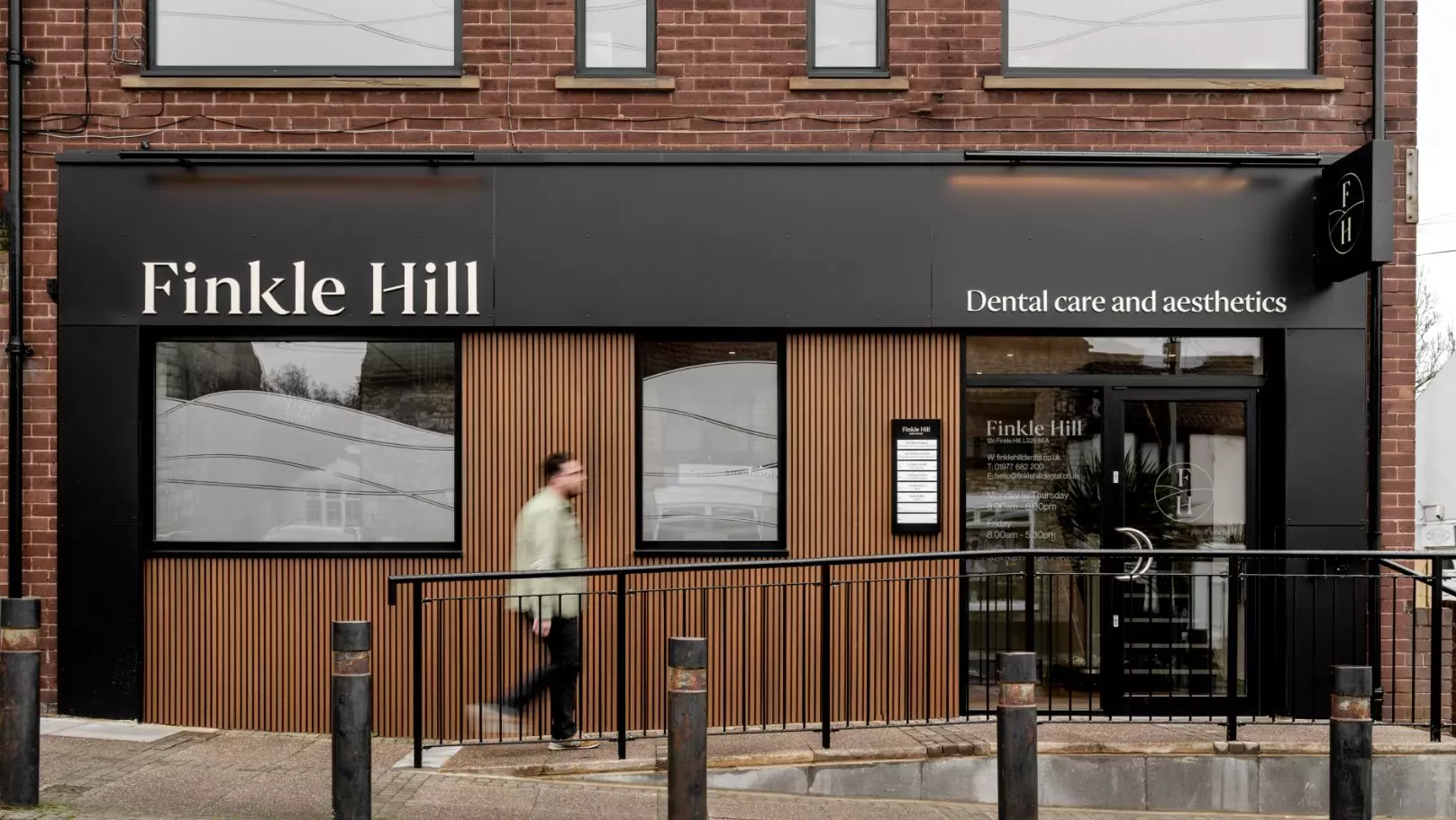
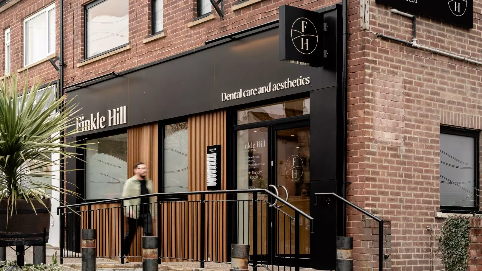
The practice now carries fresh signage both exterior and interior, fresh literature for patients and in-house posters depicting key messaging in an aesthetically pleasing and on-brand way. We have also given guidance on social media for consistency across all branded assets. The brand has been a huge success, with the business very quickly tripling its new patient numbers.
