Tarttu
Every now and again were approached by somebody with a really wild and unique business idea. This was certainly the case when we were approached by Katie Davison, a designer herself, who had been dreaming up a new business for ‘wearable skin art’ for some time. The concept; to curate and commission artists and illustrators, to then apply their work to a series of temporary tattoos. We of course jumped at the chance of helping her build the brand.
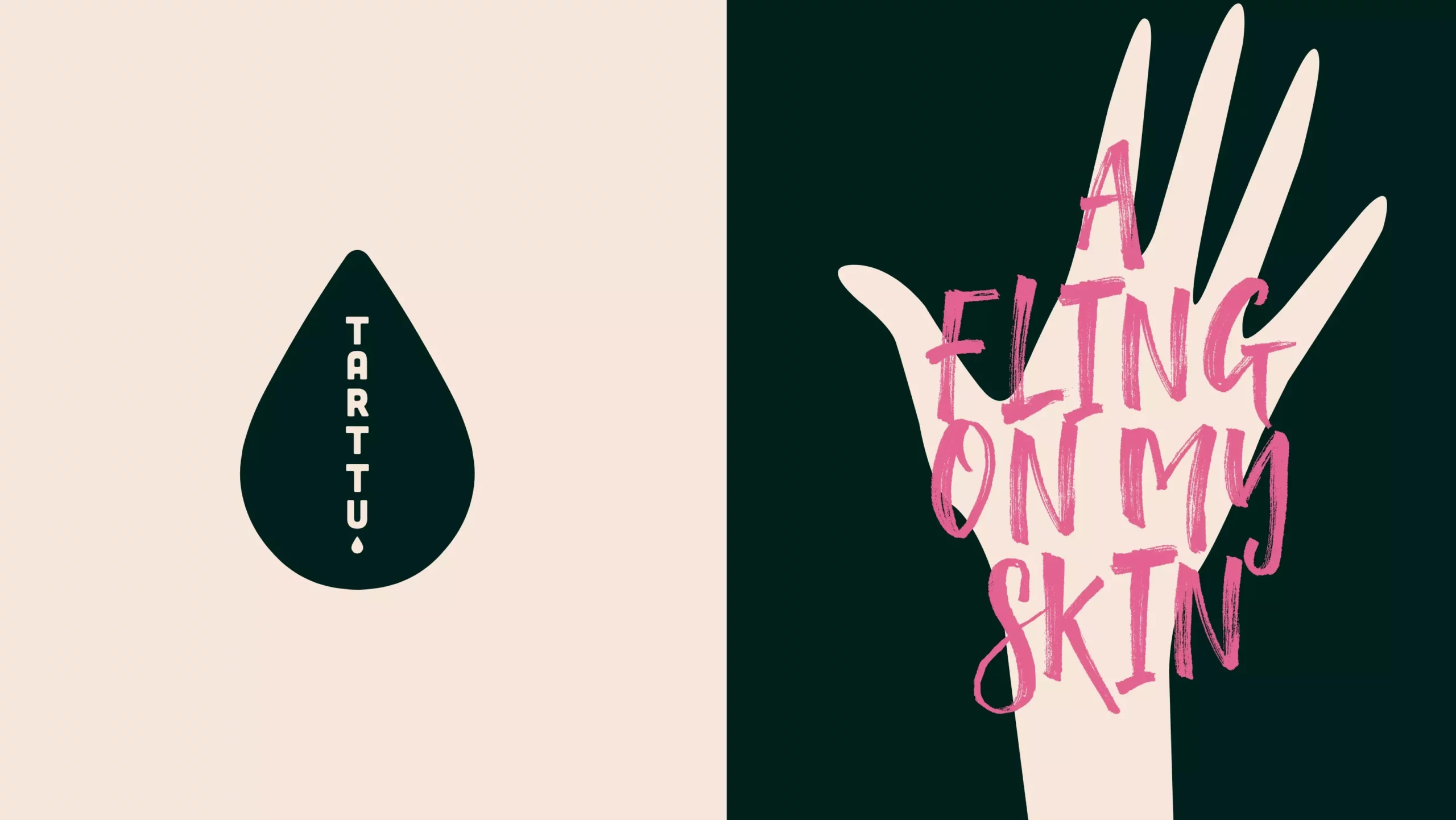
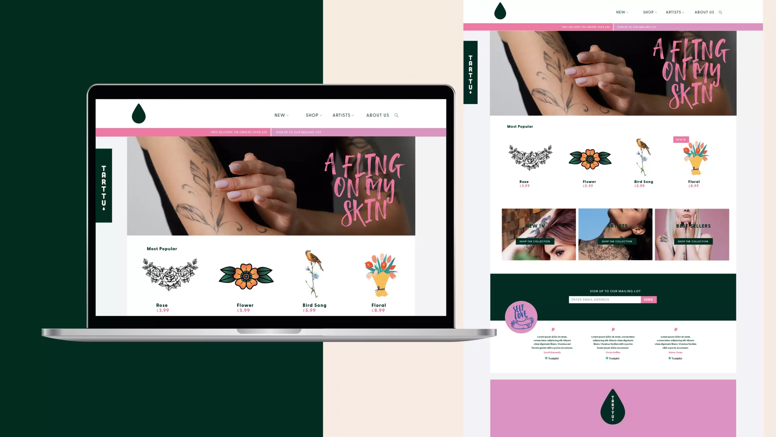
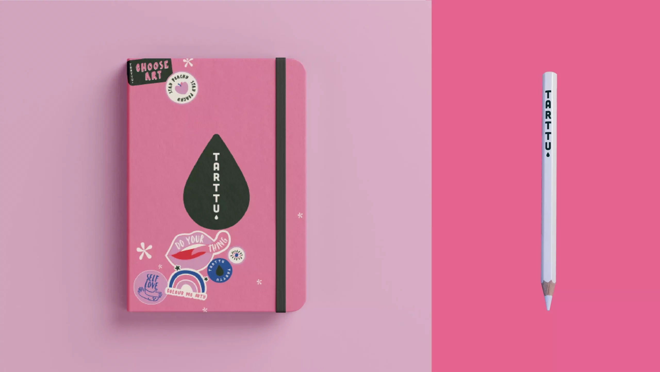
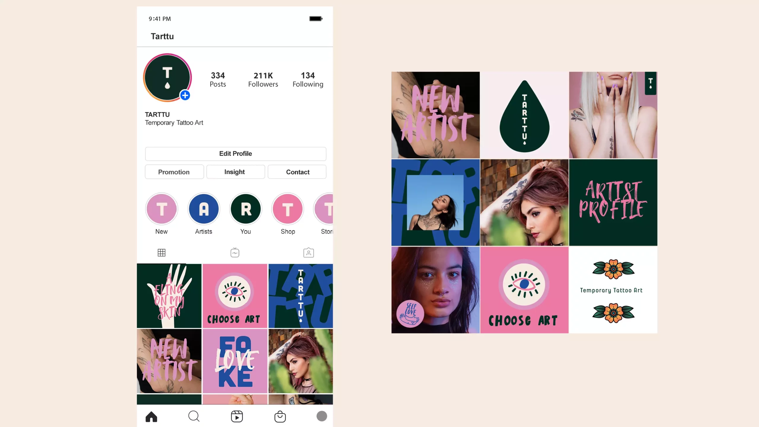
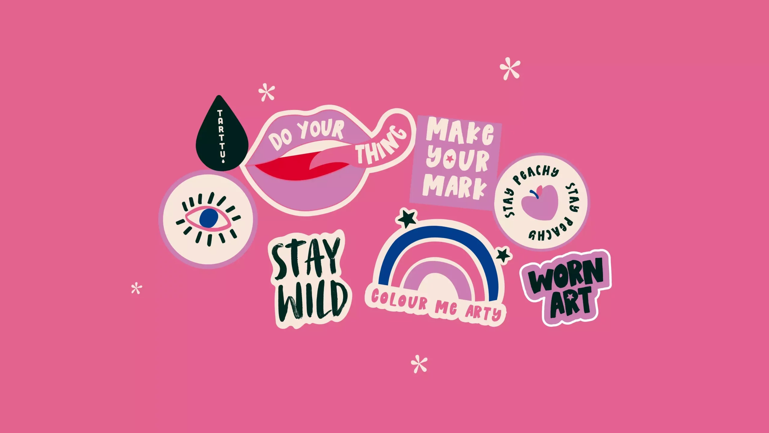
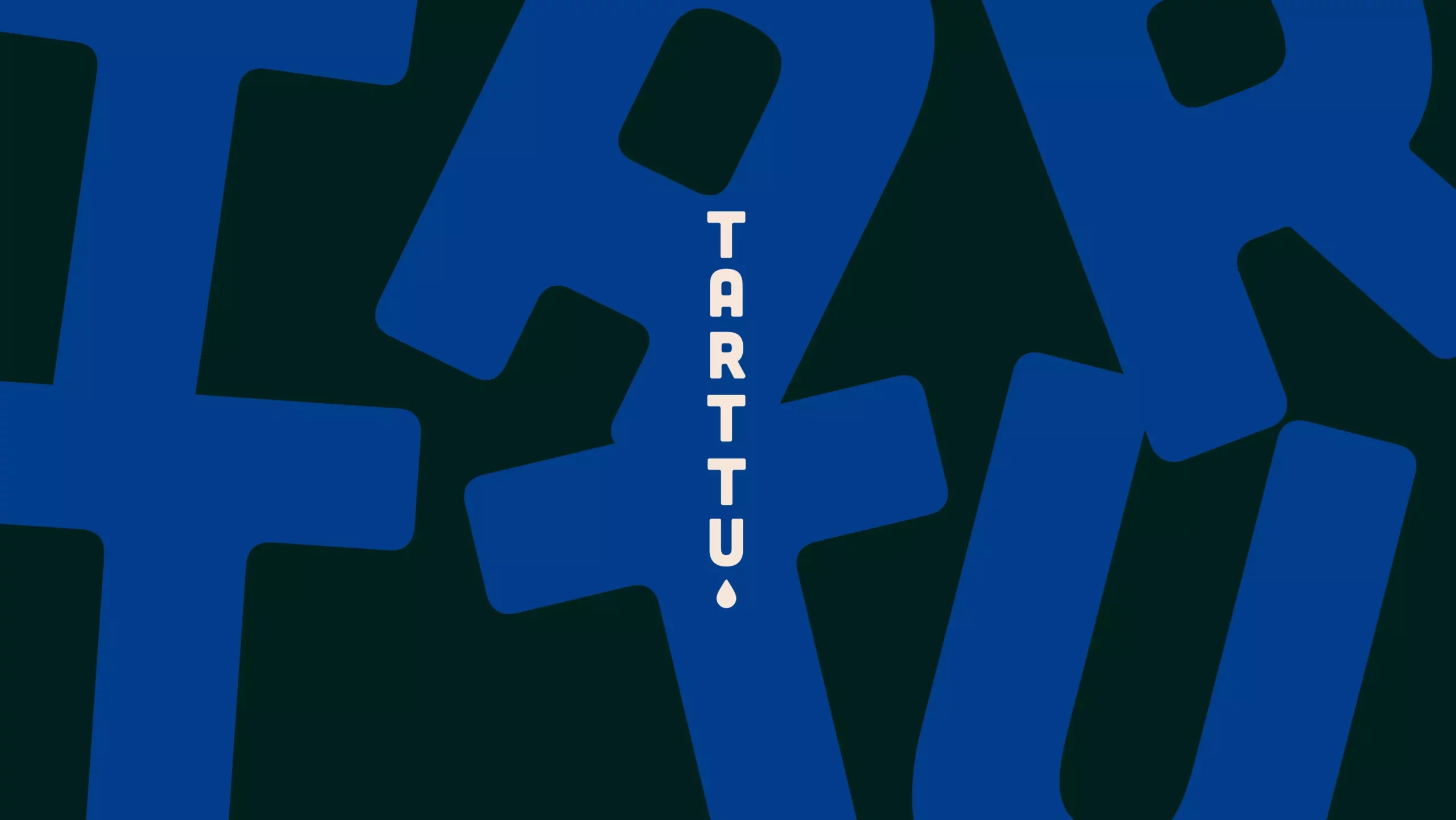
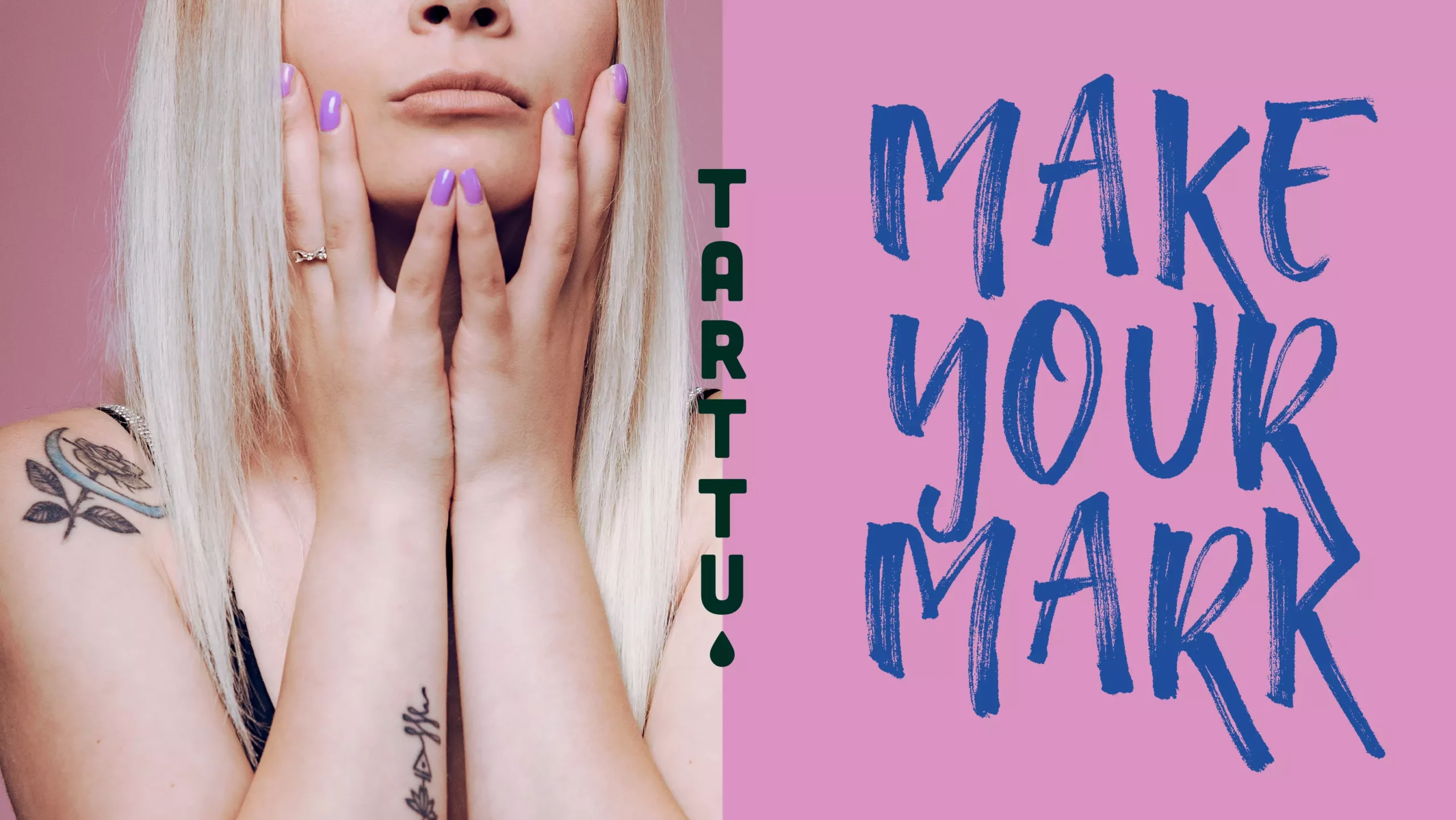
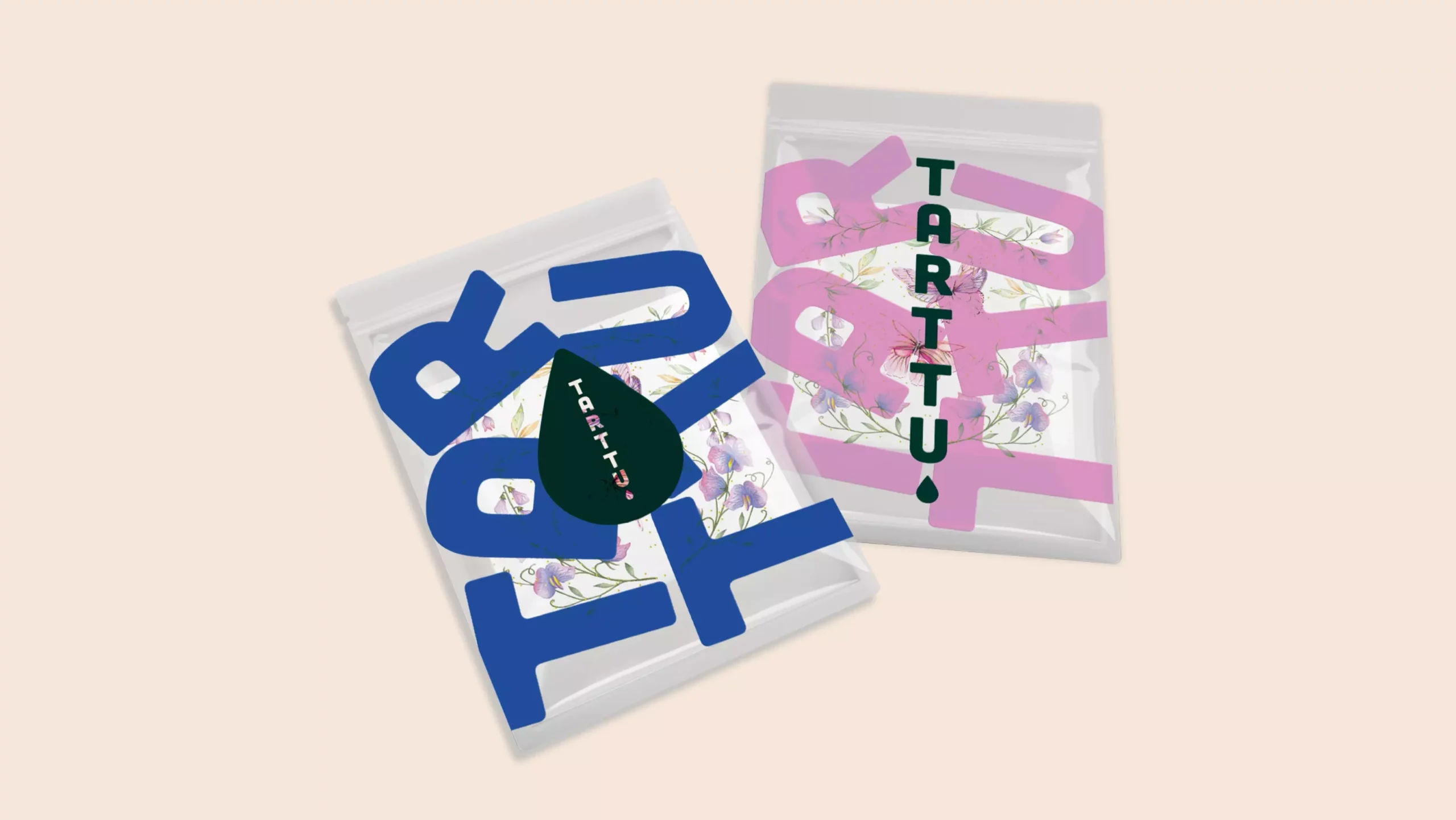
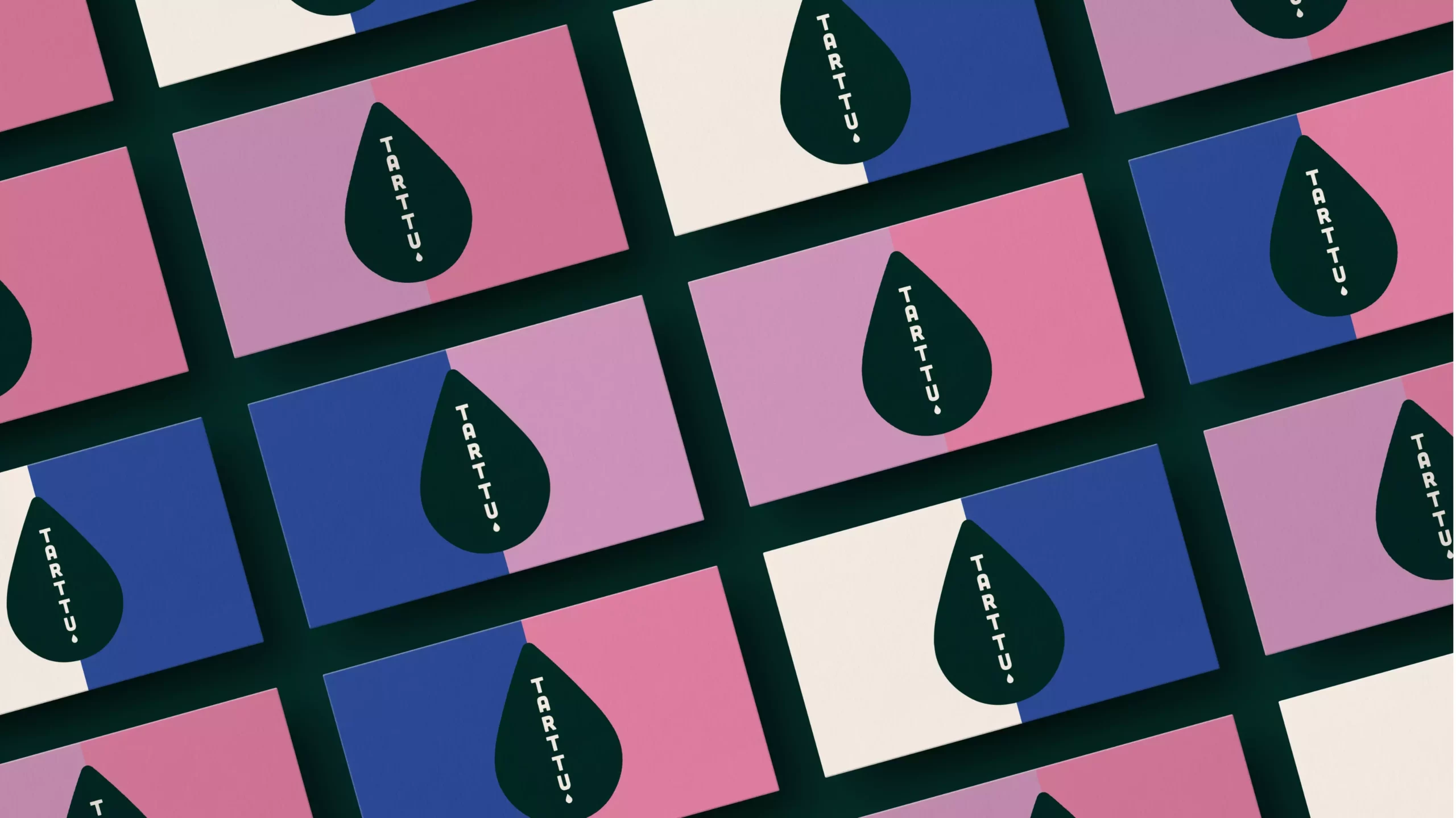
Initially we conducted a brand workshop, to understand the opportunities for the business and to explore naming territories. We helped concept the name ‘Tarrtu’, a play on the word ’tattoo’, ‘art’ and ’tu’ meaning ‘you’ in french. The next task, to bring the brand to life in a fun and engaging way. The brand brief was to design something feeling full of life, creative, rule-breaking and expressive. We imagined an ink drop, representative of the ink of traditional tattoos – and the ink and paint which the commissioned artists creating the tattoos may use.
This symbol acts a part of brandmark itself, or a device to house the logo within. A carefully chosen palette of grungy dark green contrasts with playful and vibrant pinks and blues for a sense of fashion and fun.
The tone of voice doesn’t take itself too seriously, we see soundbites such as ‘A fling in my skin’ in bold, expressive type treatment, to give life to social media posts, packaging and branded material. As a start-up business, the brand needed a confident foundation to launch itself and we look forward to seeing the brand come to life.