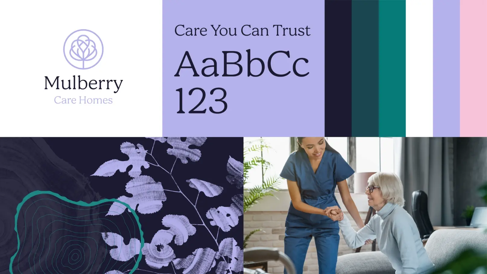
Mulberry Care Homes
The rebrand for an independently owned small group of residential care/nursing homes, that centres its brand values around; integrity, empathy, respect and excellence in care. We looked to nature to depict this welcoming home-from-home environment.

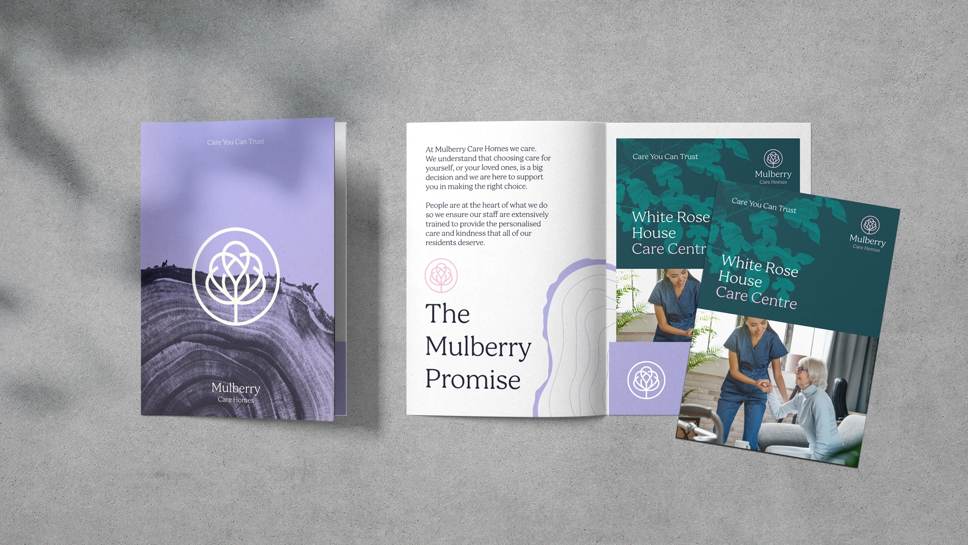
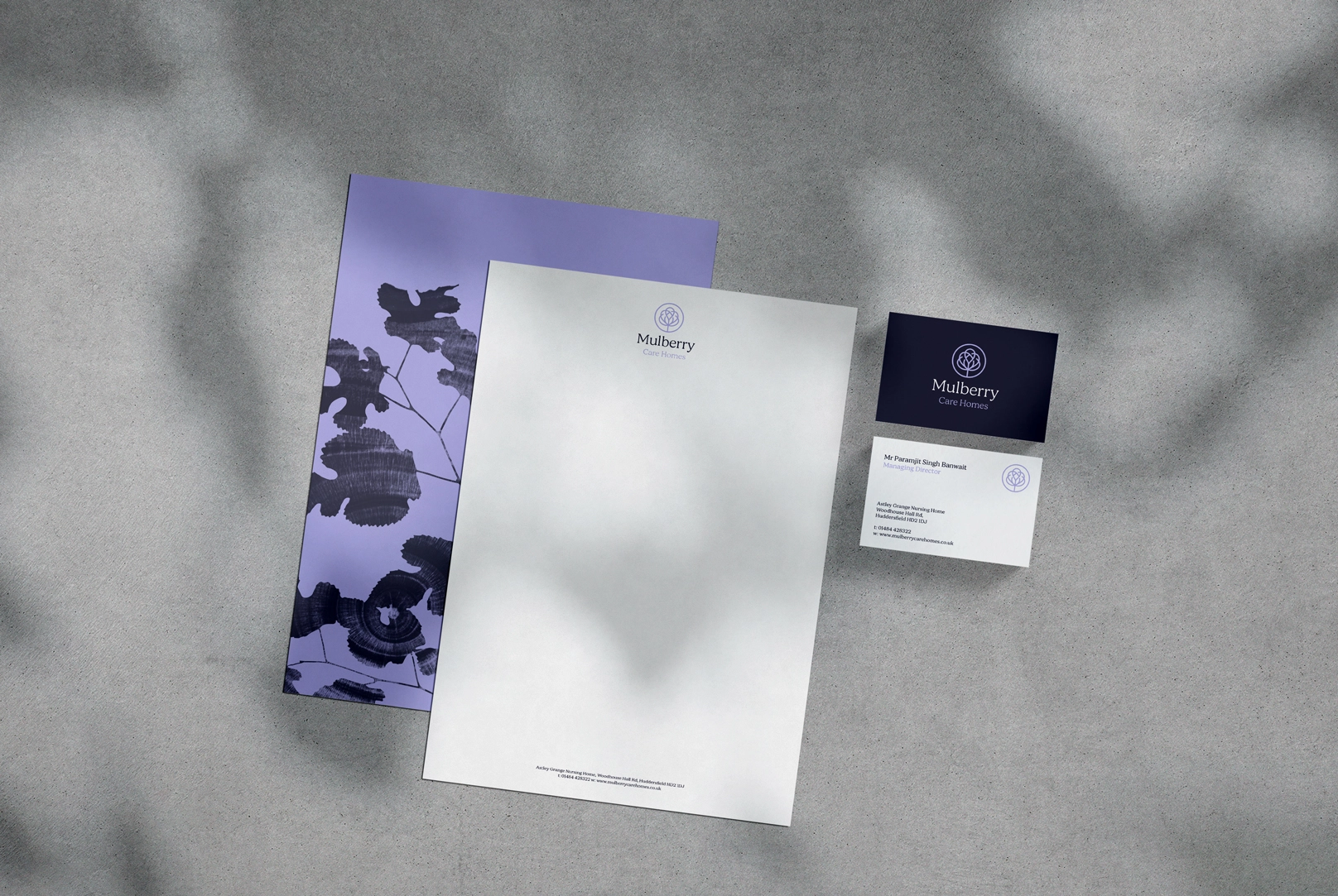
The brand mark feels elegant and simple, with our illustrated mulberry tree symbol and classically serif typography. Close up imagery of the rings of a tree trunk add further texture and depth – a route chosen since trees are symbols of stability and protection; we treasure our loved ones and we treasure trees; they bring calm and grow more wonderful with age.
We’ve taken a playful use of the botanical layers, adding a stunning layer of secondary graphics within our designer’s toolkit. All comes together with an unexpected palette of purples and teals for personality-filled differentiation in its marketplace.
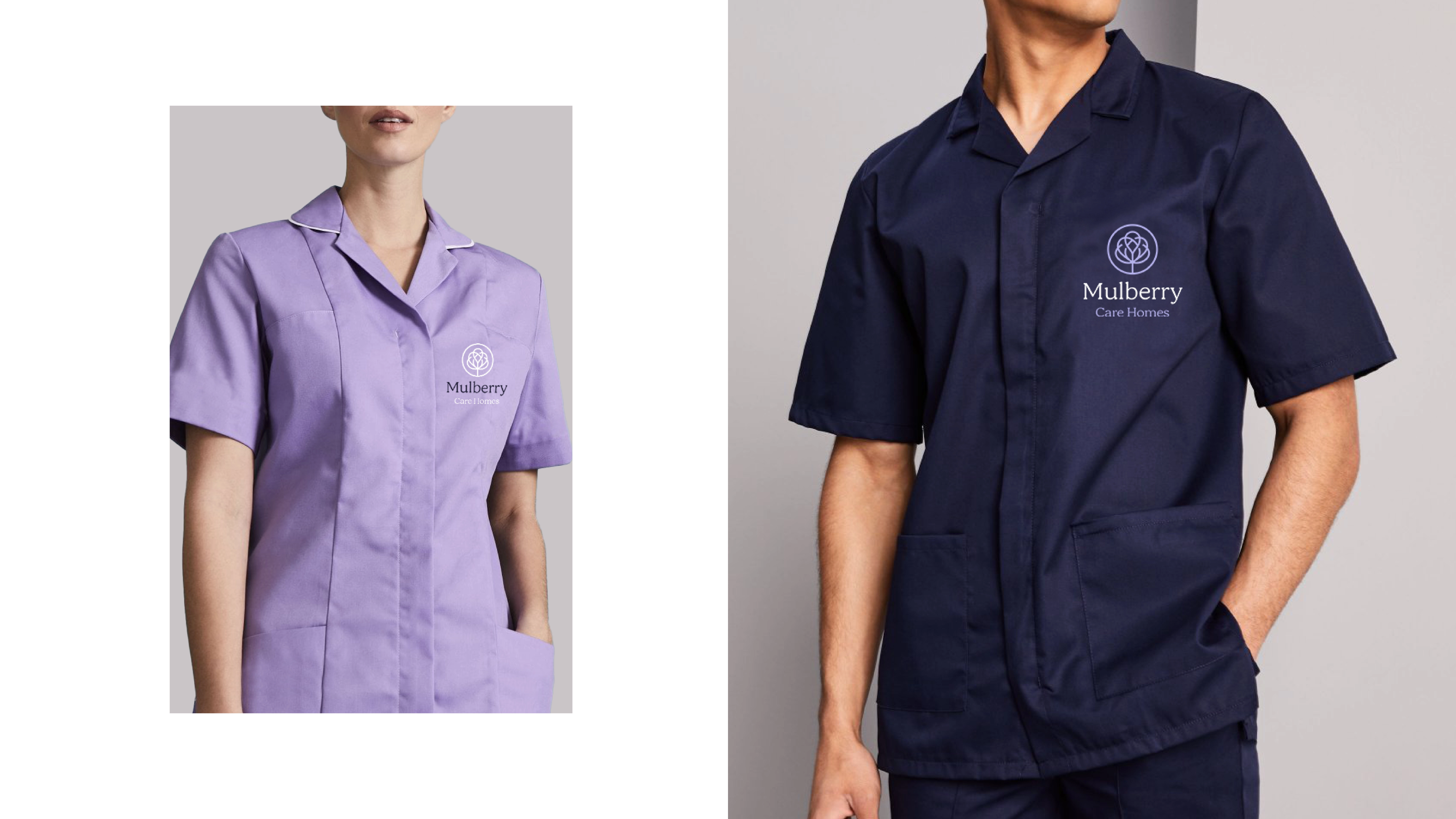
Further to brand creation, we’ve helped Mulberry Care Homes with a suite of branded elements, adding finesse to the brand’s touchpoints.