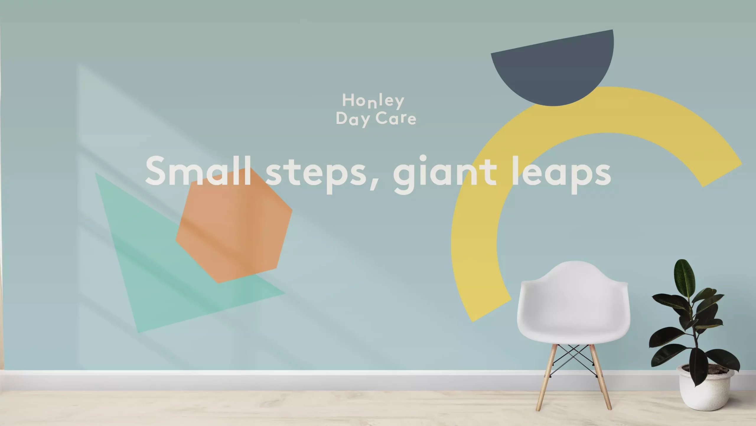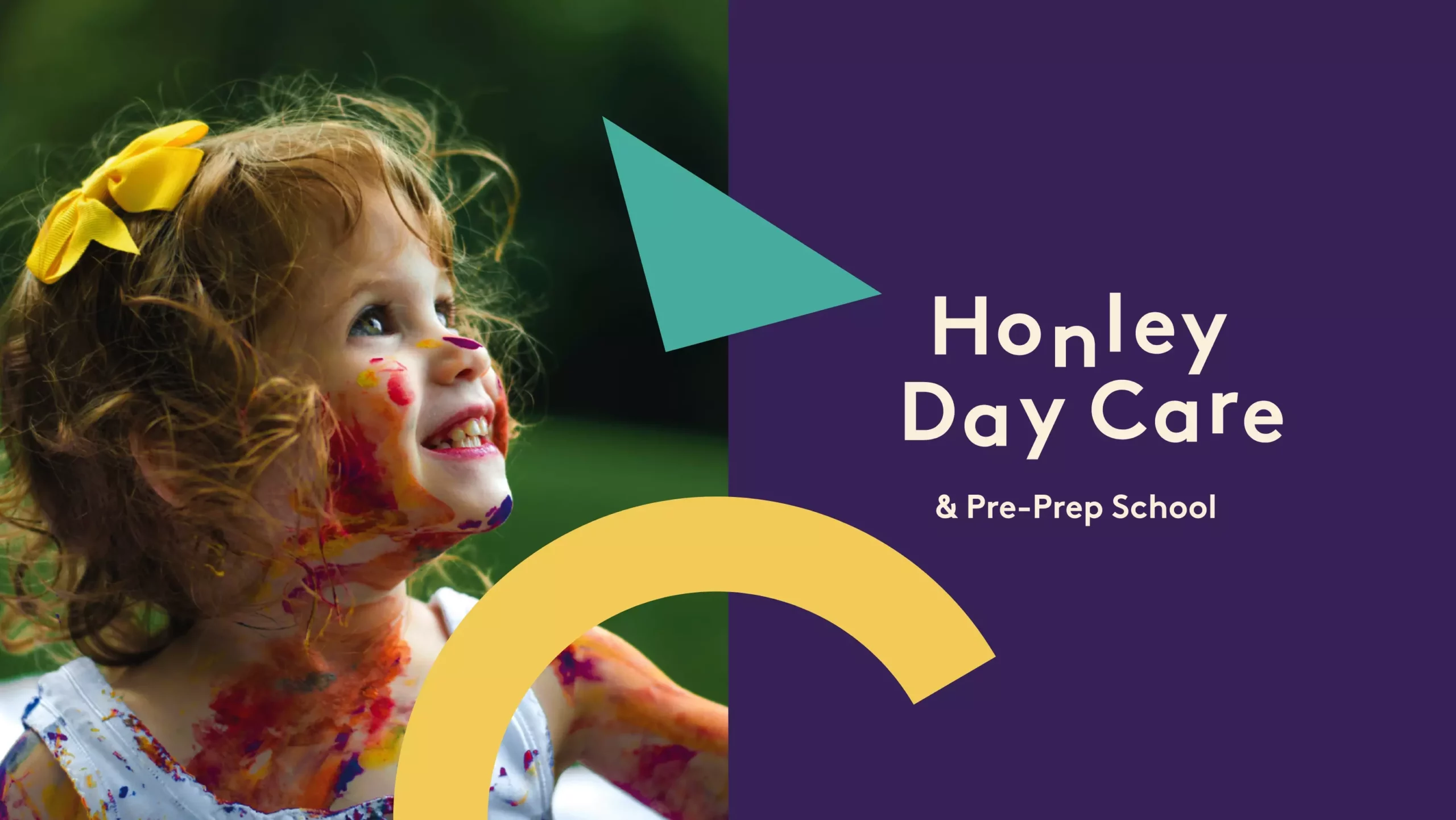
Honley Day Care
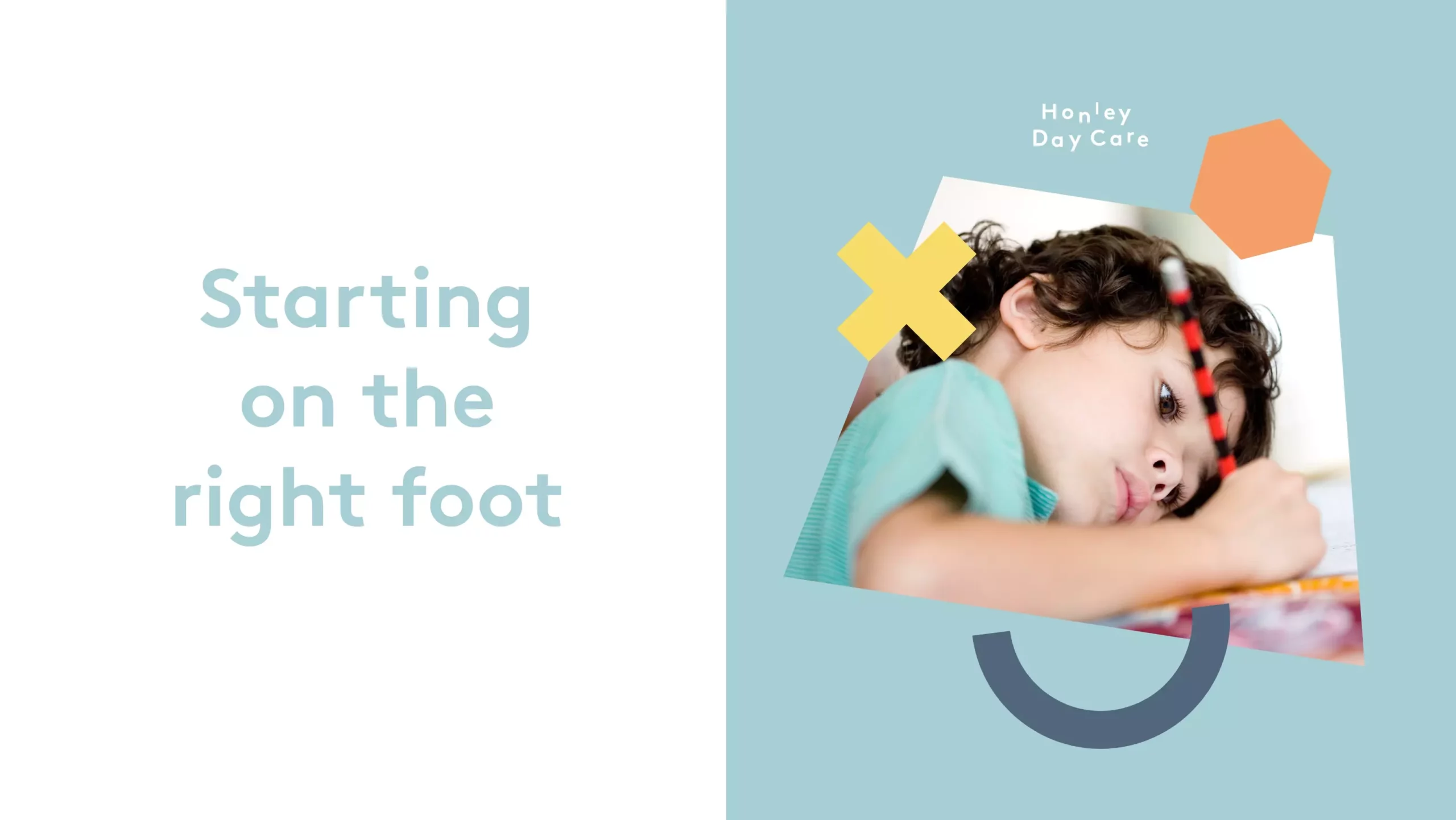
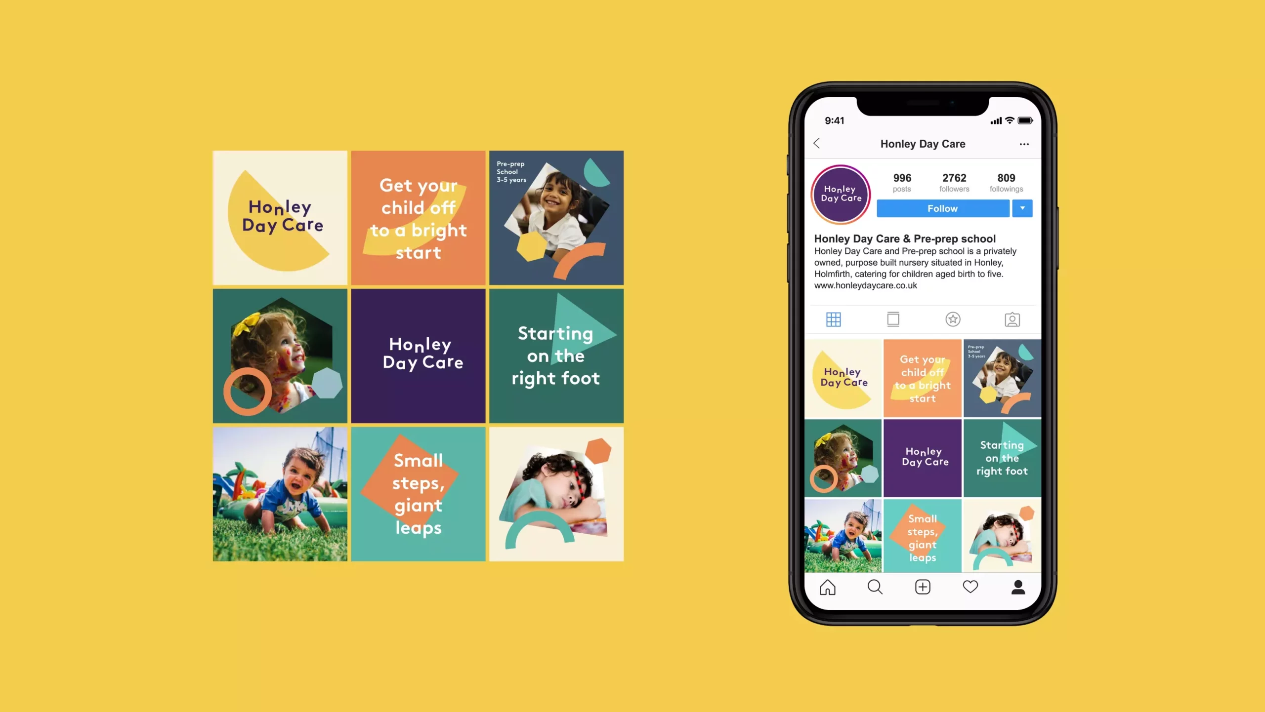
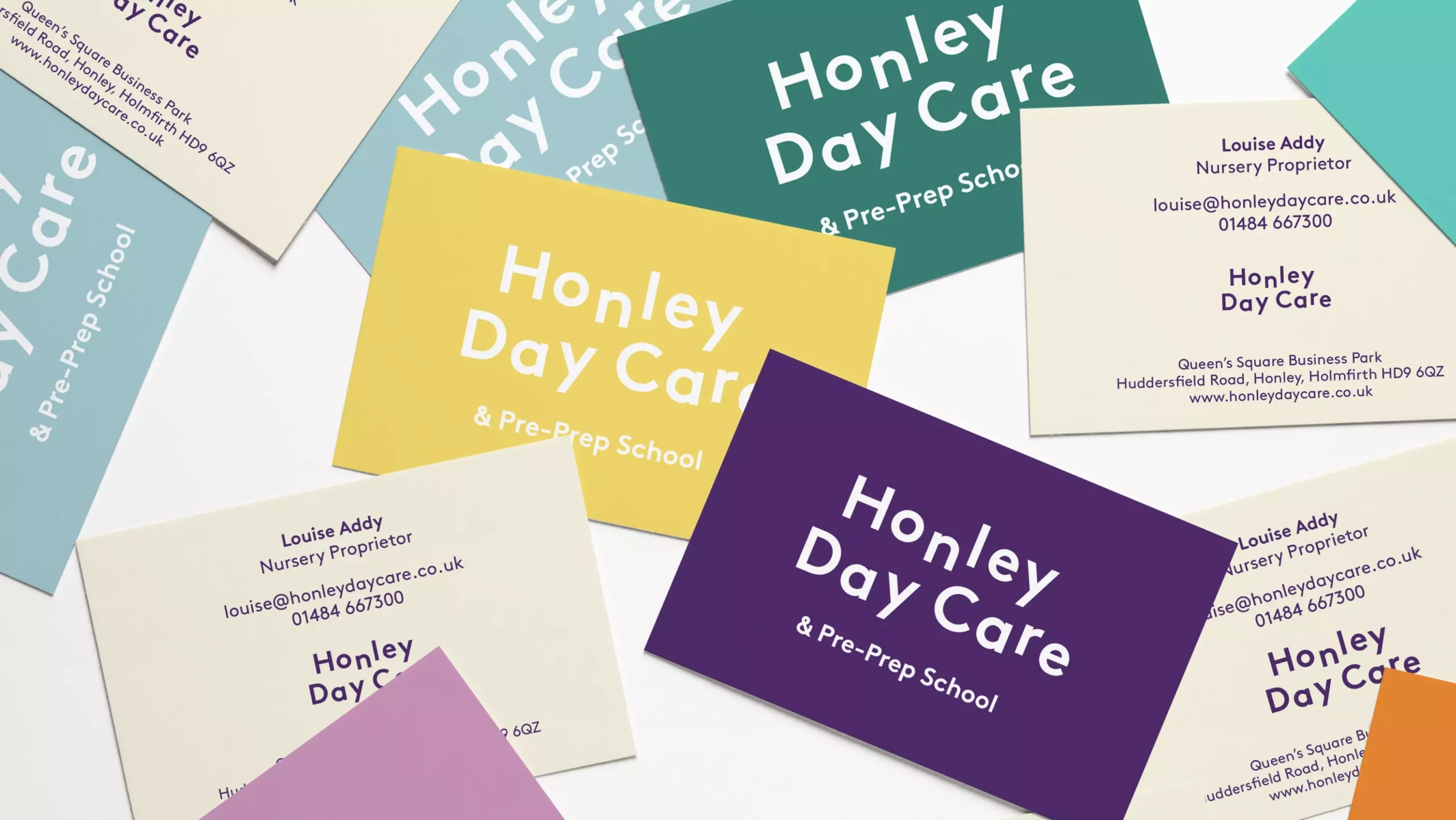
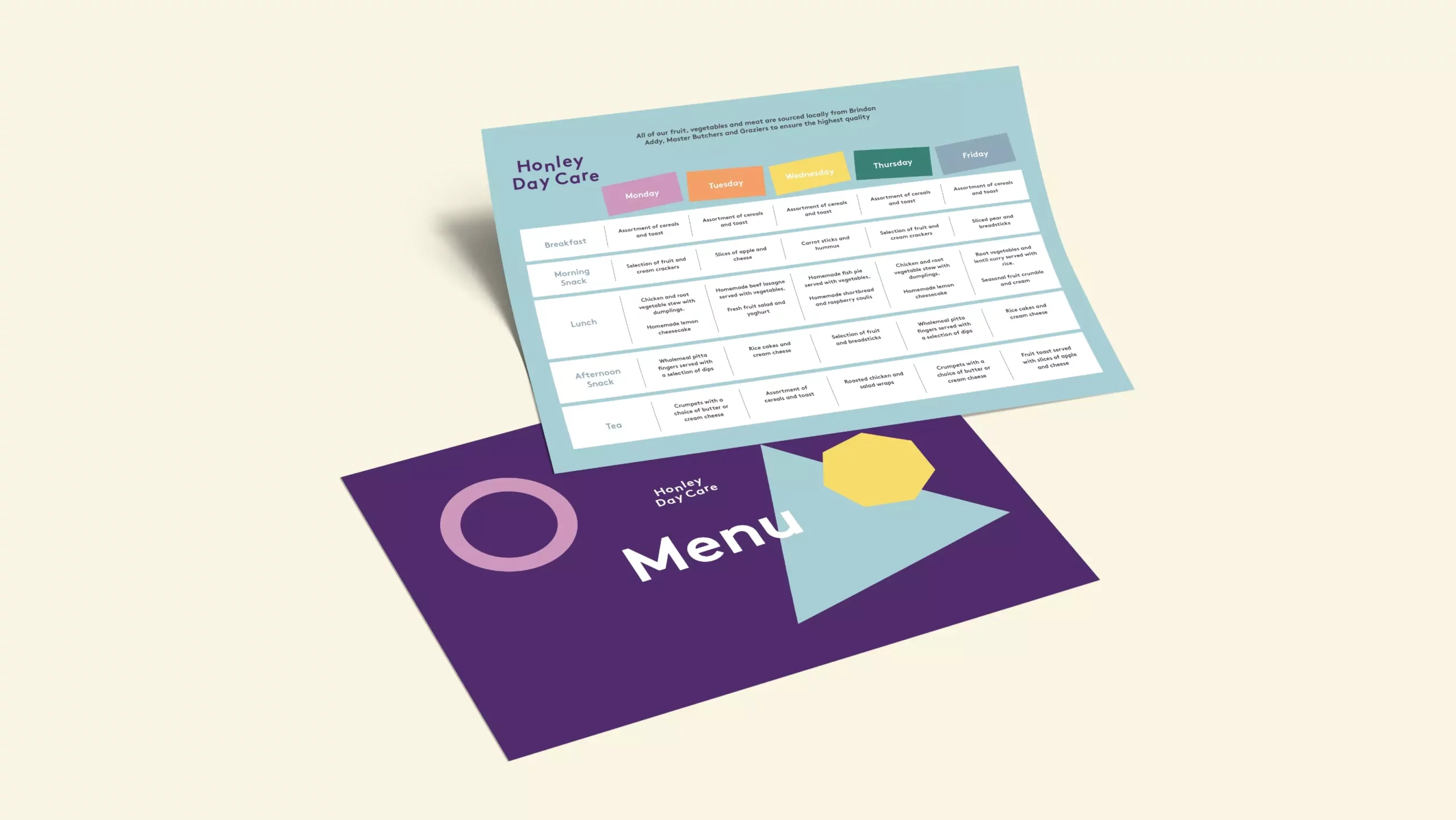
The Honley Day Care brief was to develop and freshen its branding in order to update the image of the business and in preparation for a new website. Long established, trusted and professional, this purpose-built children’s daycare centre and pre-prep school came with a great reputation for high standards. Our job was to build a connection between the offering and the way it presented itself, as branding had become a little tired and outdated.
We evolved the existing purple hero colour as it had become so recognised over the years and added a secondary palette of bright tones. Designing a set of geometric shapes that symbolise education, building blocks and child’s play, we introduced a set of assets that play an important function in the brand toolkit. Typography is clean and legible but has a delightfully playful styling, lending itself well to animation. A layer of photography helps to depict the various children’s activities and the joy of thriving in a great educational early years environment.