Cyclesense
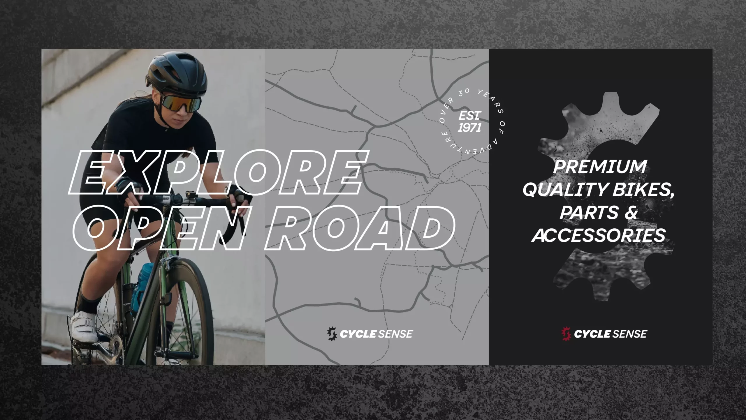
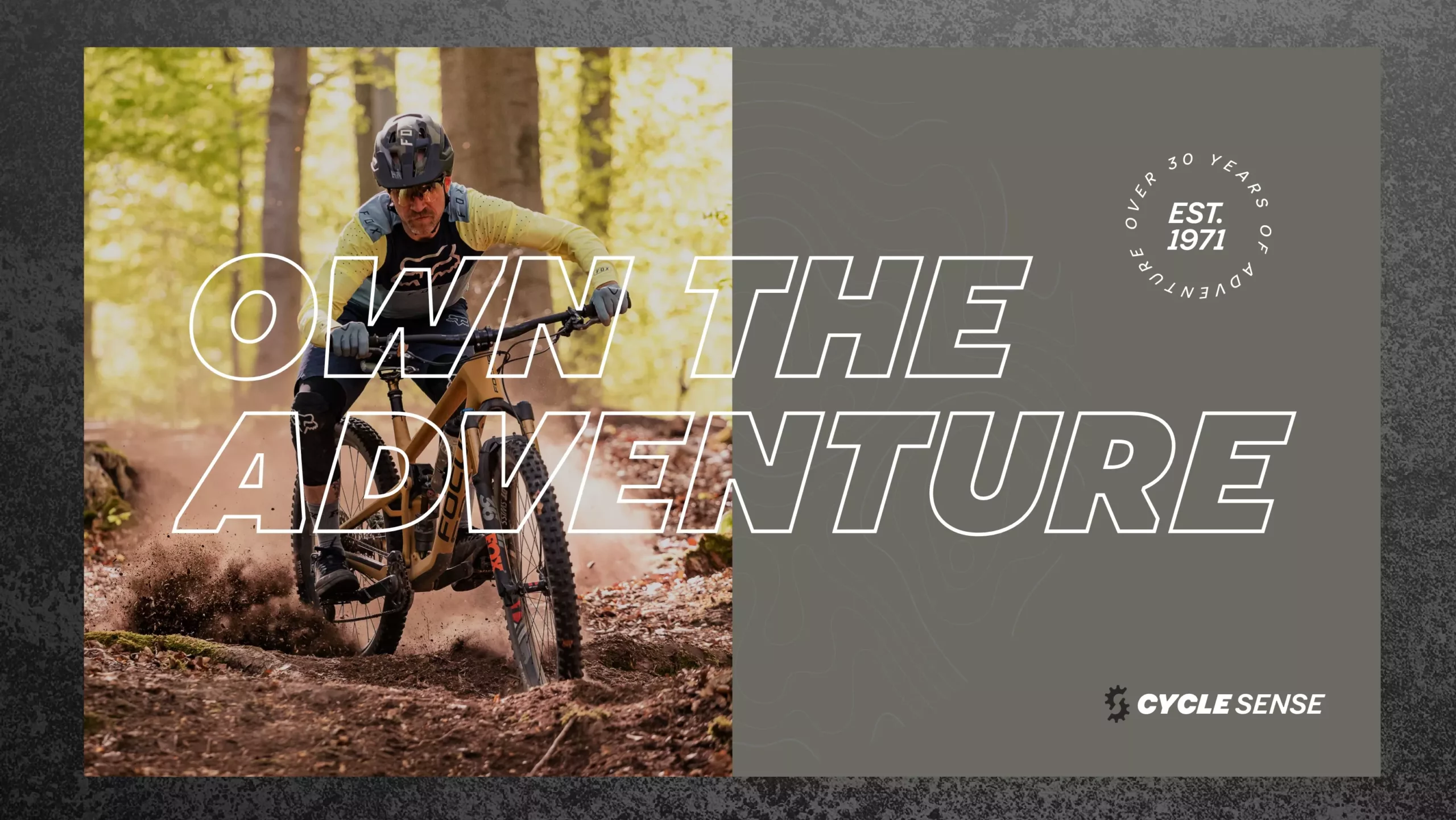
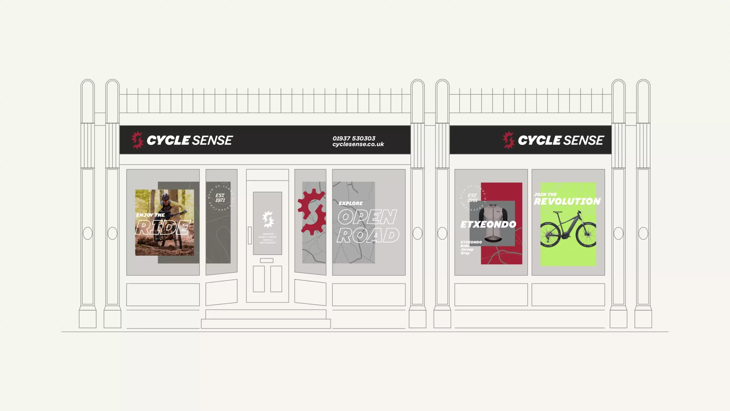
Cycle Sense is a bike shop with a well-loved presence in Yorkshire town of Tadcaster. It also has a thriving e-commerce website. A family business with over 30 years expertise, the business was looking to rebrand, with aim to present a more up to date image, differentiate in its marketplace and engage a broadening audience. Picture Smiths ran a brand workshop with all team members, within the store itself, to truly understand the scope and vision of the brand and offering.


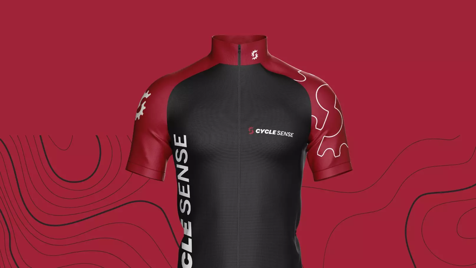
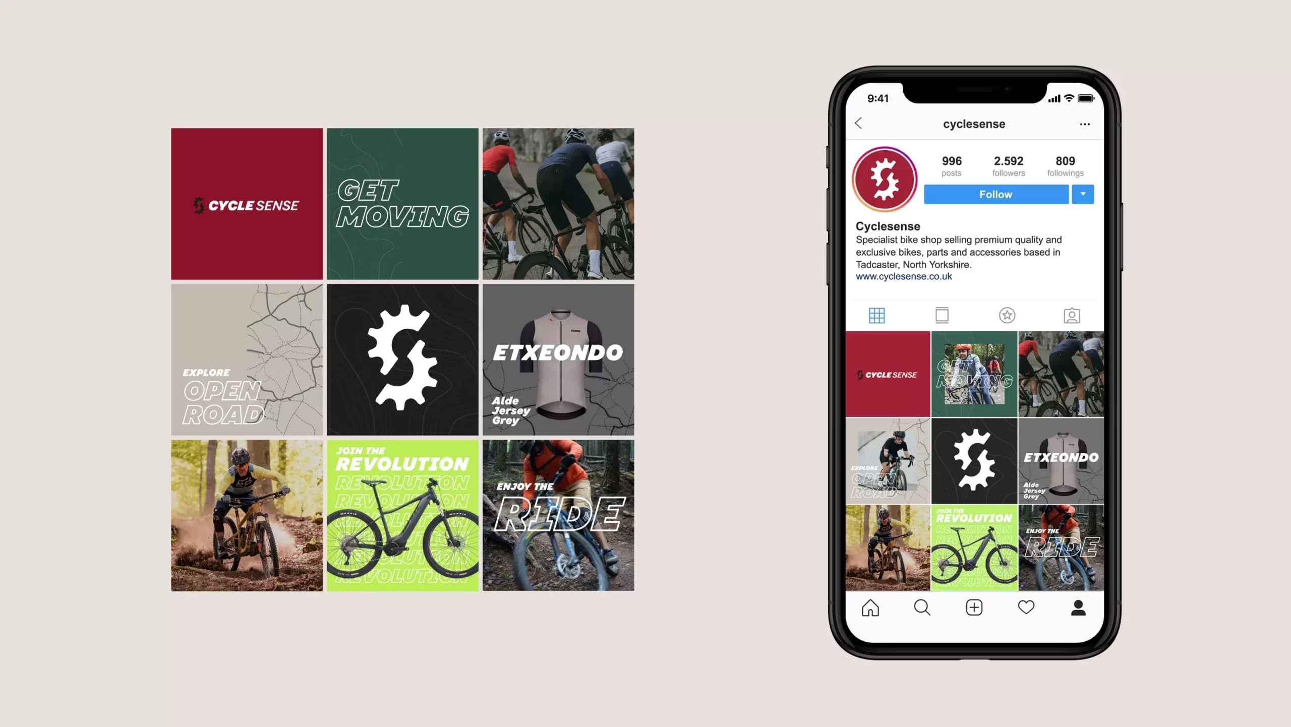
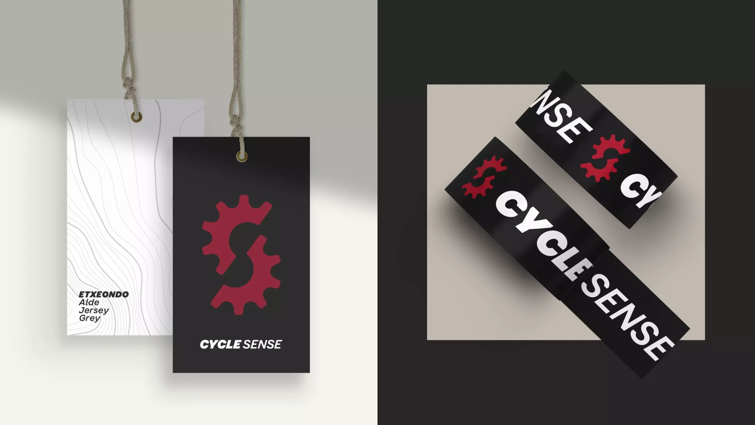
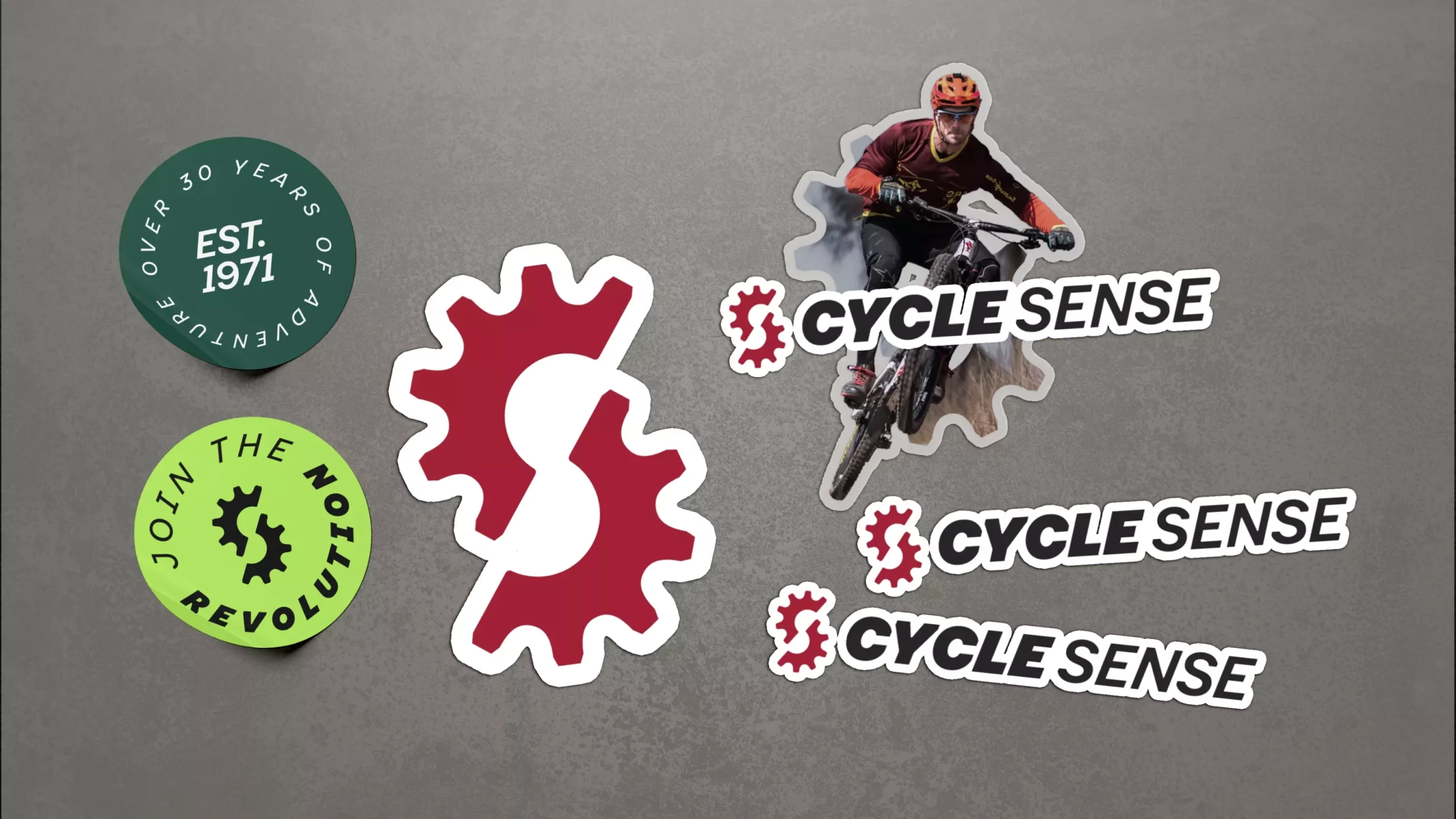
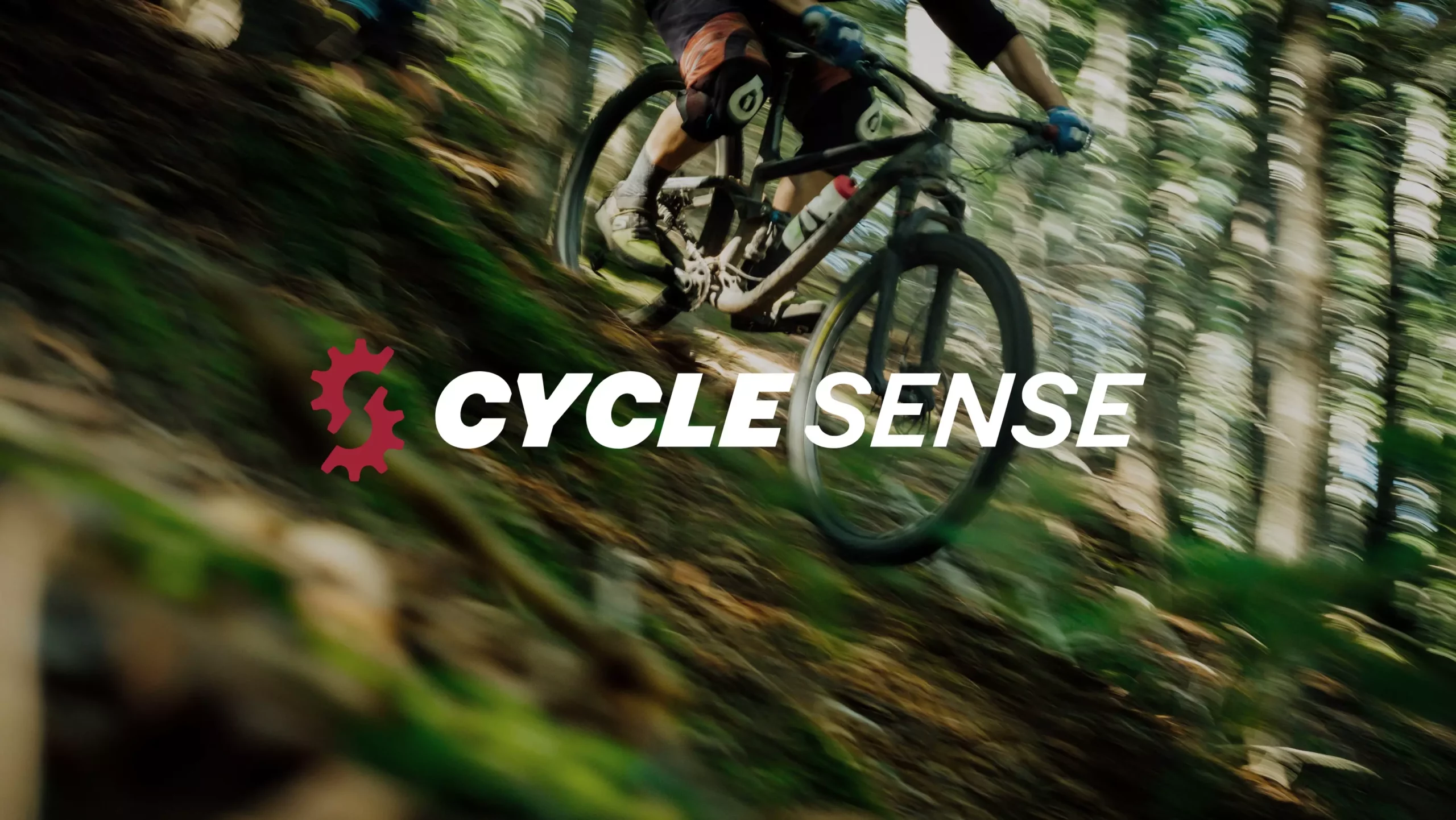
To bring the renewed impact needed, we started by evolving the existing brand mark by creating a stylised ‘C’ and ’S’ symbol in the style of a bike cog (the previous logo using a cog device). We also updated the existing colour palette of red and black to a more distinct shade of red and gritty charcoals, which helps the brand feel more considered and current, without losing recognition. New to the palette is the introduction of green, to depict the outdoor aspect of cycling, as well as bringing an intentional dramatic contrast to the red. Brand textures take influence from the contours of land and road maps, used as a stylised backdrop to action-packed photography and robust brand typography. The tone of the brand is dynamic yet knowledgeable. As with all Picture Smiths’ brands, it is delivered with the personality, in this case to stand out from the bigger chains.