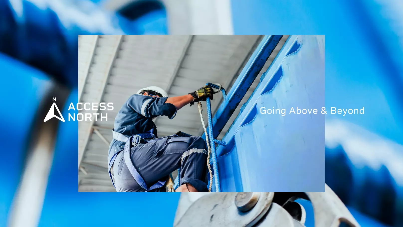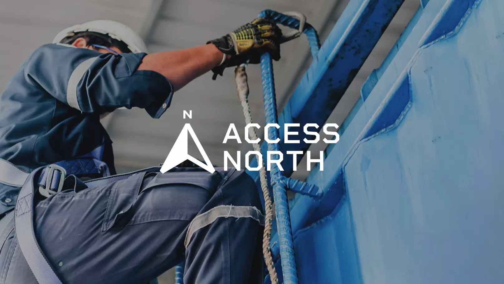
Access North
Access North is an established height work and difficult access specialist, which was looking to freshen and update its brand.
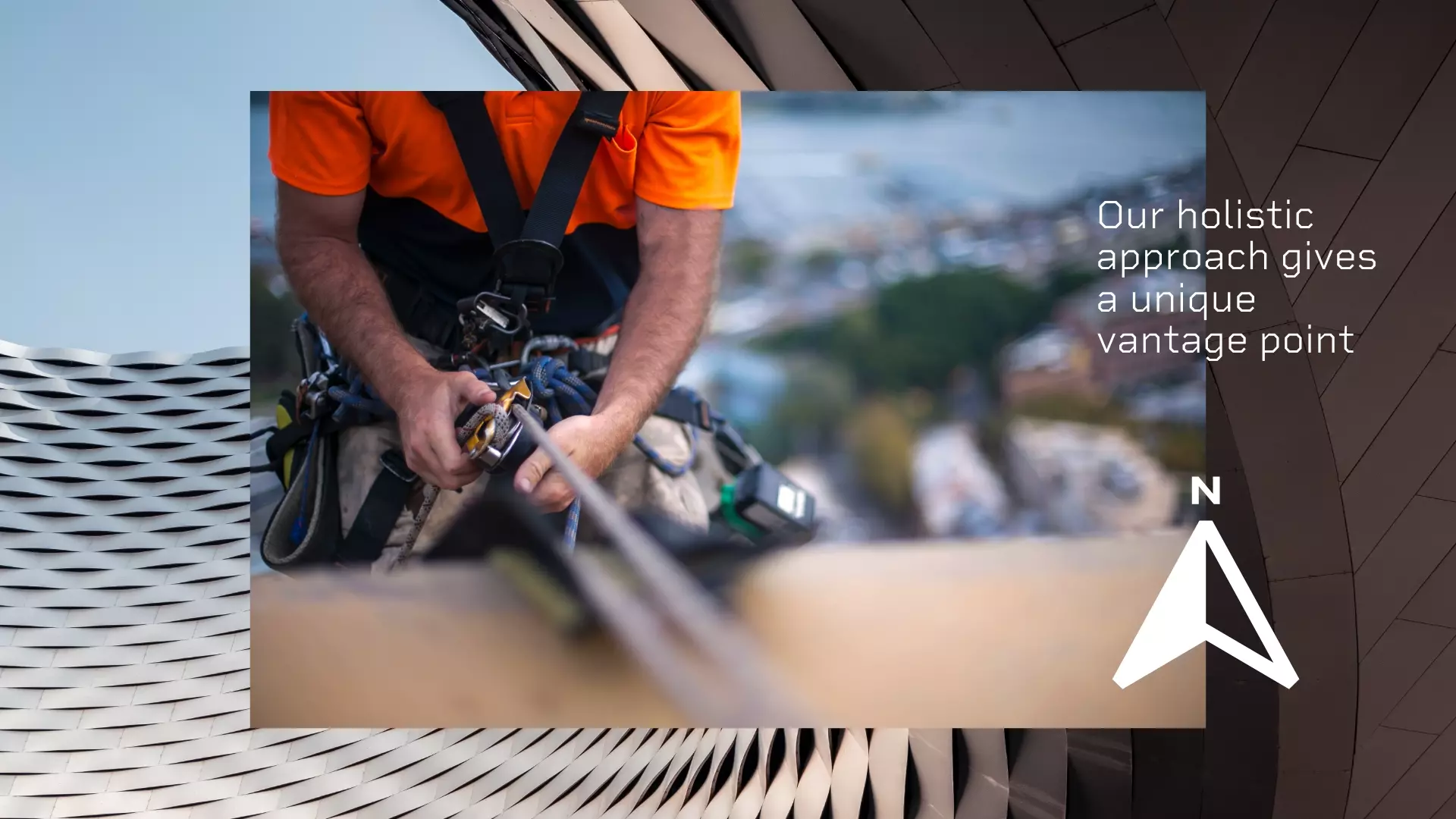
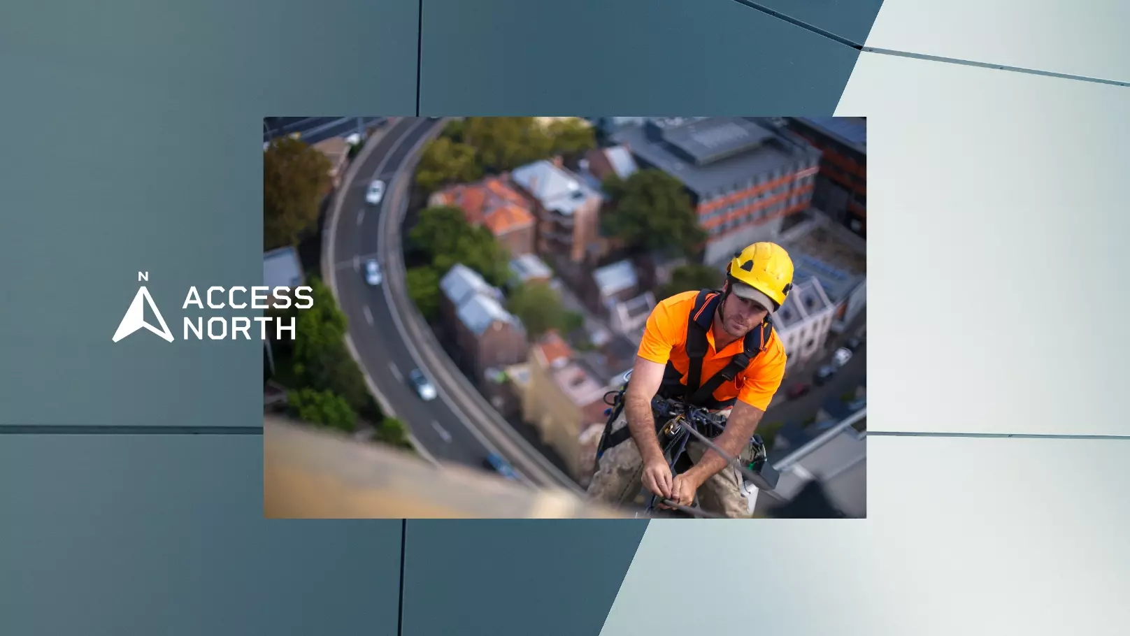
What shone to us was the uniquely holistic approach Access North brings to its projects. Such thorough attention to detail here; to safety, to problem-solving and to relationship nurturing, alongside a remarkable level of energy and passion from the owners. We saw an opportunity to inject authentic personality into the brand, to refine the tone of voice and to help brand differentiation, in synergy with their values and the way they go about business.
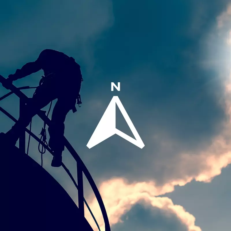
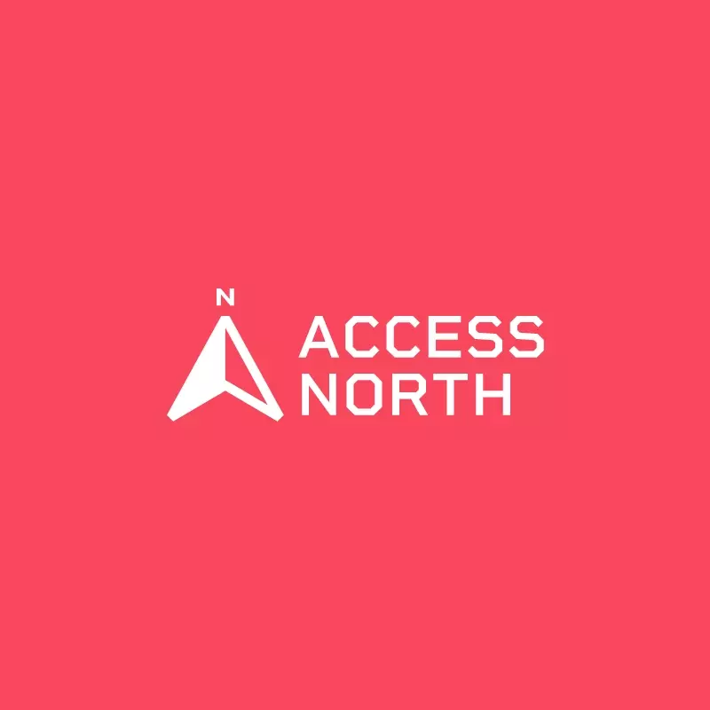
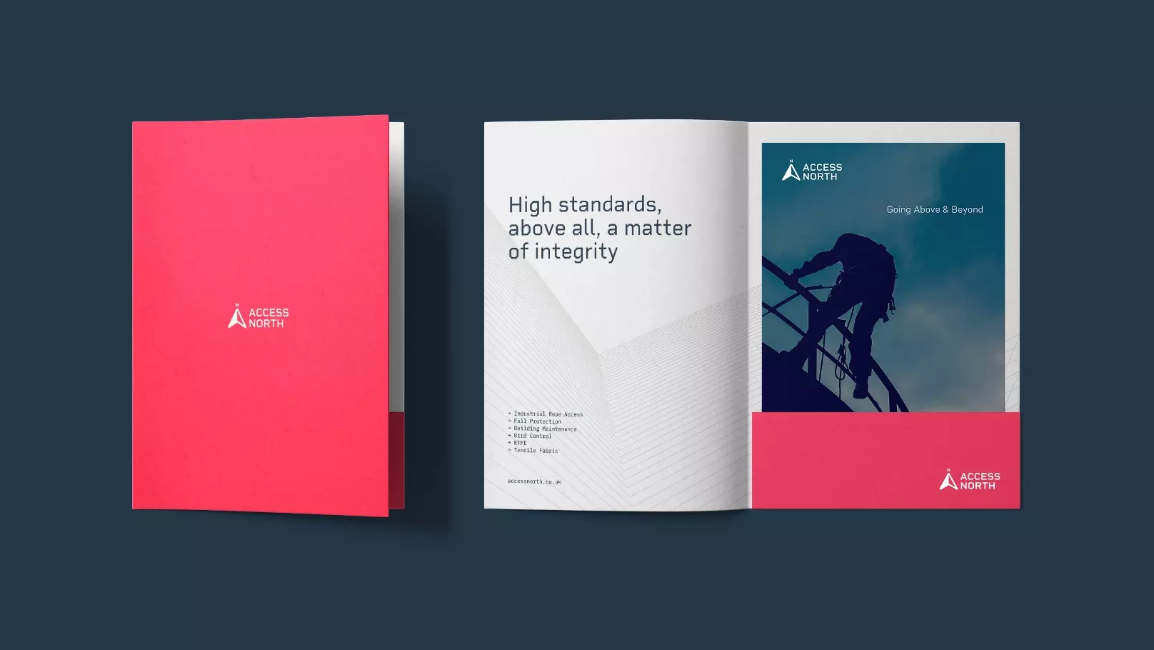
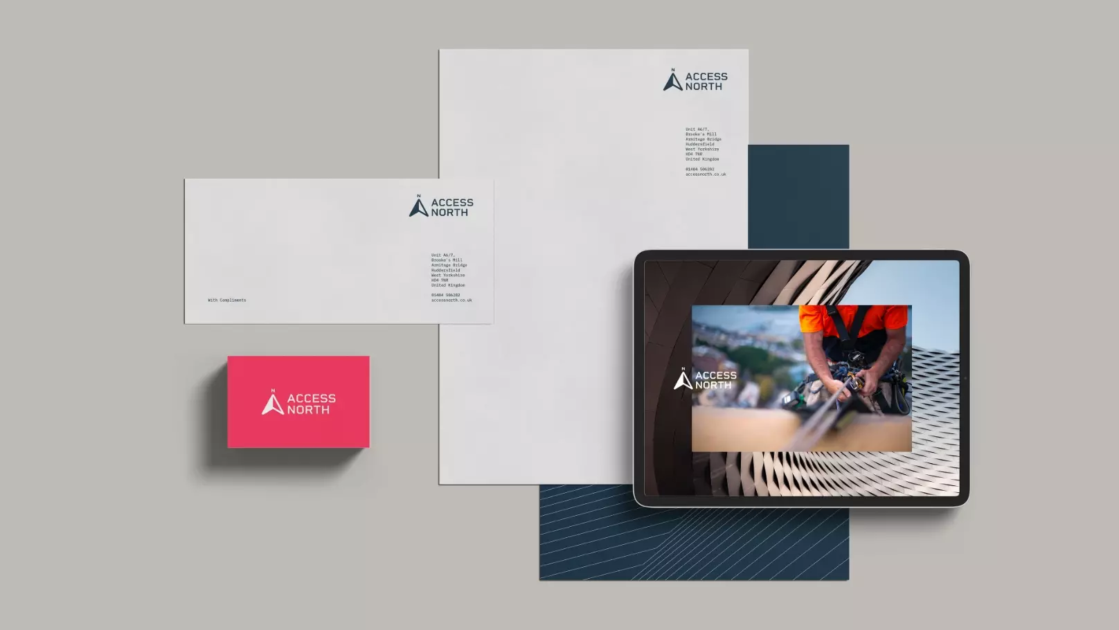
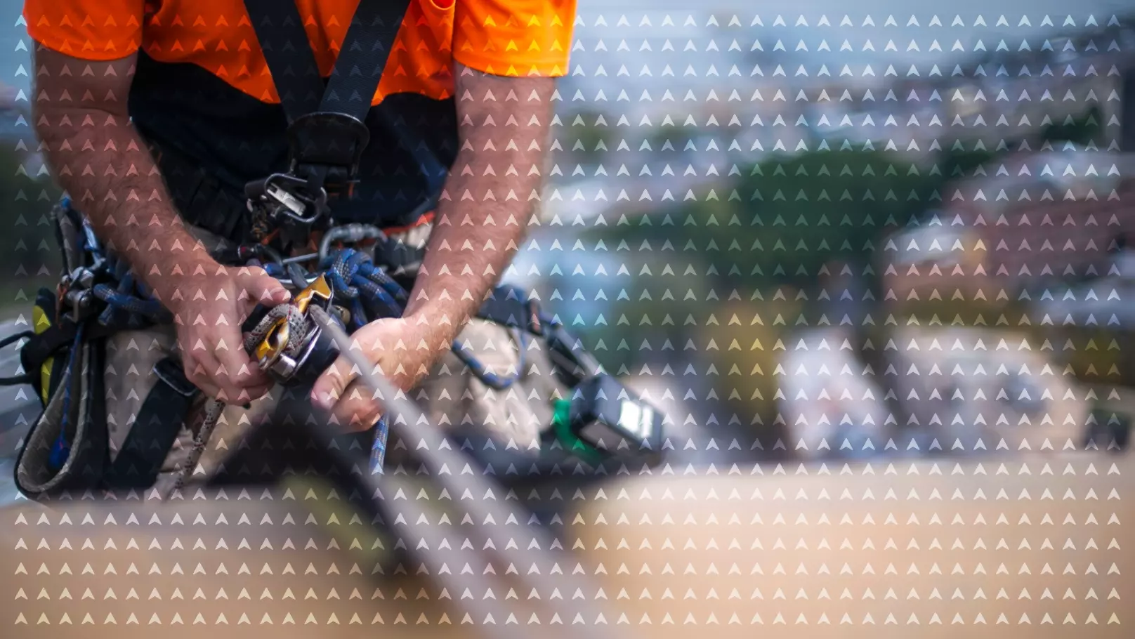
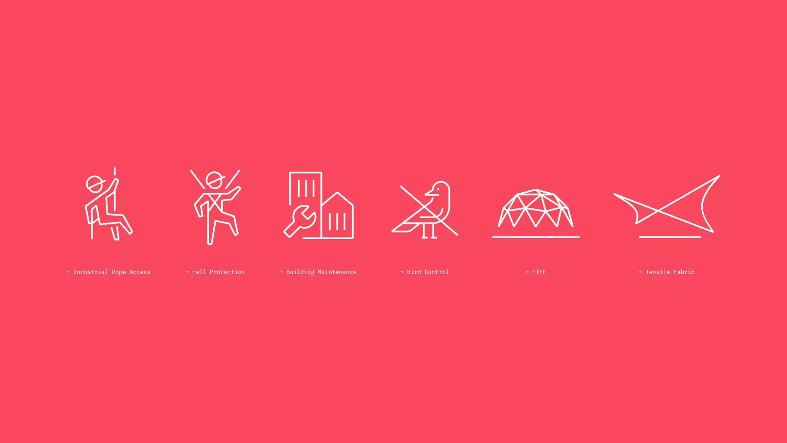
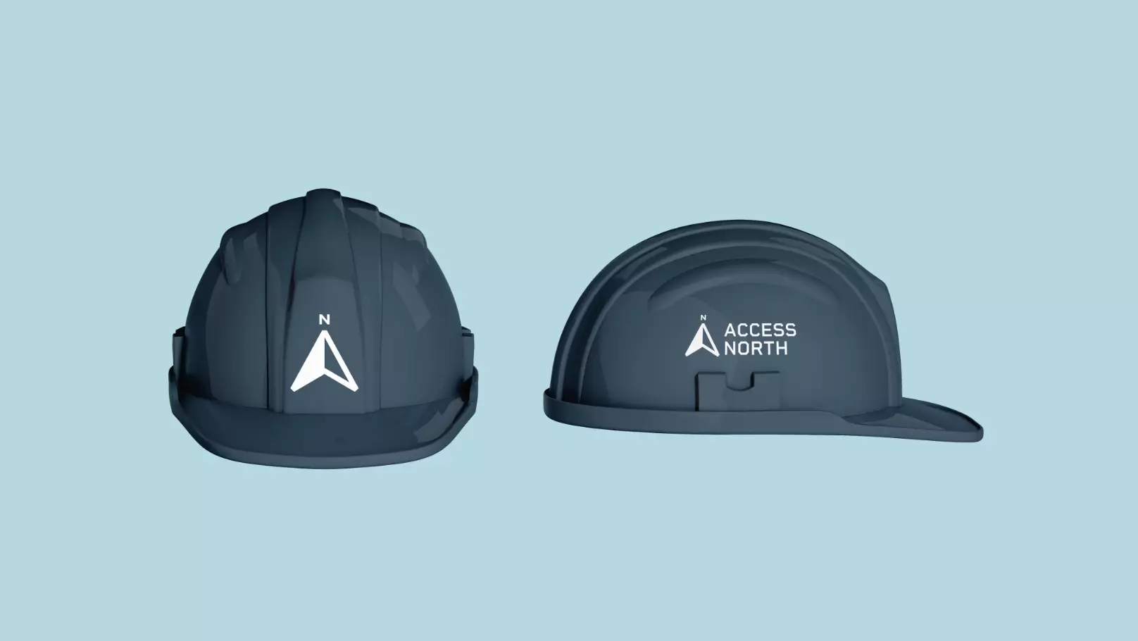
We created a modern stylised ‘A’ symbol, in a way that depicts height, paired with confident, clean, robust typography for a reliable and trustworthy brand depiction. A stripped back palette of red, blue and complimentary tones was selected, for use in toolkit to be combined in different ways, so allowing for variation across application. With a distinct photography tone and nicely organised iconographic layer, this design scheme is composed of a number of core elements coming together to create a distinct visual language, making the Access North brand instantly recognizable.