Pandora Ryan
We were approached by Pandora Ryan to help her create a brand for her new eponymous garden design business. As soon as we met Pandora, a creative herself, it was clear that we shared the same vision for great design and creativity, and relished in the process of designing something unique. Pandora didn’t want to blend with the expected image many of her garden competitors adopted, often using greens or obvious garden iconography in the brand – instead the brief was to be bold with colour, and for a brand presentation which represented with her artistic experience, as a former marketing employee of the V&A, Tate Gallery and Royal Academy of Arts.
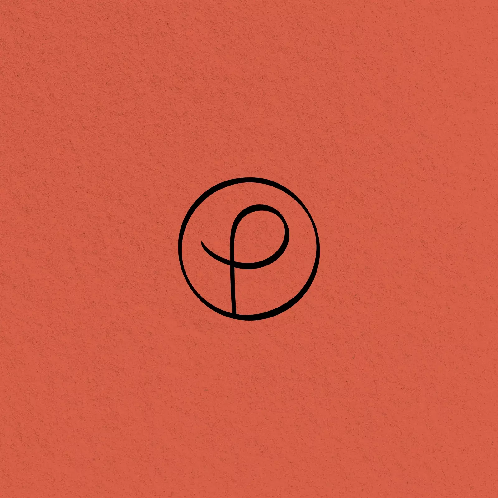
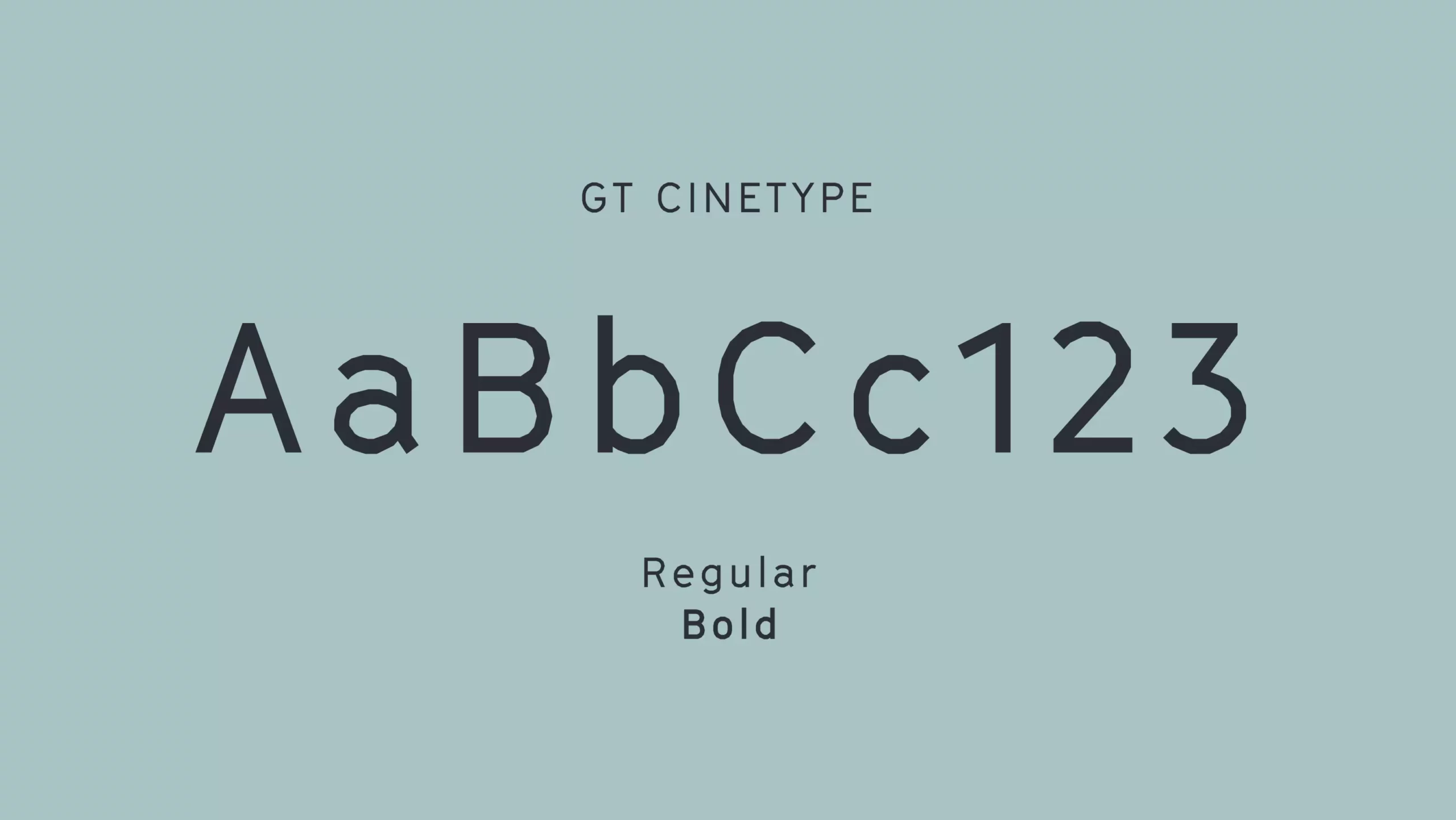
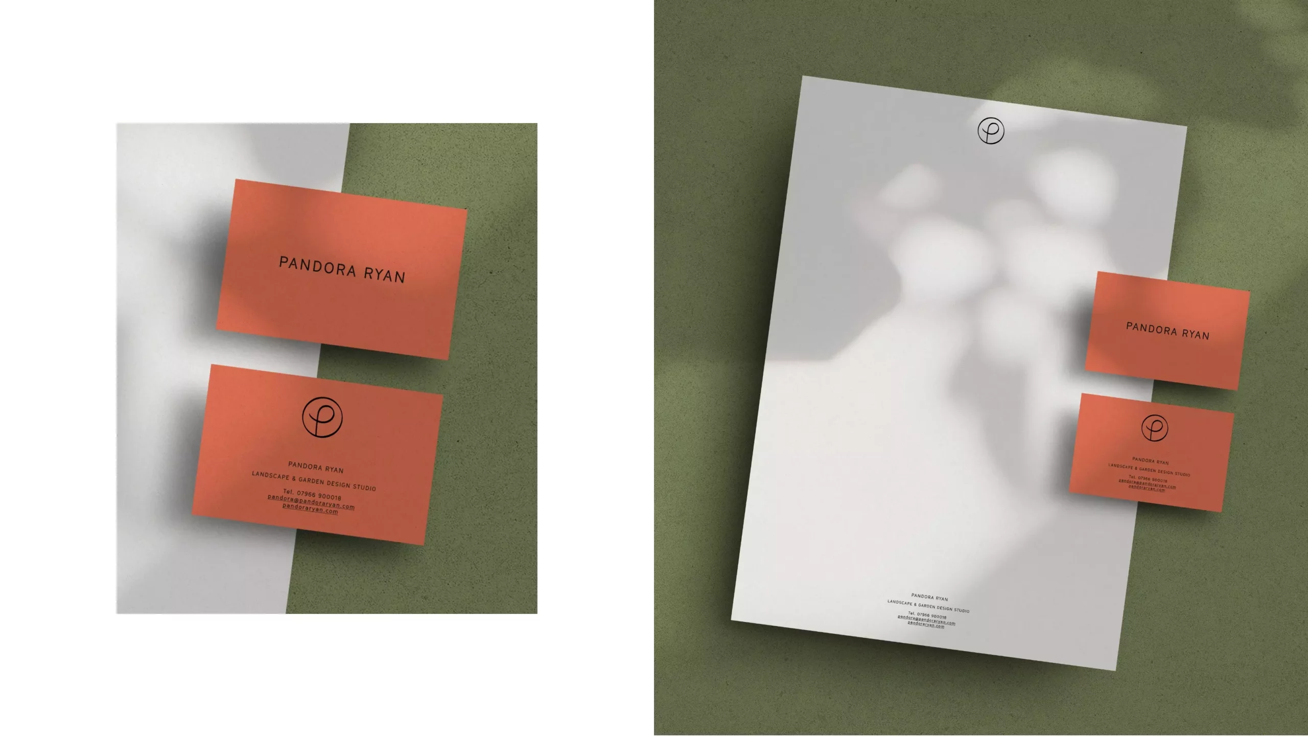
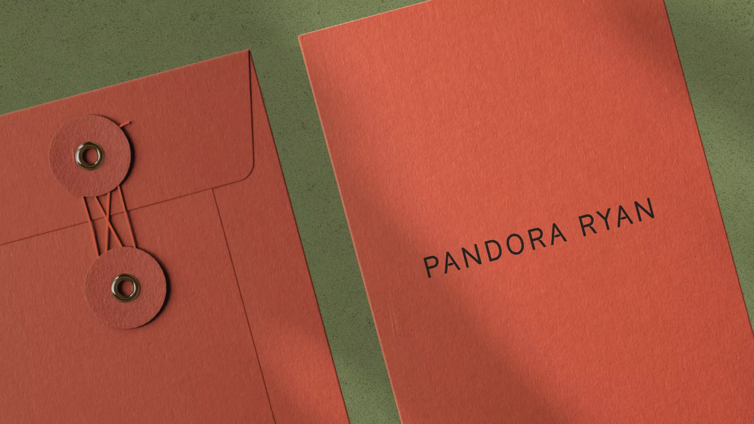
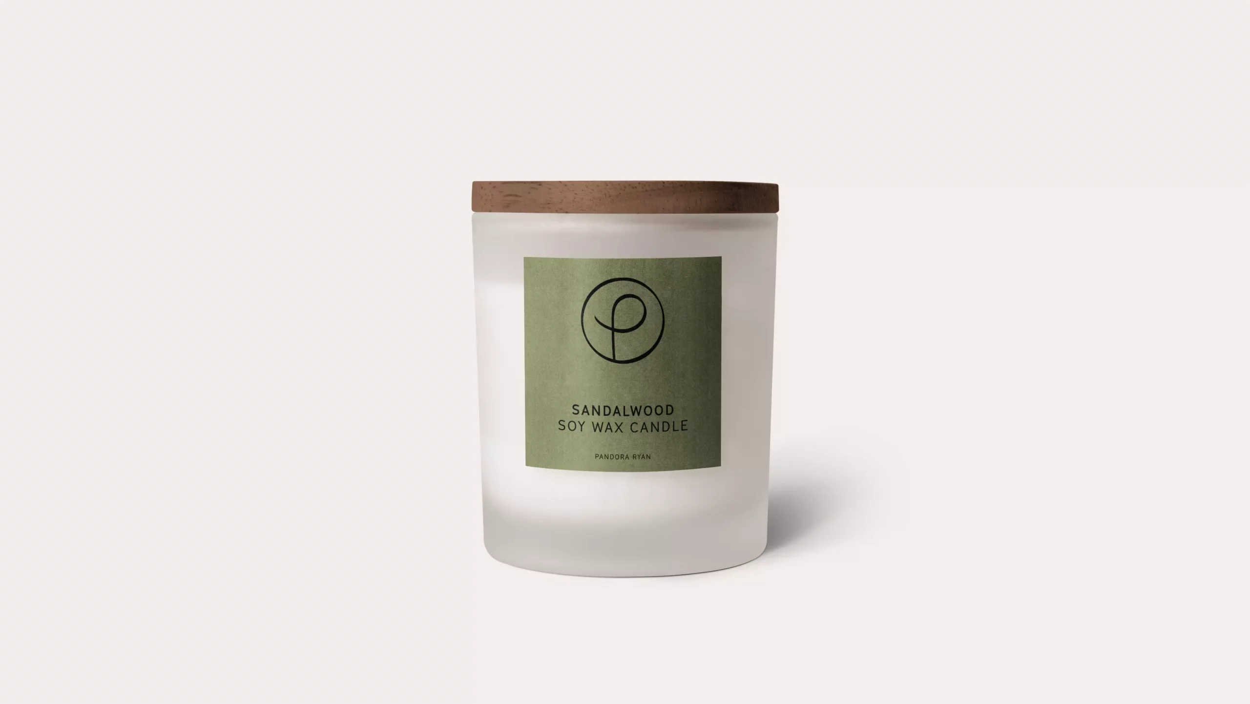
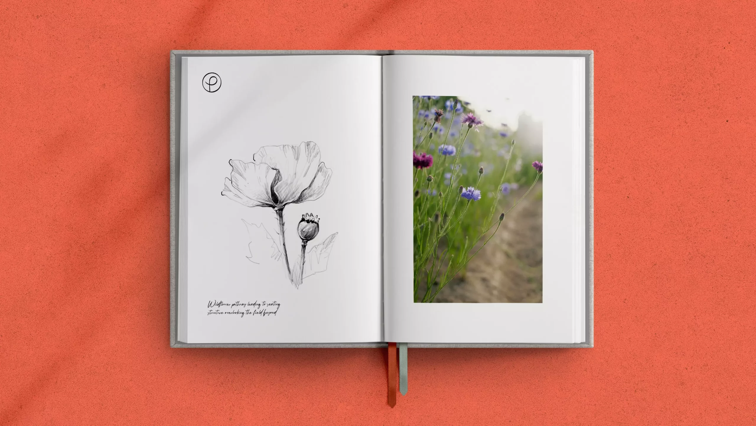
We drew a stylised ‘P’ character, inspired by then organic spirals often found in nature, such as the unfurling fronds of a fern leaf. We wanted this symbol to also feel expressive and free, as if drawn by a human hand, as a signature, seal or stamp of endorsement from Pandora herself. A custom drawn font for the wordmark is the perfect balance of minimal yet unique. The key colour for the brand, a vermillion red, was inspired by meadow flowers of poppies. This accompanied with a cornflower blue and a buttery white, within the wider brand palette.
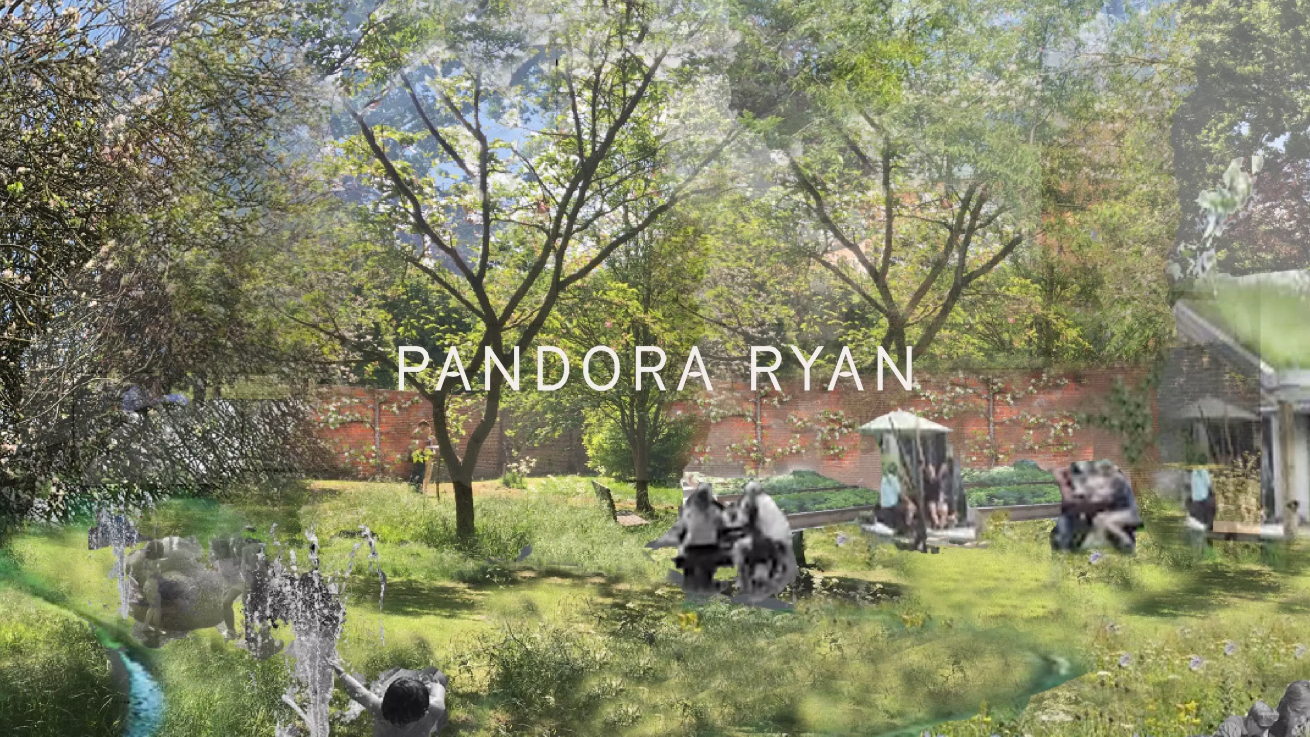
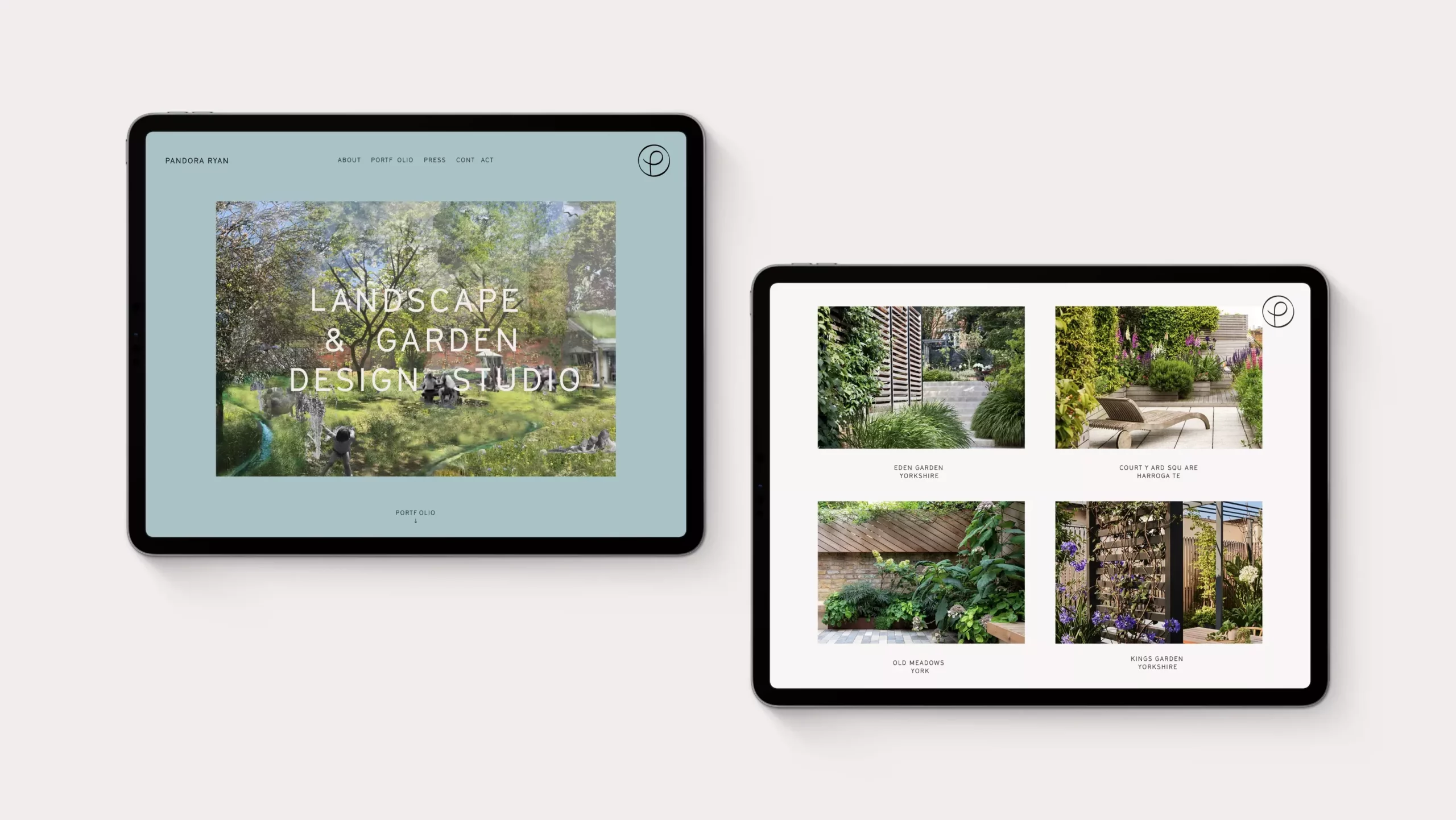
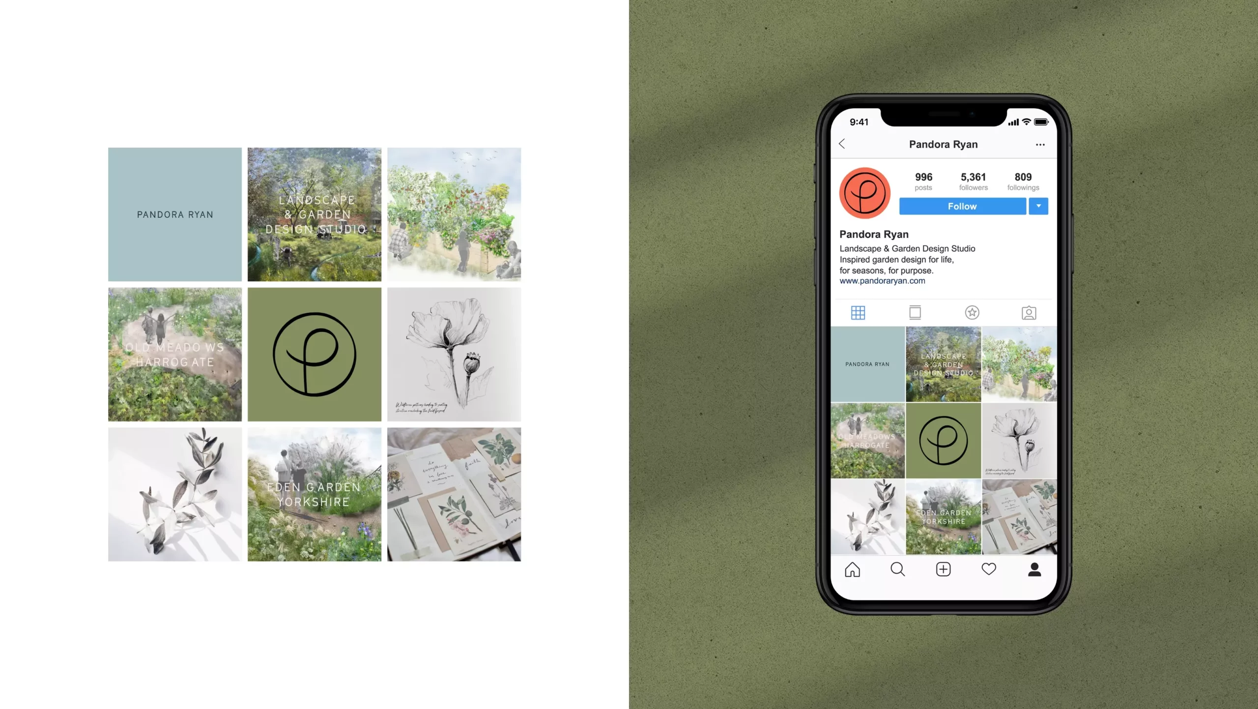
The brand acts as simple yet distinct canvas for Pandora’s sketch-work, landscape visuals and musings to sit alongside. It is applied beautifully to uncoated boards and papers to add to the sensory feel of the brand. Nature being and important theme of course, papers are recycled and sustainably sourced.