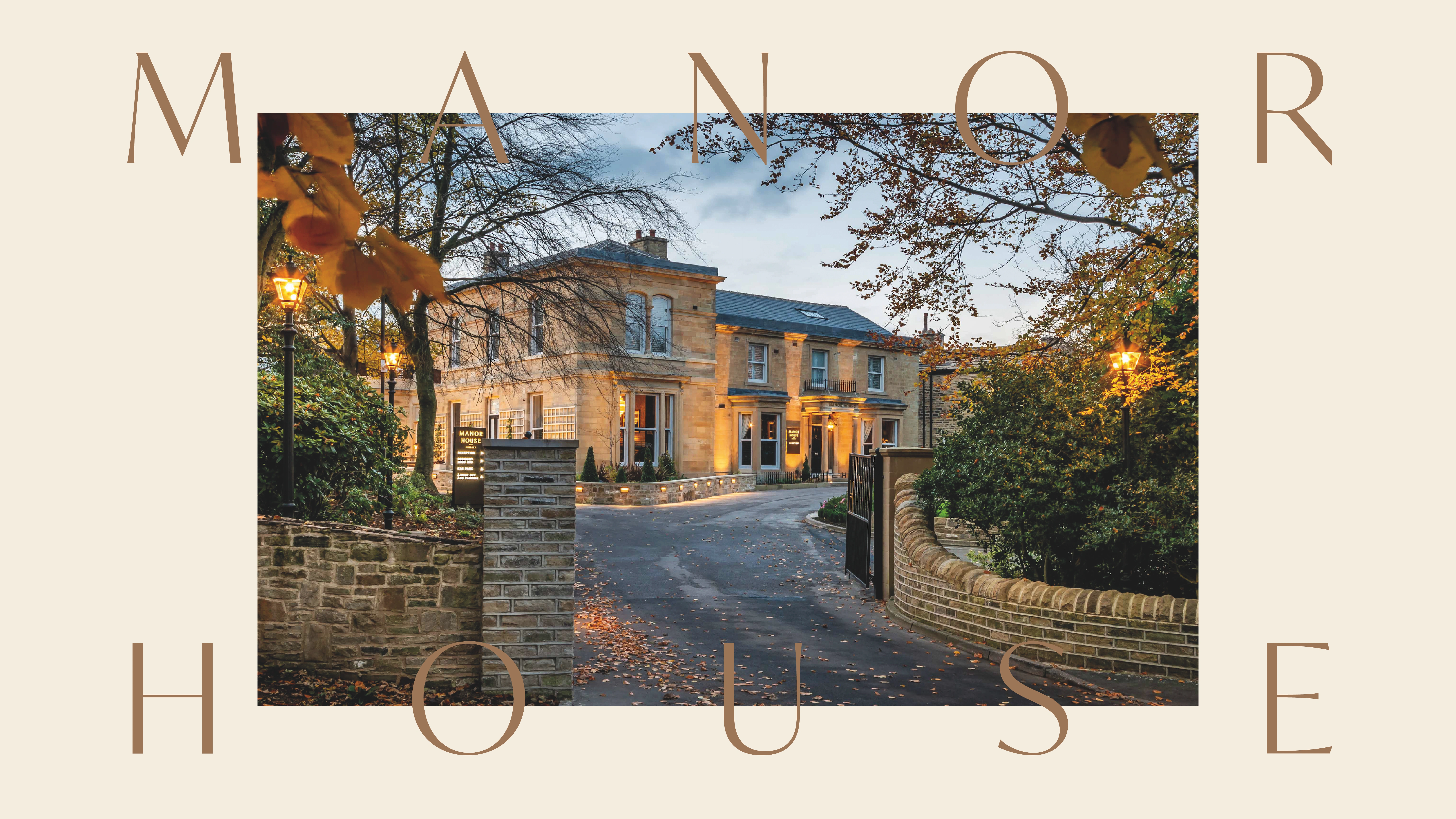
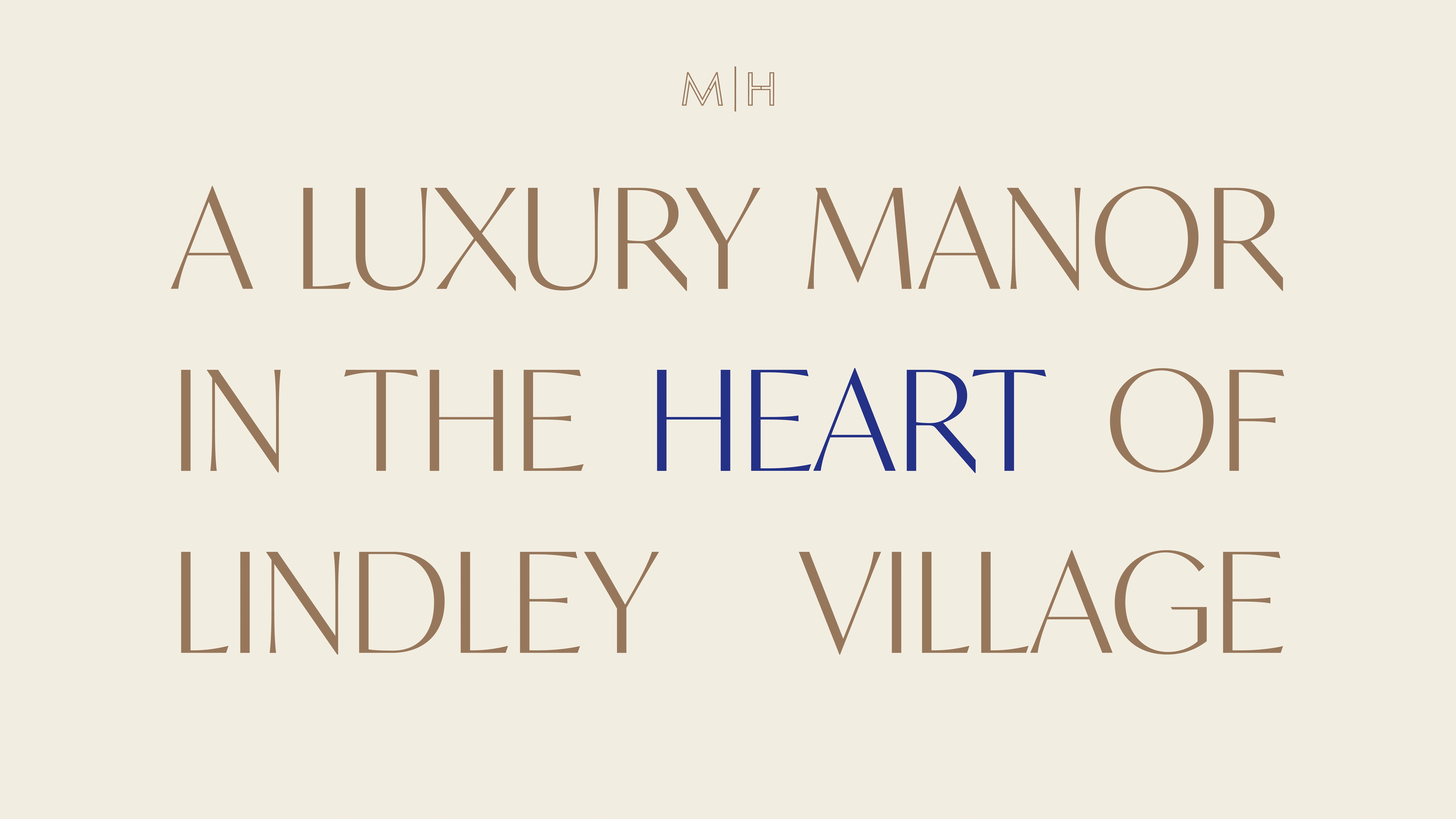
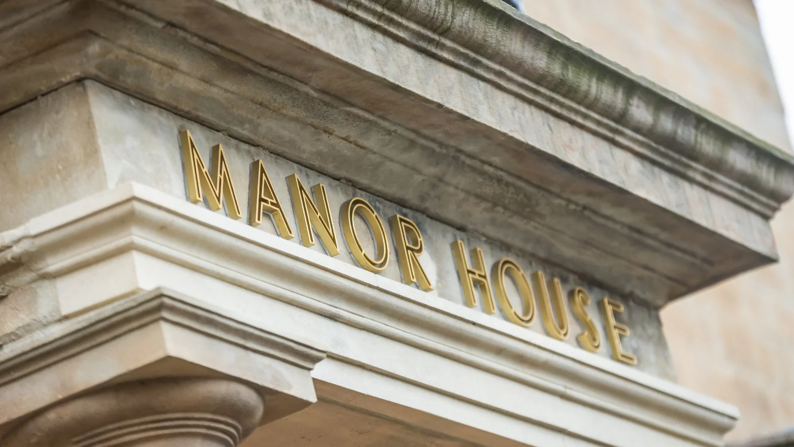
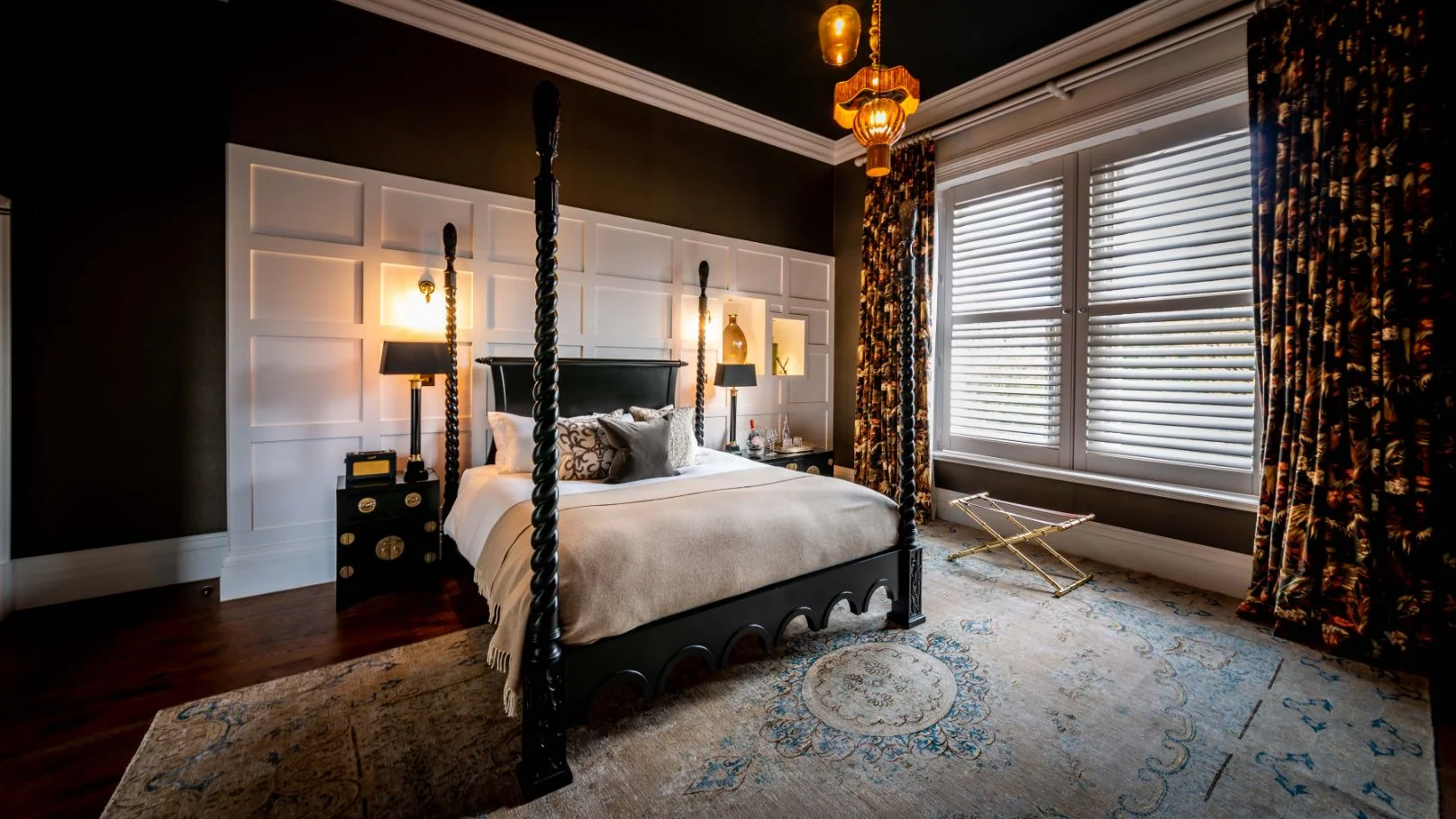
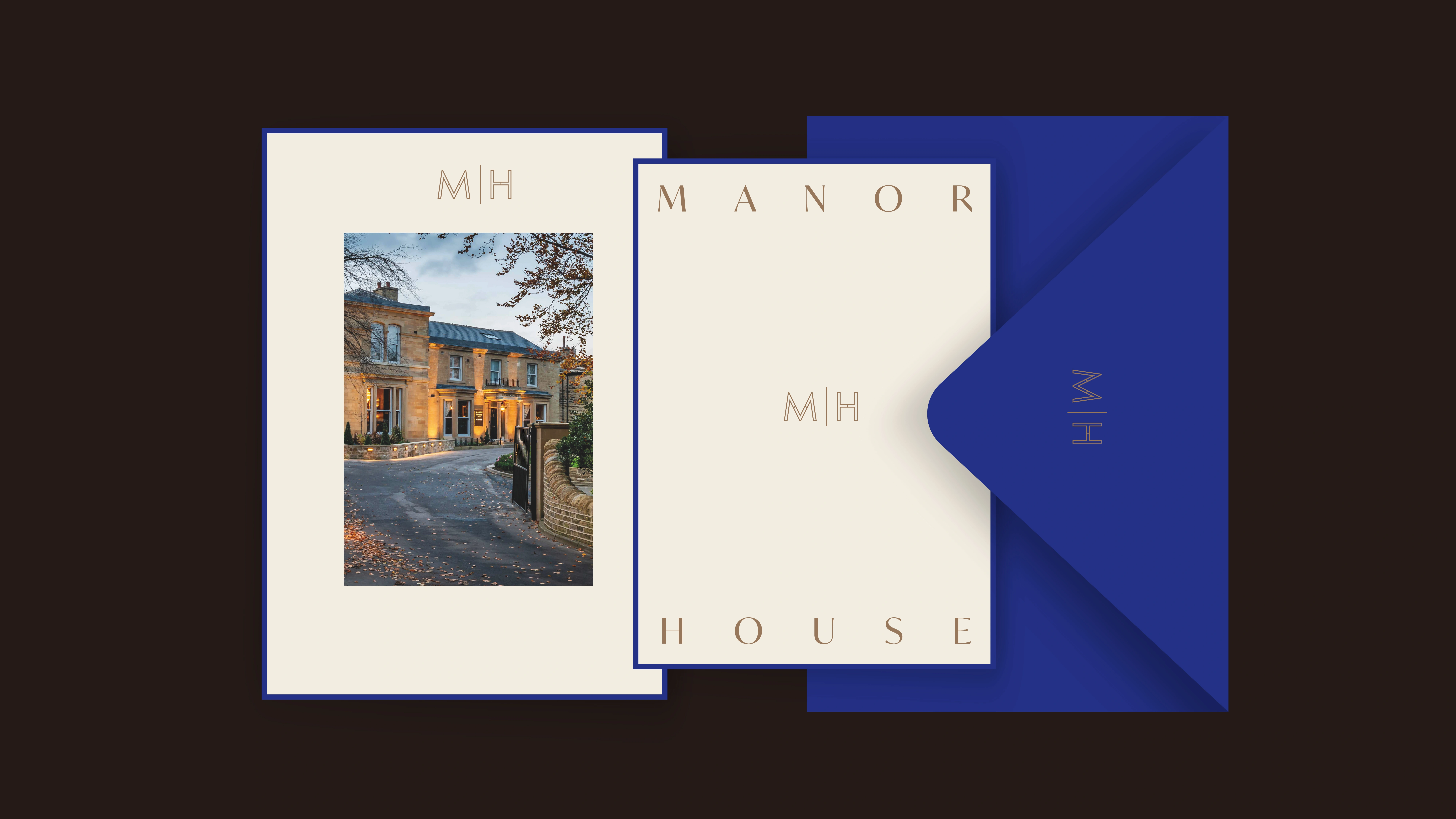
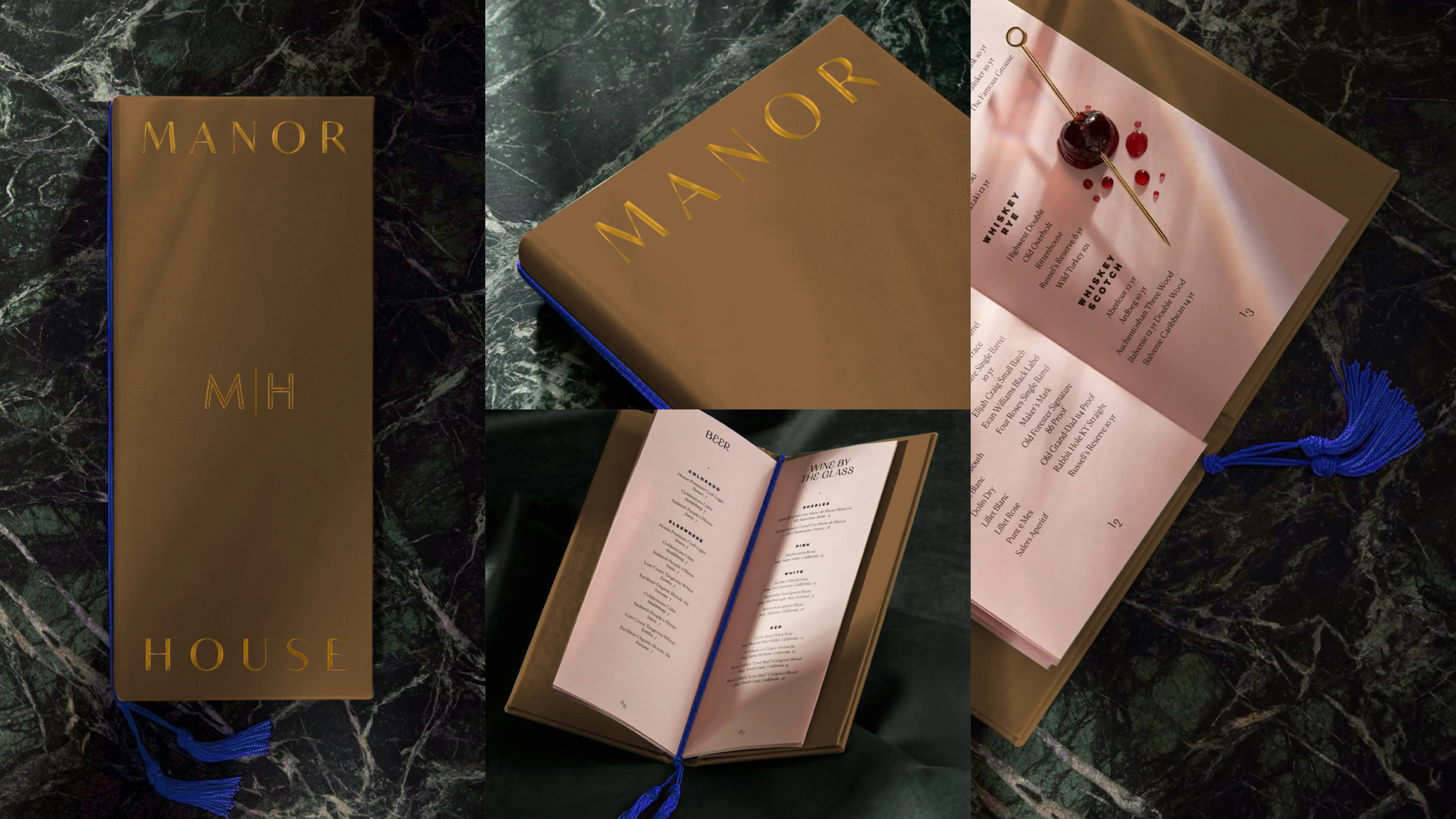
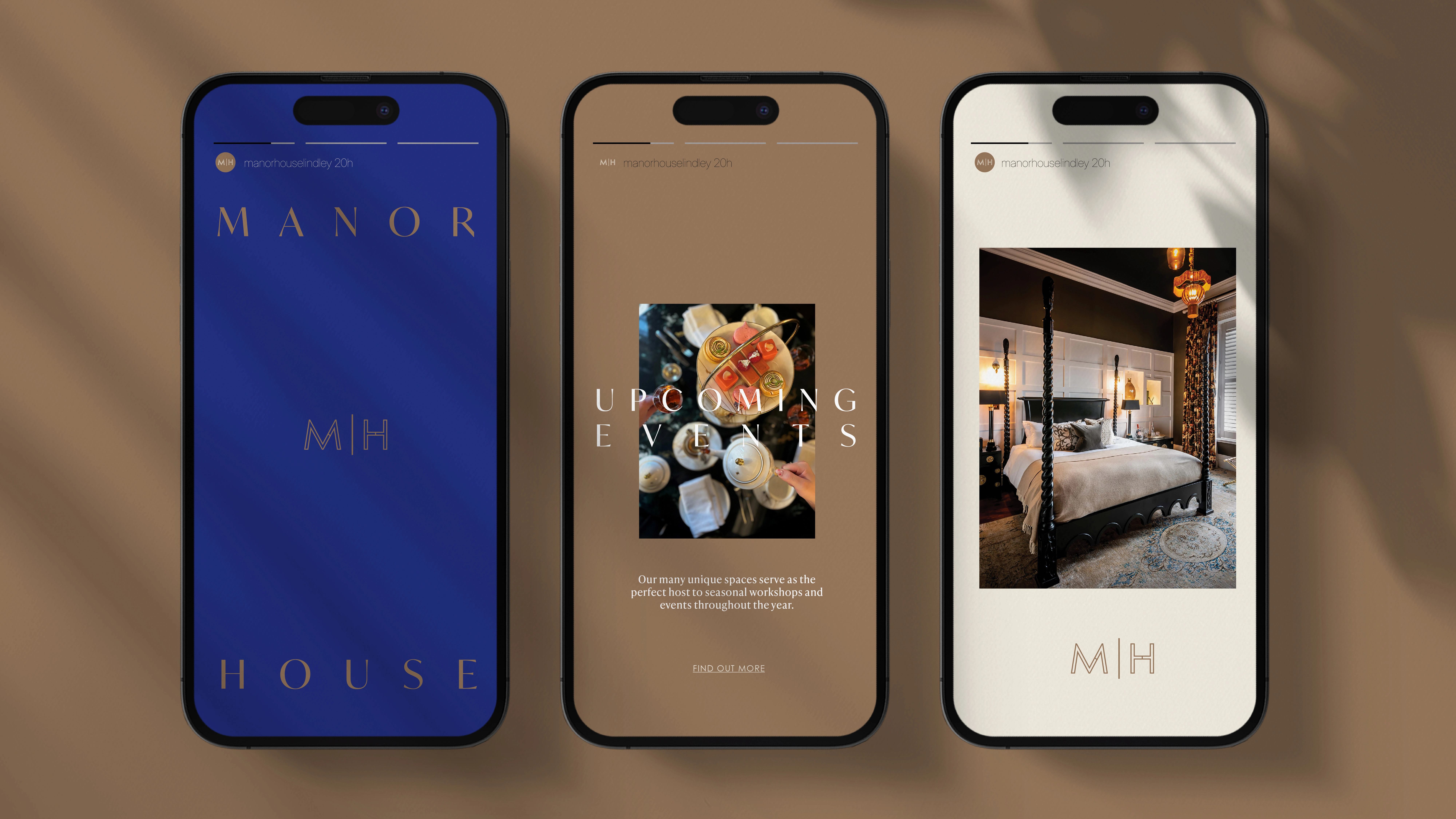
Manor House
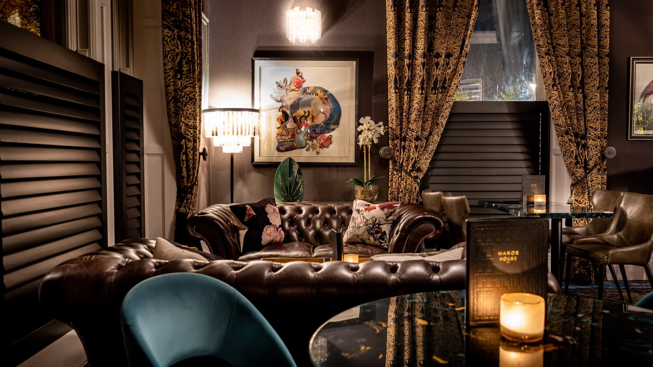
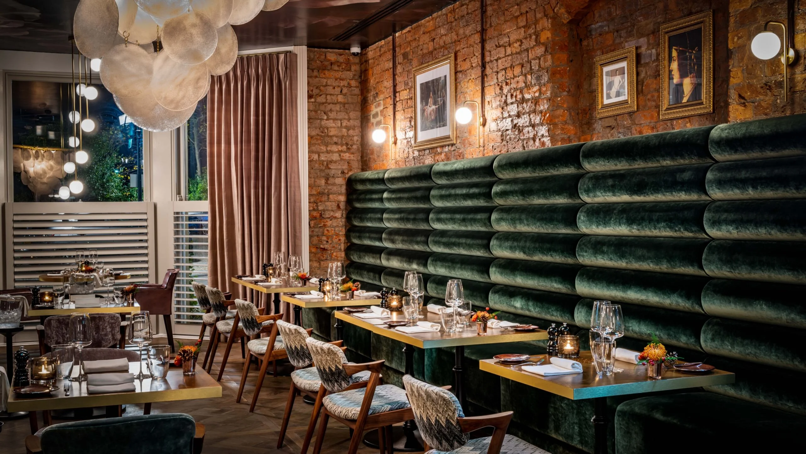
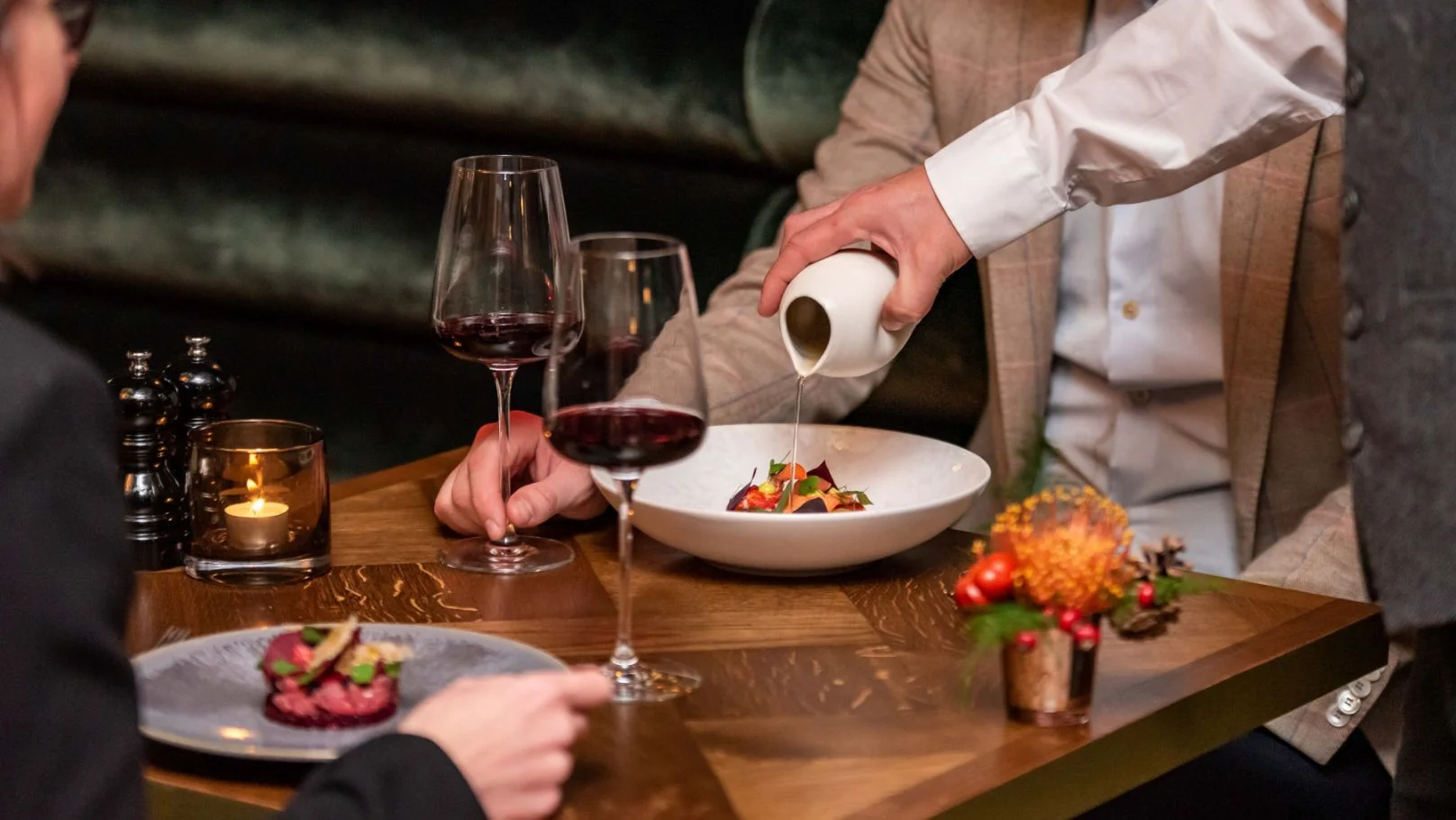
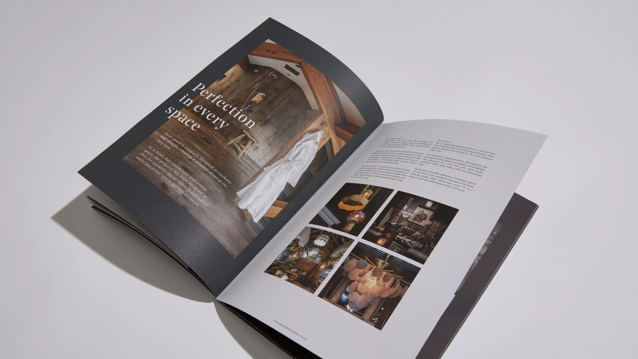
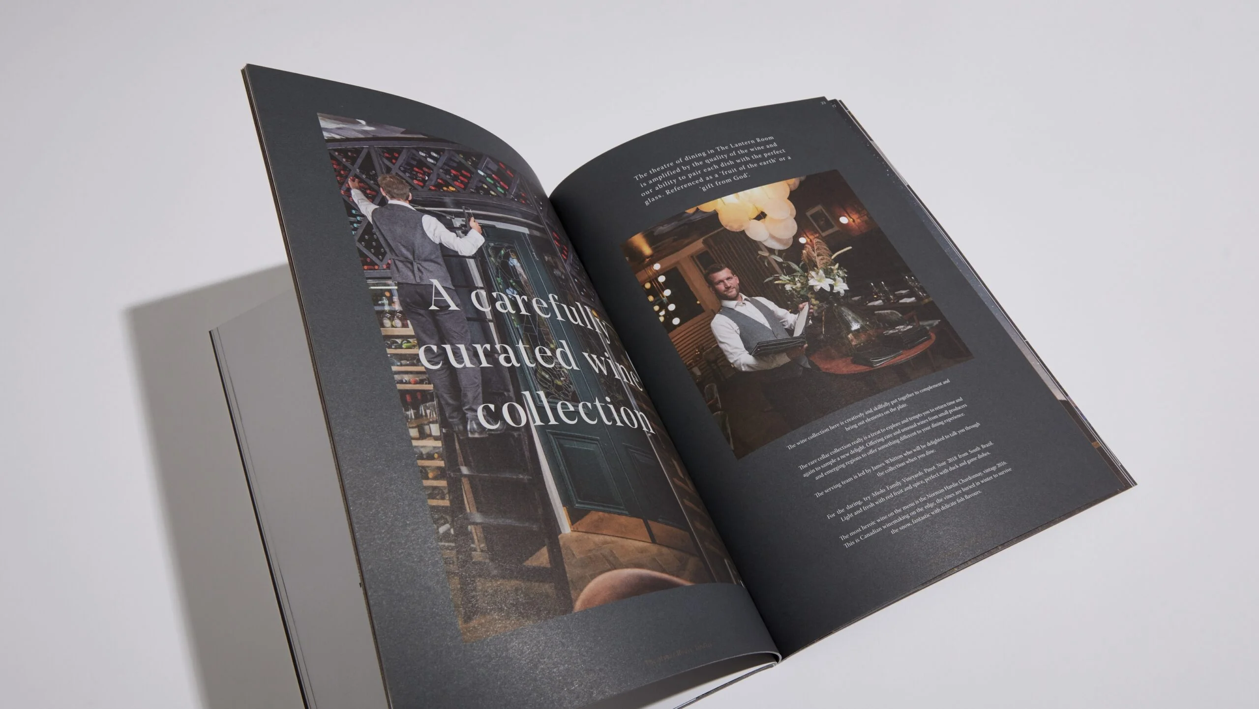
HospitalityWe helped luxury boutique hotel Manor House Lindley develop a visual language that reflects its unique offering. The hotel is set in a beautiful 19th century house in the village of Lindley, meticulously refurbished and drawing on eclectic influences from around the world. Manor House commanded a brand that portrays elegance, in synergy with the building’s heritage and today’s glamorous appeal. The brandmark we crafted confidently features bespoke typography with Art Deco interior cues. We achieved premium positioning from the offset and it is now firmly established as a prestigious gem in Yorkshire’s hospitality sector with incredible food, bars, luxurious wedding packages and sumptuous rooms.
A well-defined brand tone is showcased in a raft of engaging marketing devices including ‘The Post’ – a lifestyle magazine designed exclusively with guests in mind. We work with Manor House to compose stories from within the business itself. Bringing a layer of beautiful content to the experience at this boutique hotel.

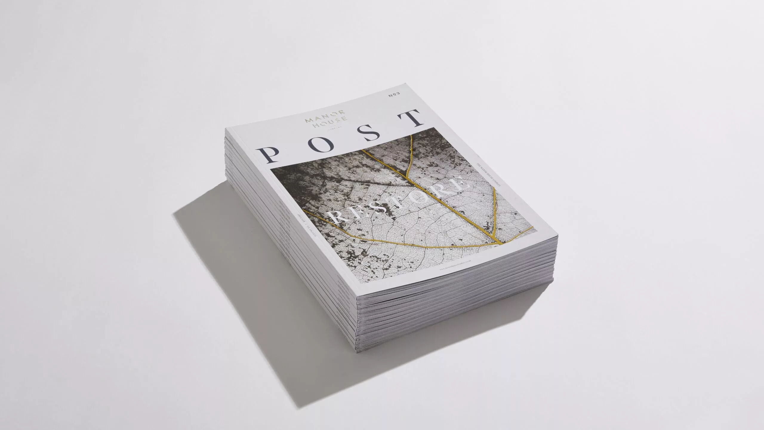
The Post is the lifestyle magazine for our client Manor House. Designed exclusively with guests in mind, it adds another layer of beautiful content and attention to detail, to the experience at this stunning boutique hotel.
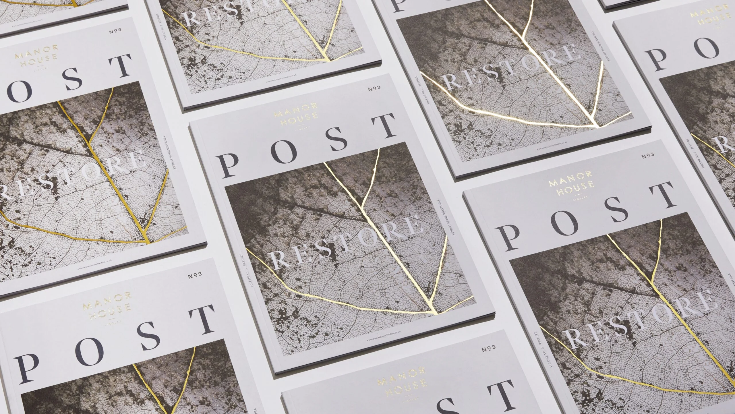
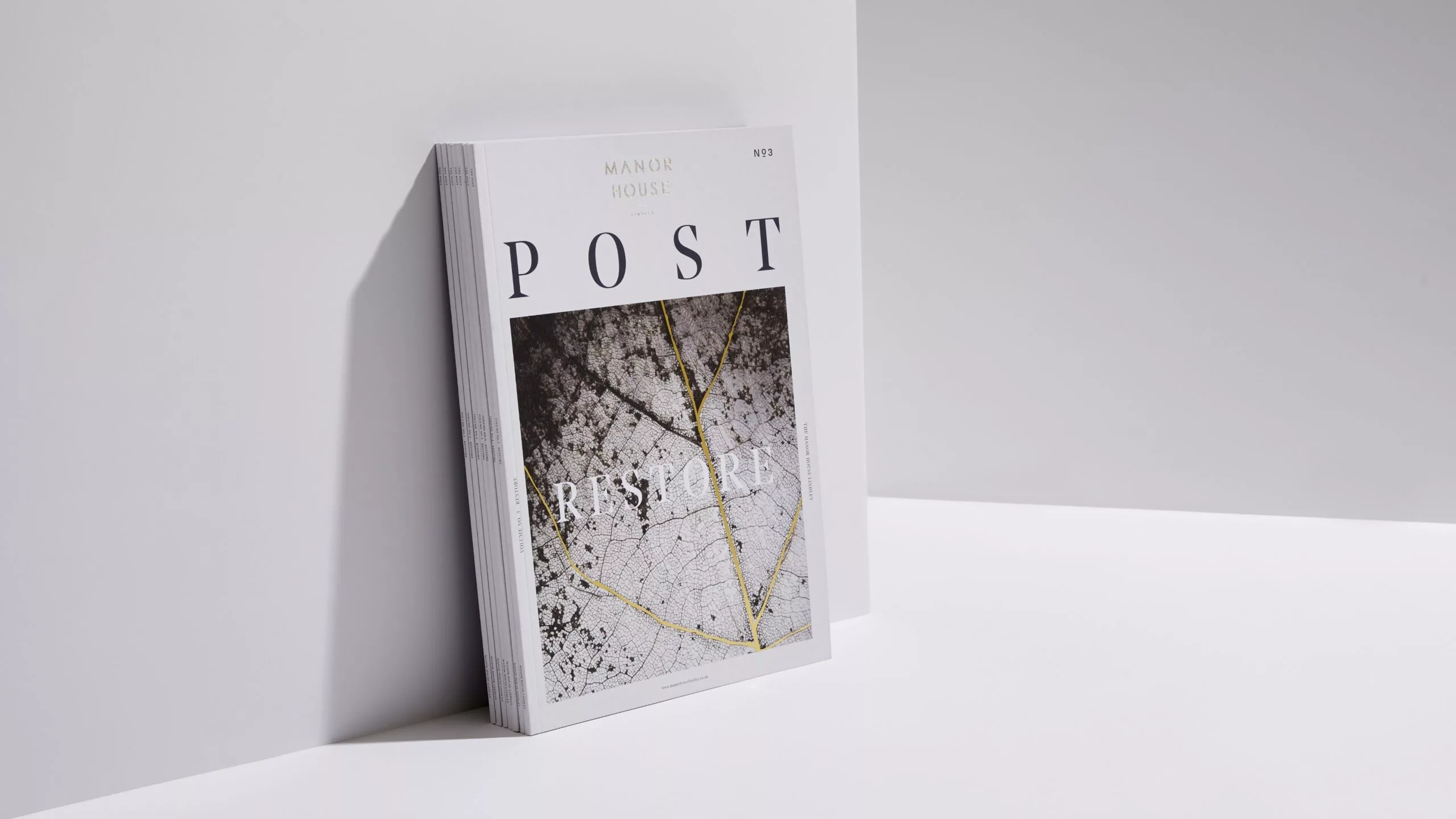
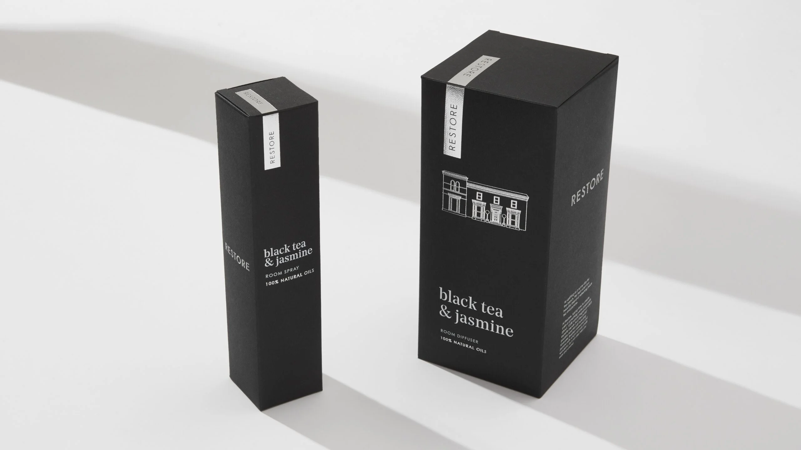
The design commission of the Manor House homewares sub brand for products including scented candles, room sprays and diffusers was answered by Picture Smiths with the identity ‘RESTORE’. This was created in a nod to the restorative transformation of the Manor House, from dilapidated listed Victorian building to today’s stunning boutique hotel with award-winning interiors.
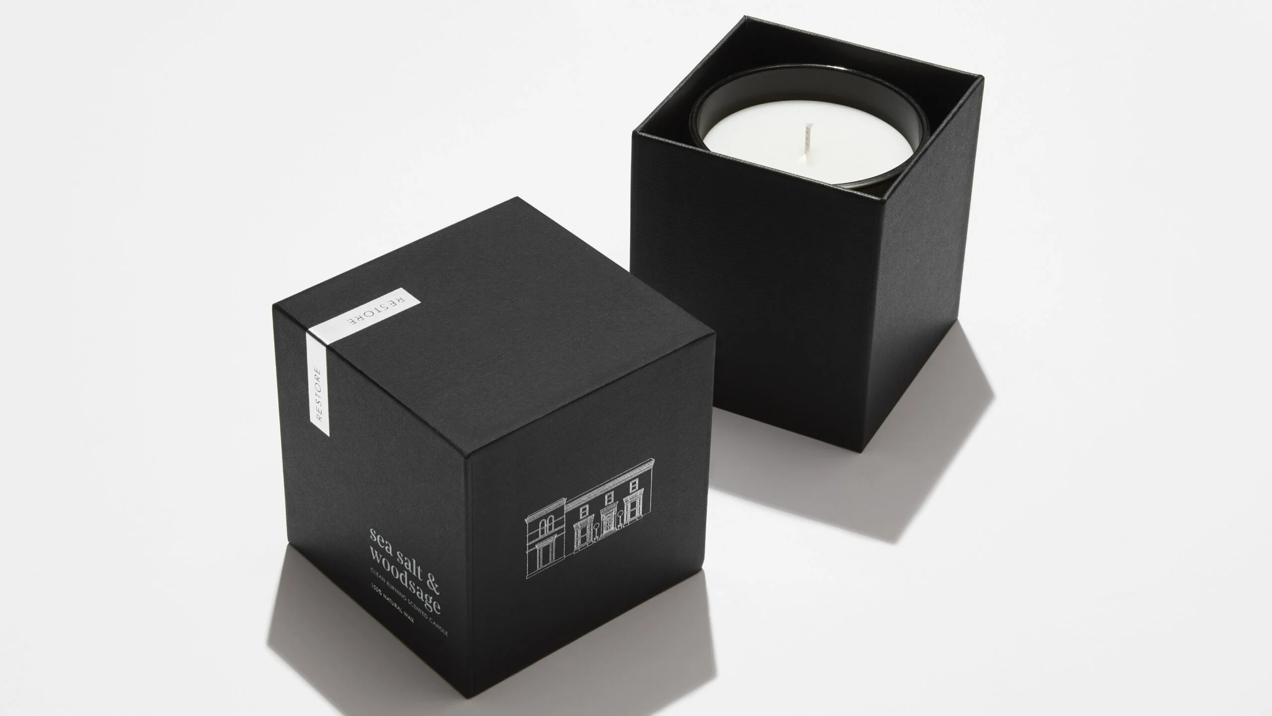
The brand identity also draws on the wellbeing theme that threads through much of Manor House’s messaging. The brand uses typography with a premium feel alongside our illustrated line drawing of the Manor House building. Colour palette is strictly monochrome with metallic pewter accents. We worked closely with Consult Packaging to create bespoke packaging, using hot foil print by Foilco and a beautifully textured paper by the renowned G. F. Smith Papers. (G F Smith has featured this project on its website).