Kosmetiko
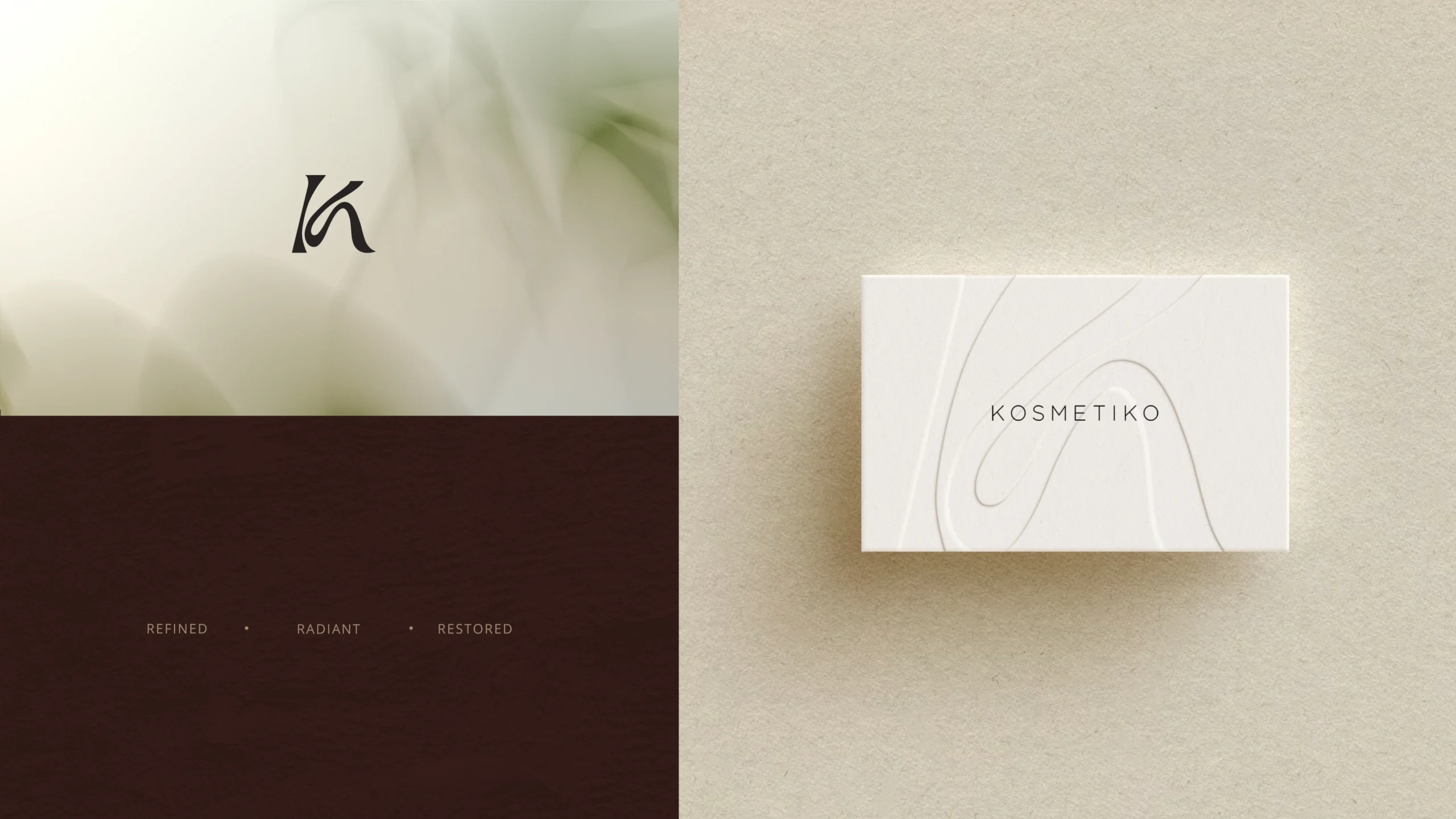
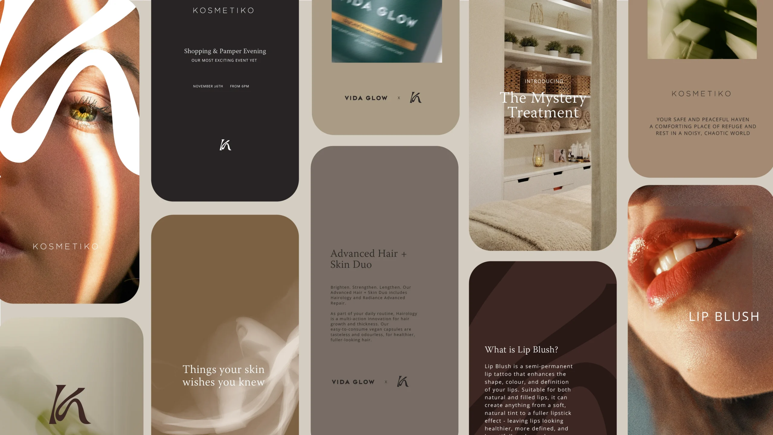
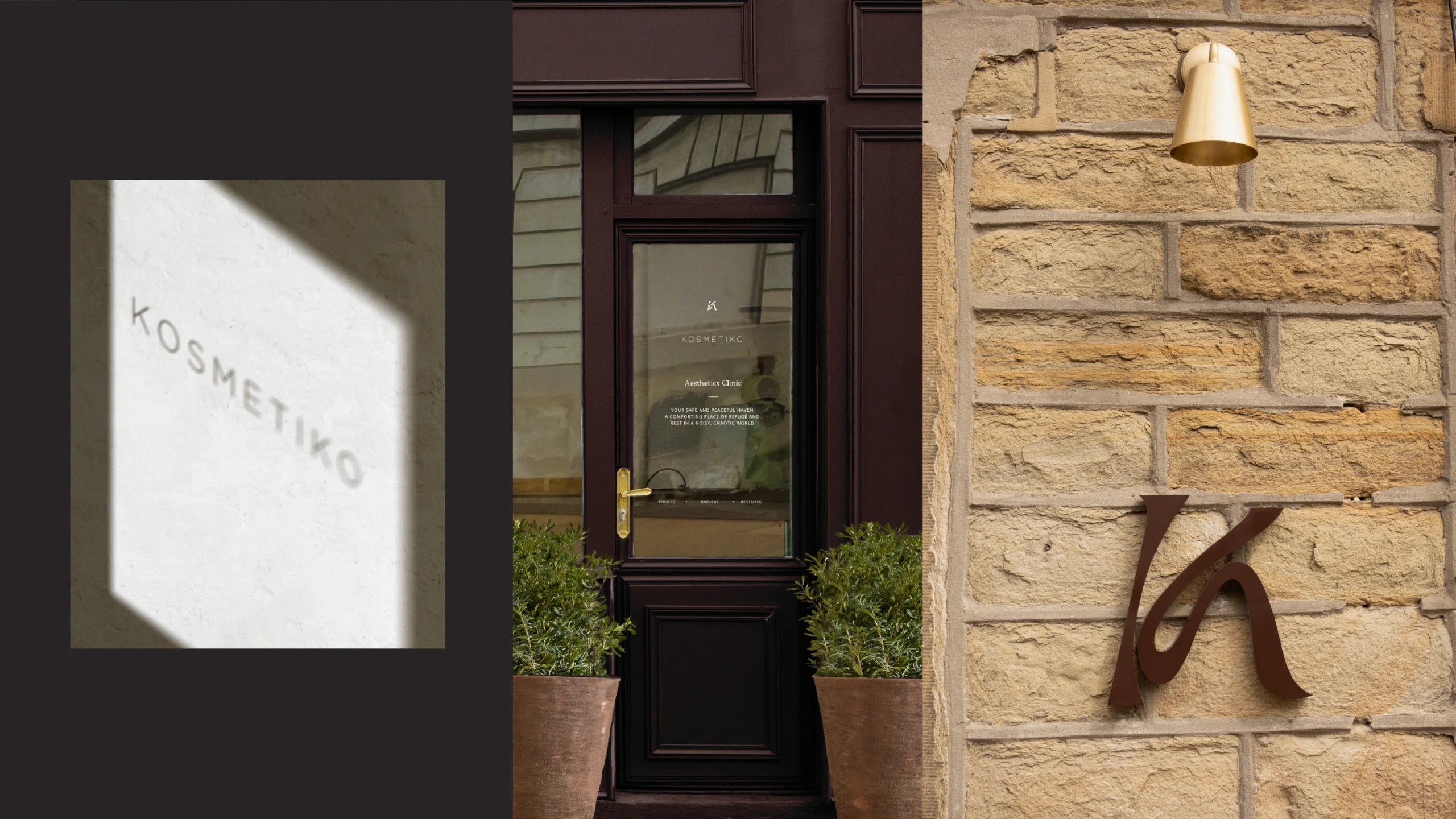
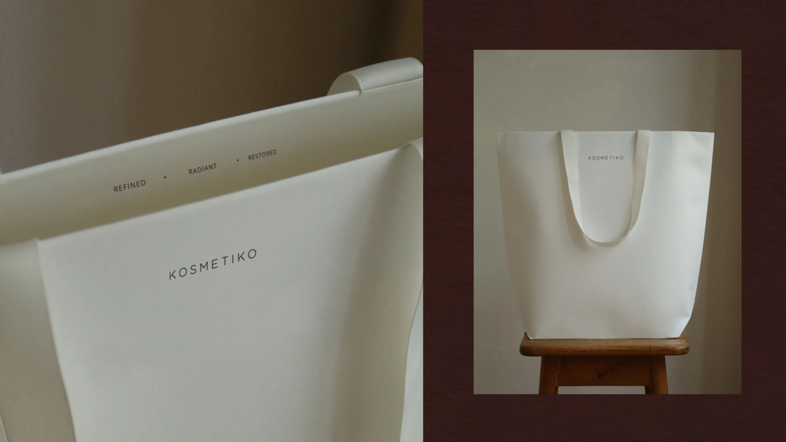
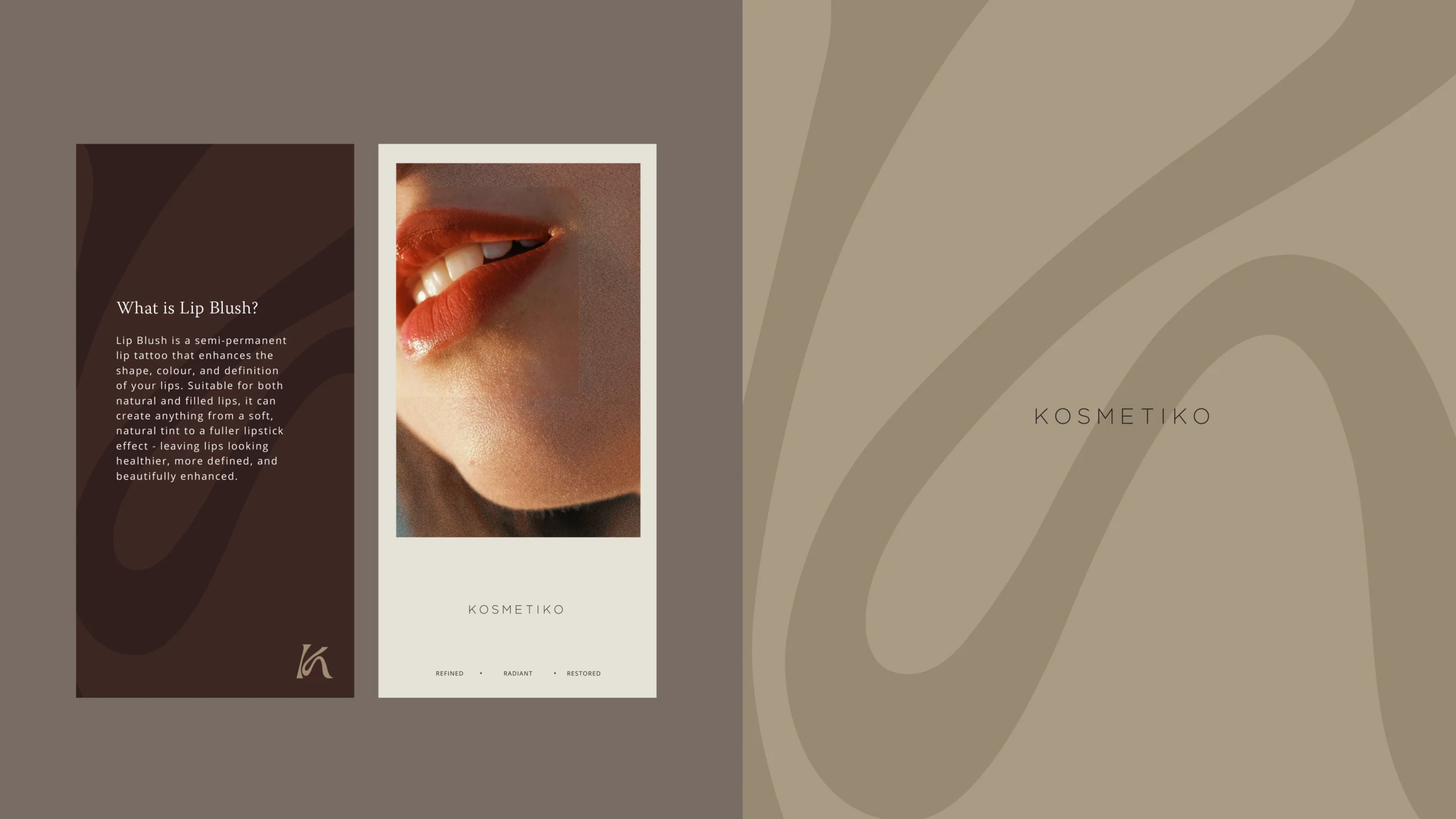
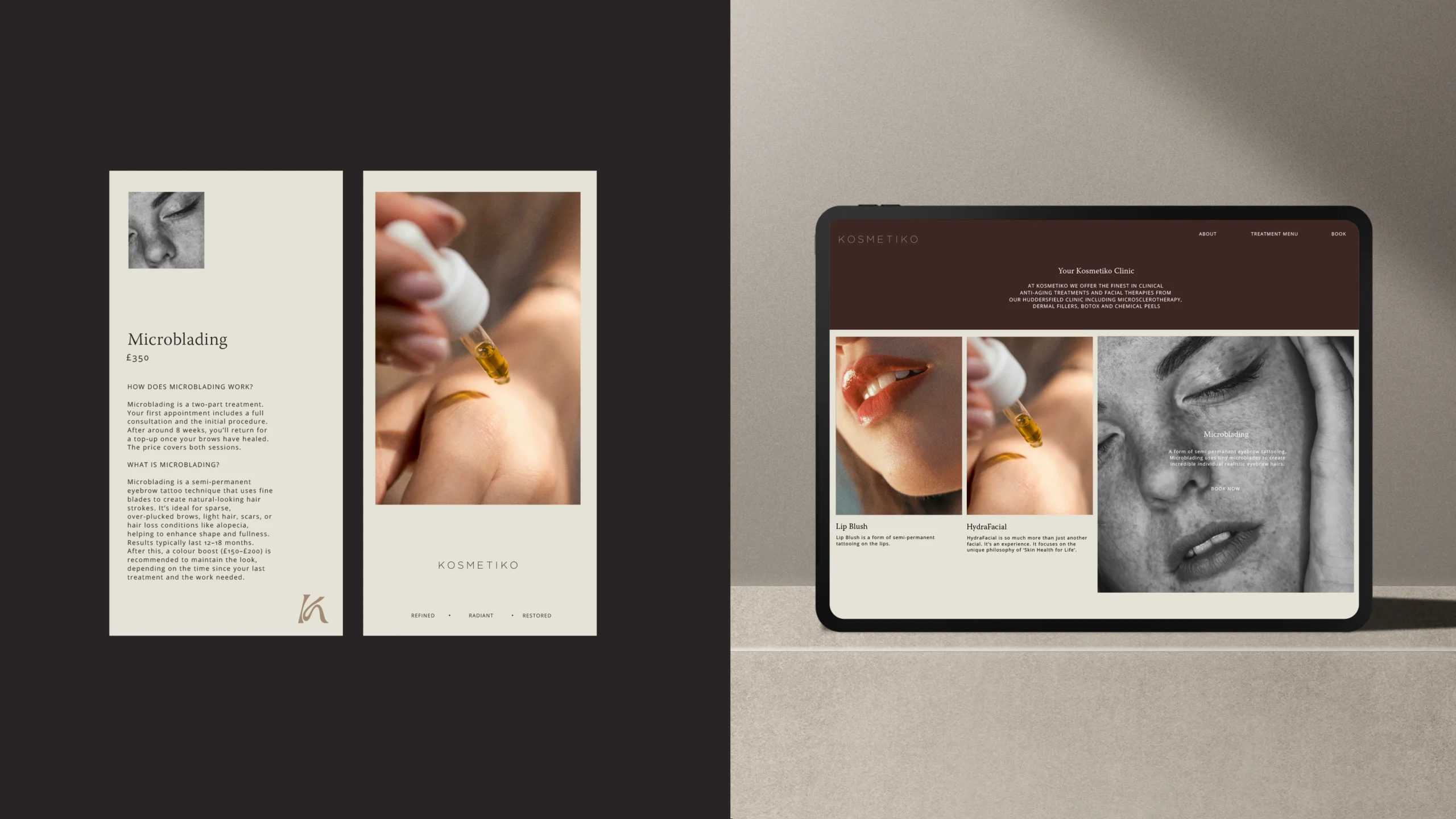
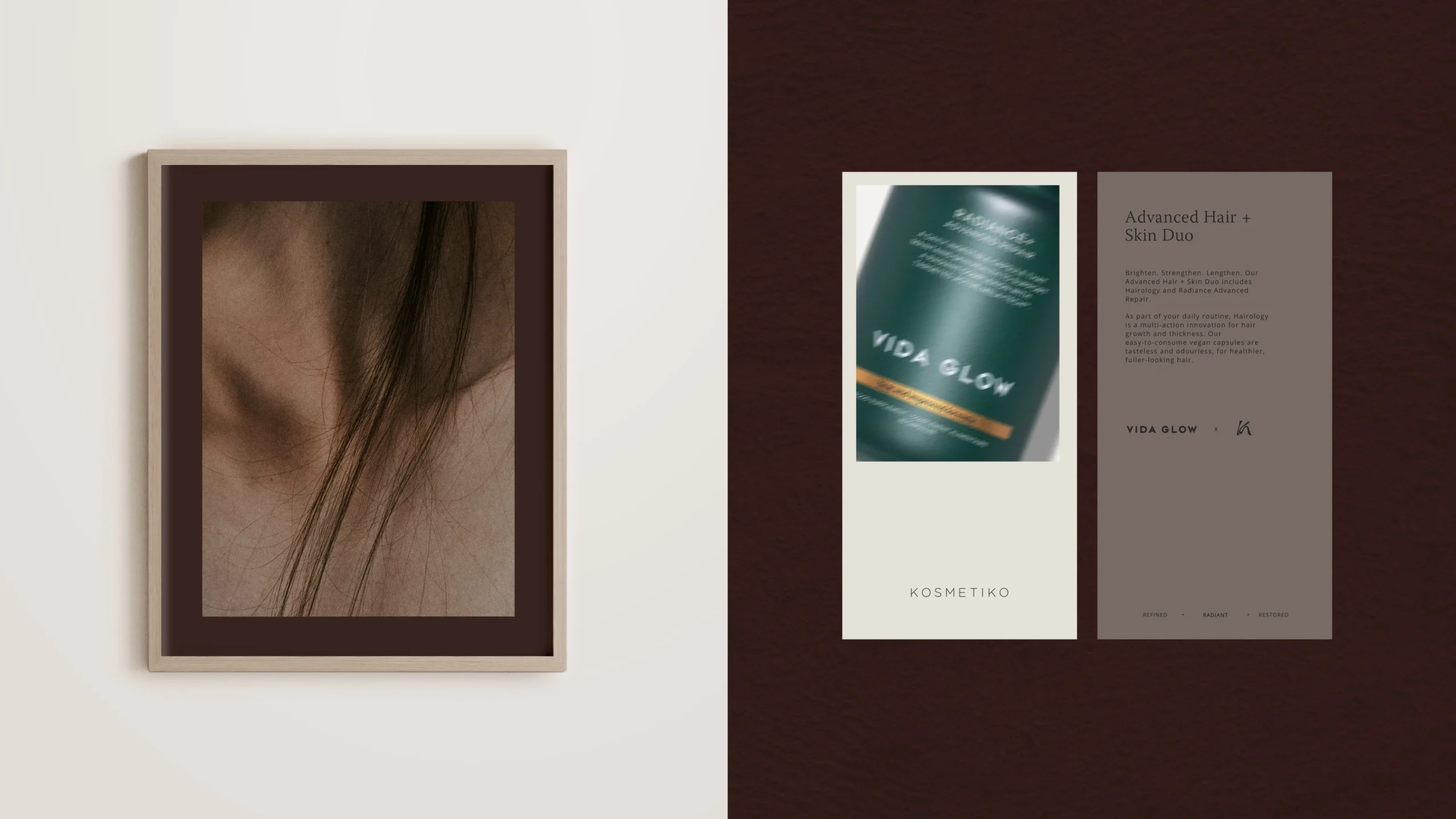
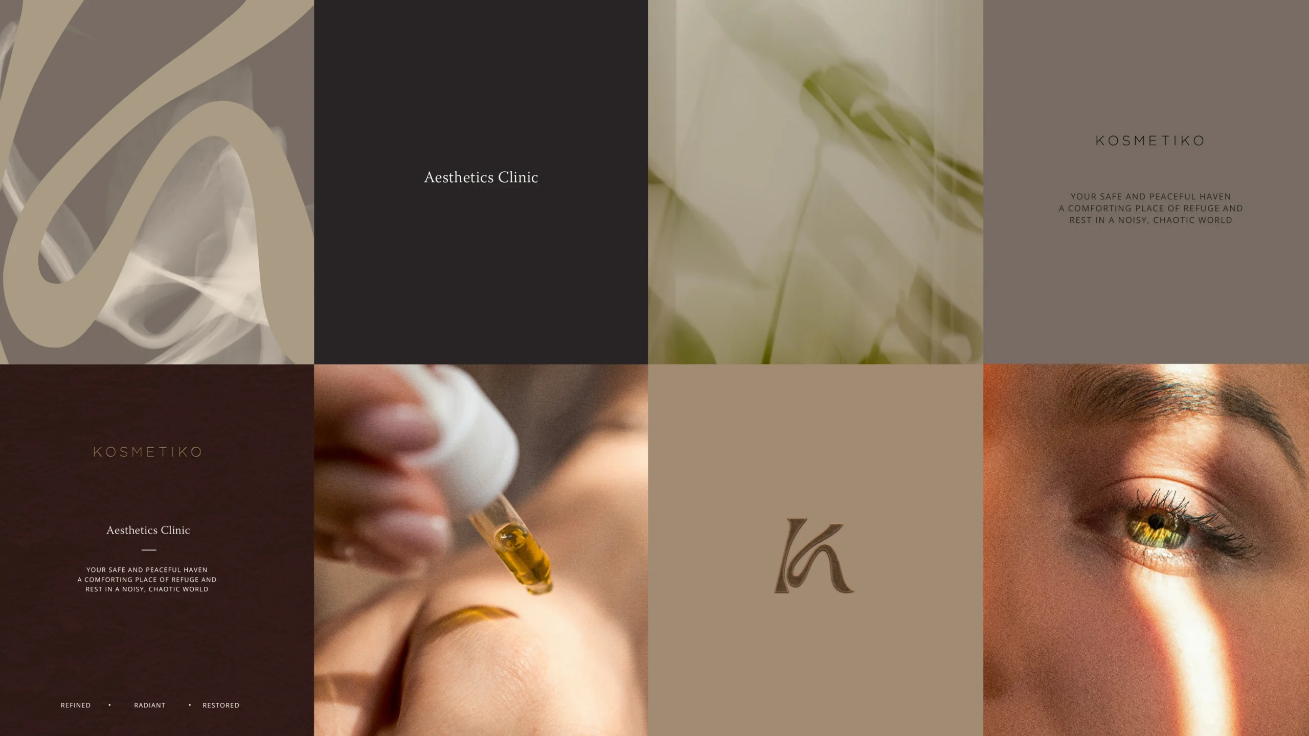
For over a decade, we’ve had the privilege of working alongside Kosmetiko founder Kim, supporting the evolution of her business through three brand identities. As the clinic entered a new chapter, this latest project focused on refining and elevating the existing brand rather than reinventing it. We introduced a richer, earthier palette of warm putty and brown tones, layered with tactile textures to create a more sophisticated and immersive visual identity that reflects the clinic’s premium, human-centred approach.
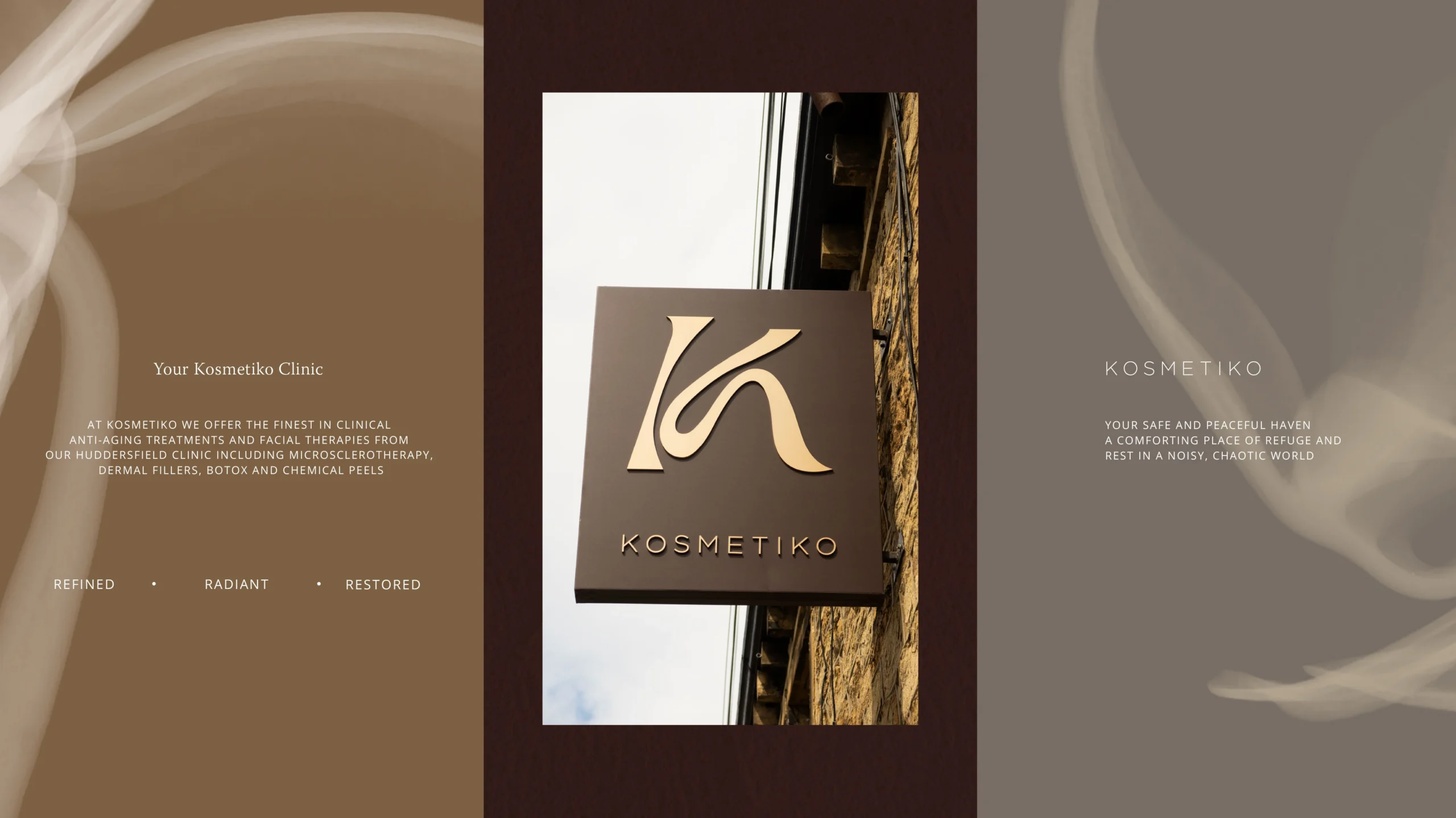
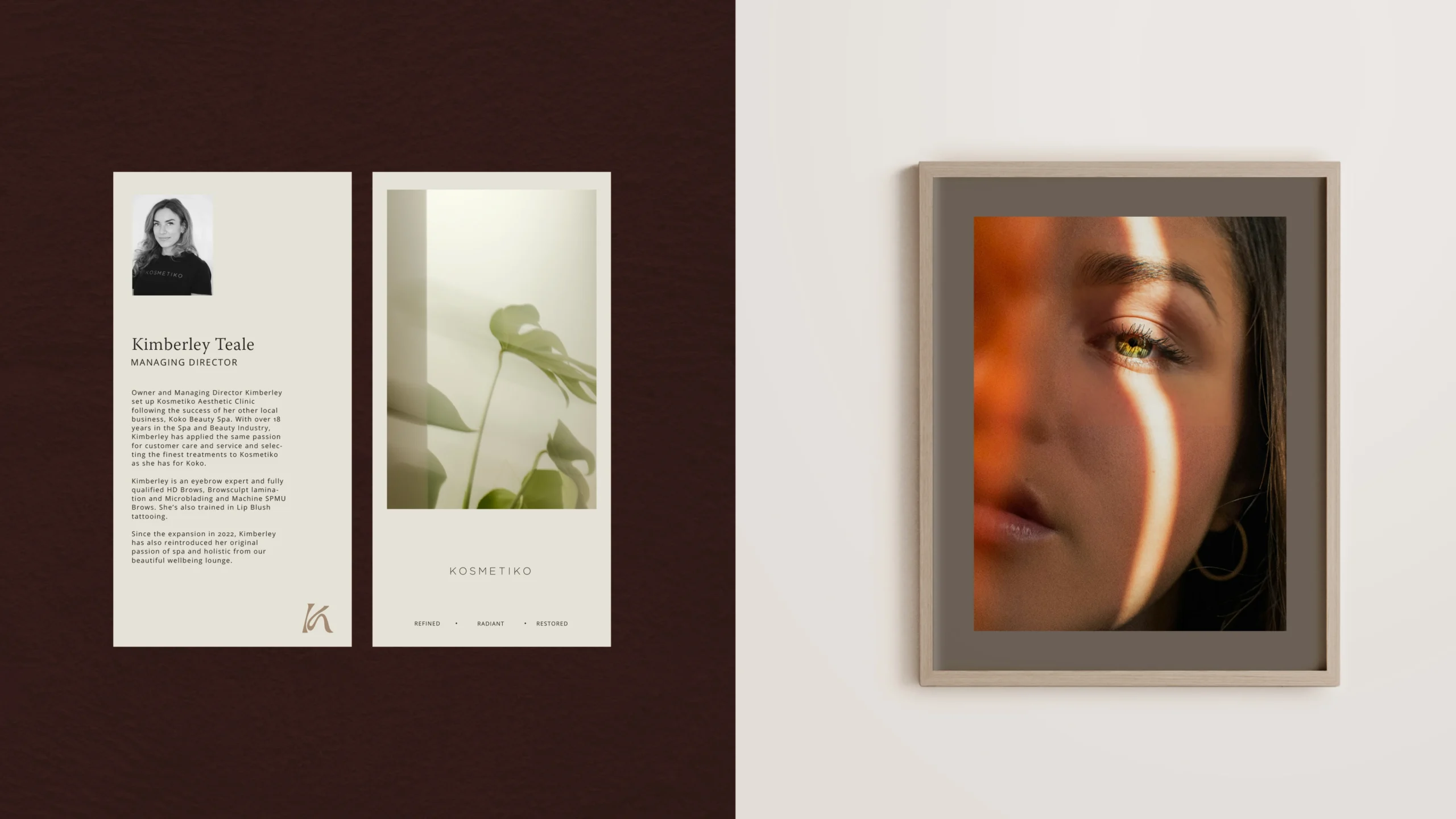
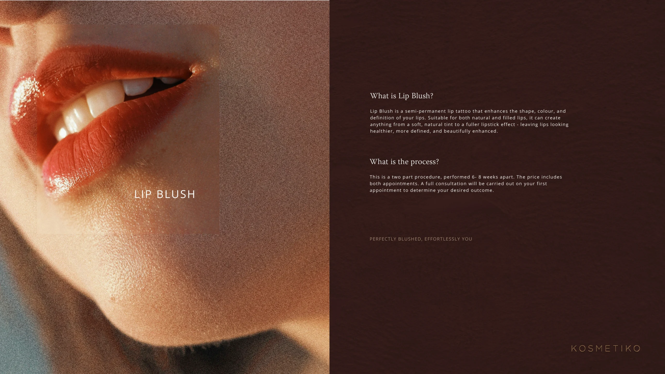
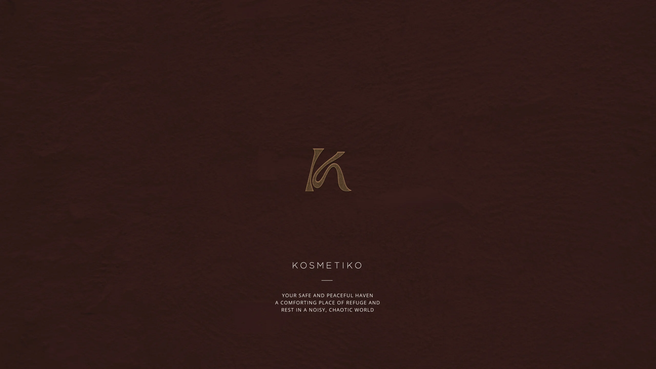
A bespoke signature ‘K’ symbol was developed to introduce a sense of fluidity and organic movement throughout the brand. Combined with photography that feels authentic, imperfect and alluring rather than clinical, the refreshed identity captures the confidence and warmth of the Kosmetiko experience. The new brand has since been rolled out across the clinic’s signage, interiors, printed literature, social media and wider marketing materials, creating a cohesive presence at every customer touchpoint.