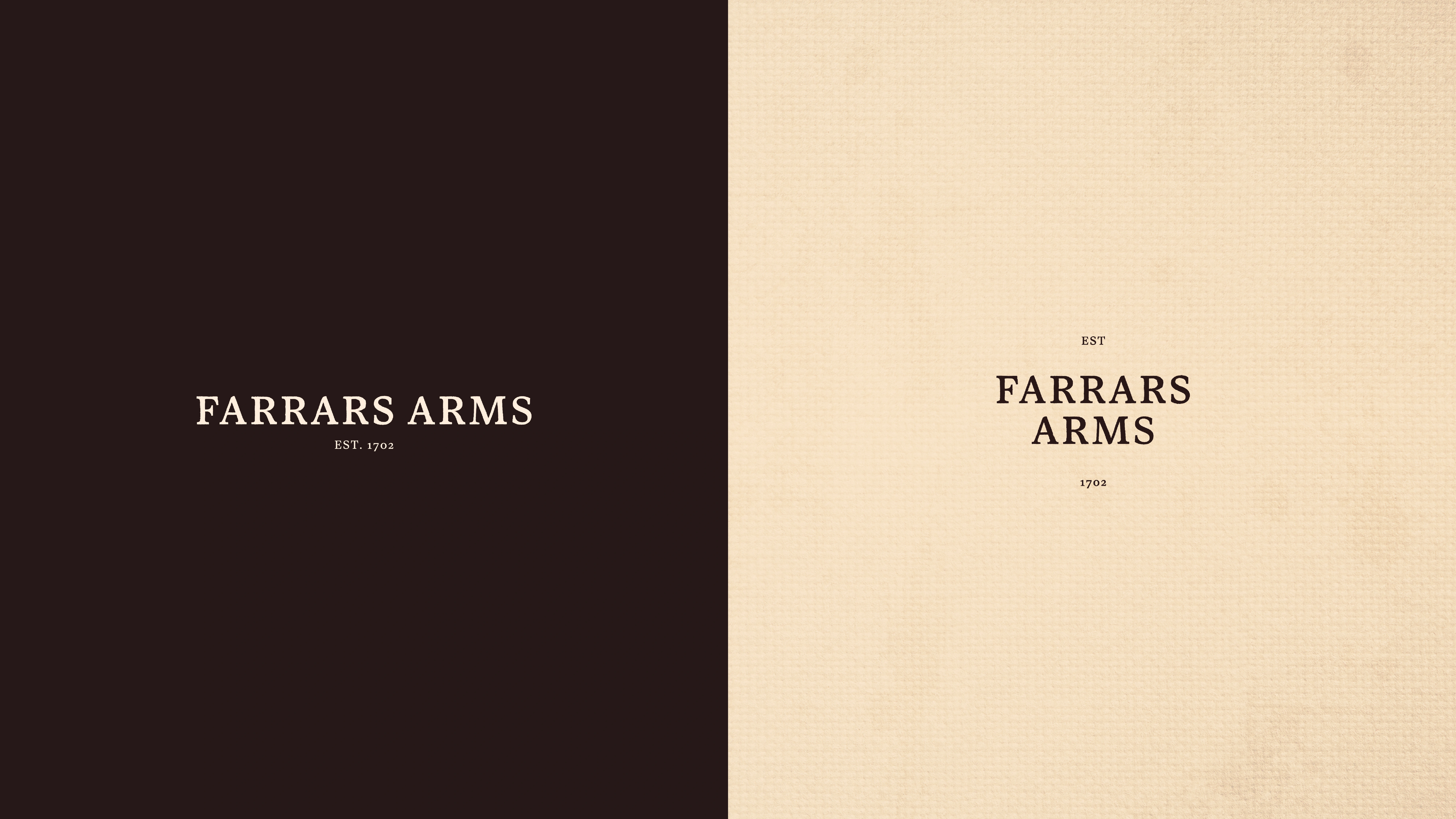
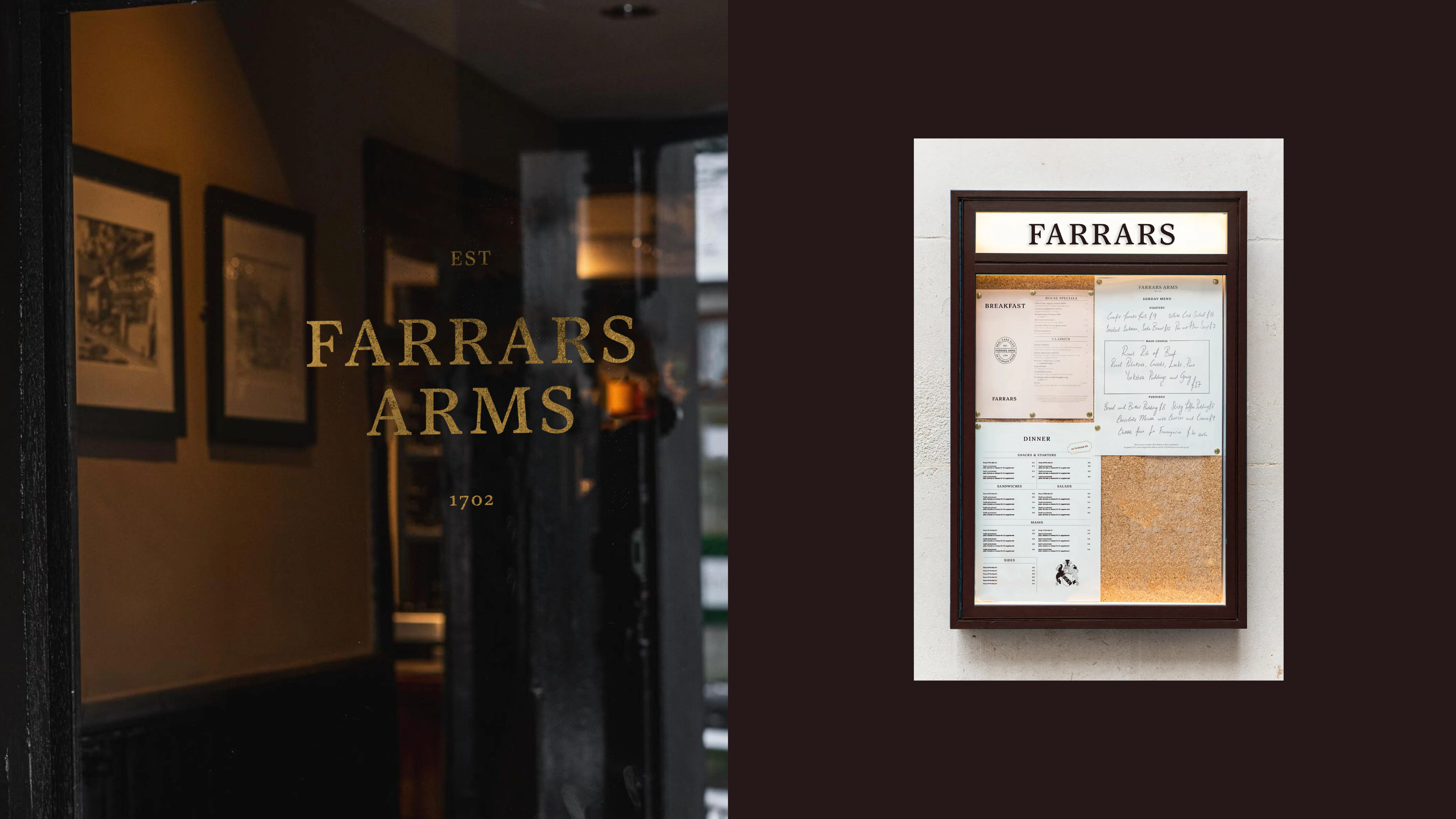
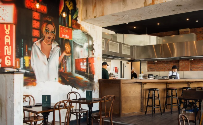
Farrars Arms
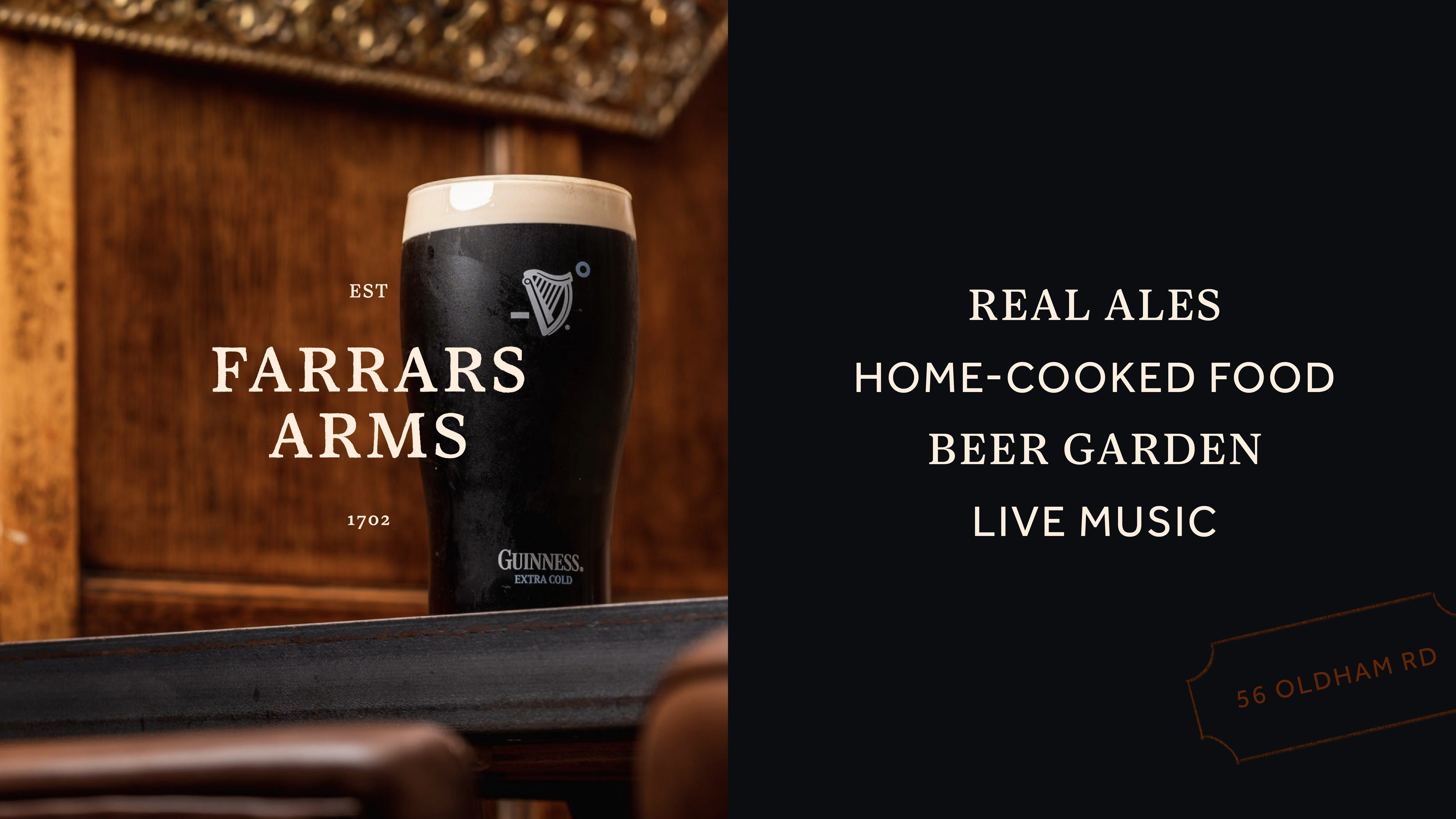
HospitalityA traditional cosy pub in the heart of Saddleworth that’s full of character and pulls a great pint.
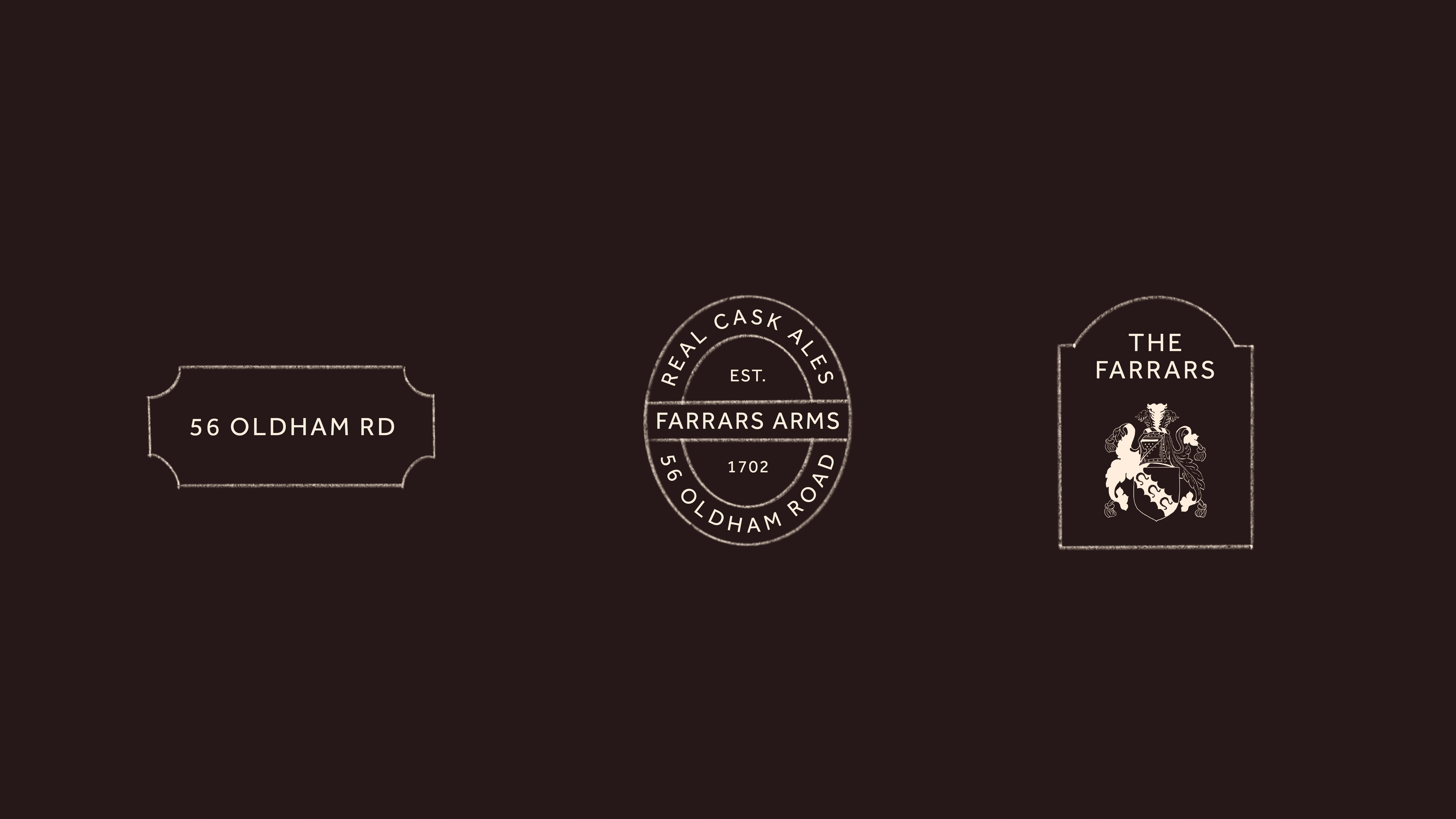
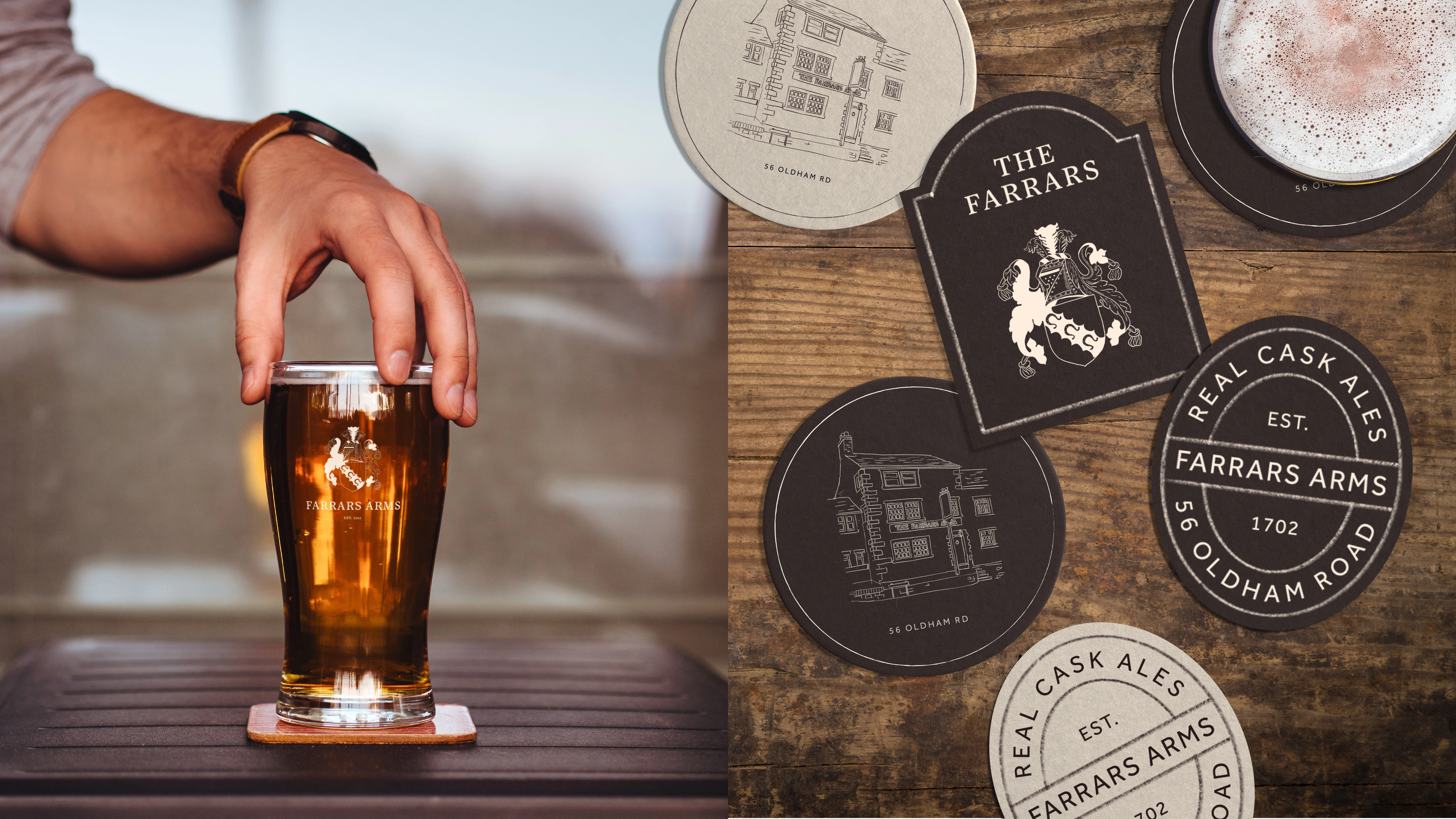
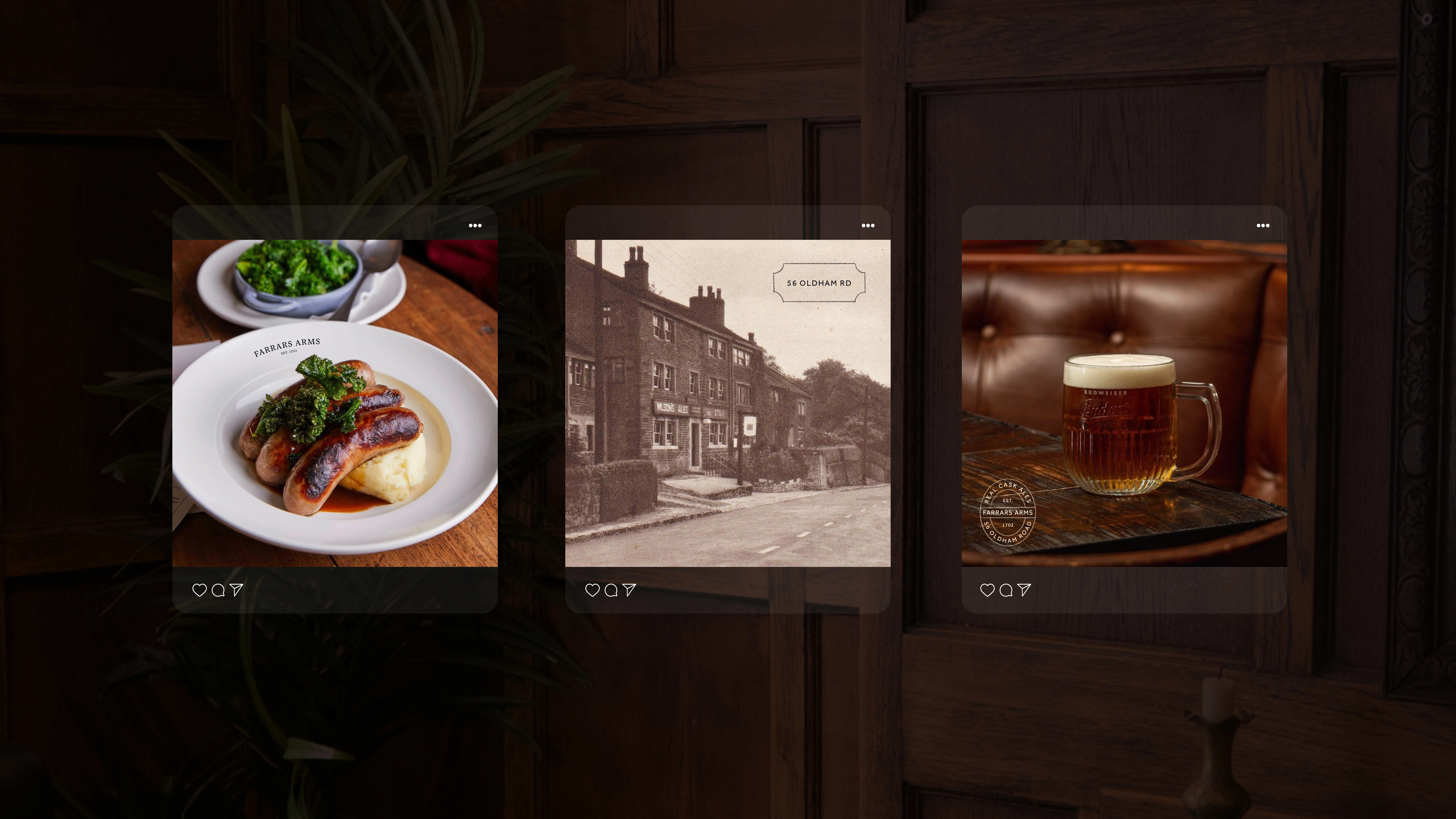
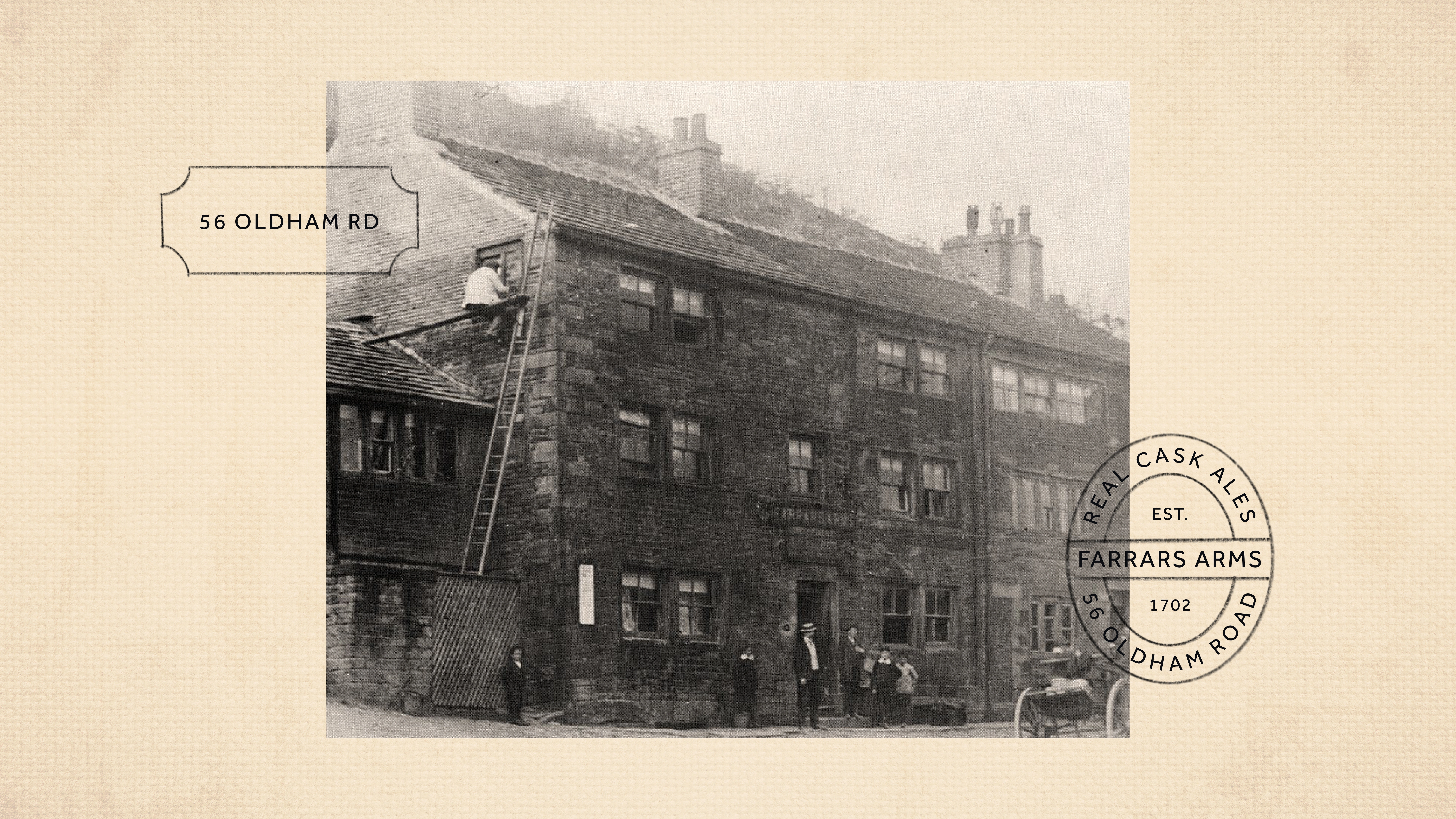
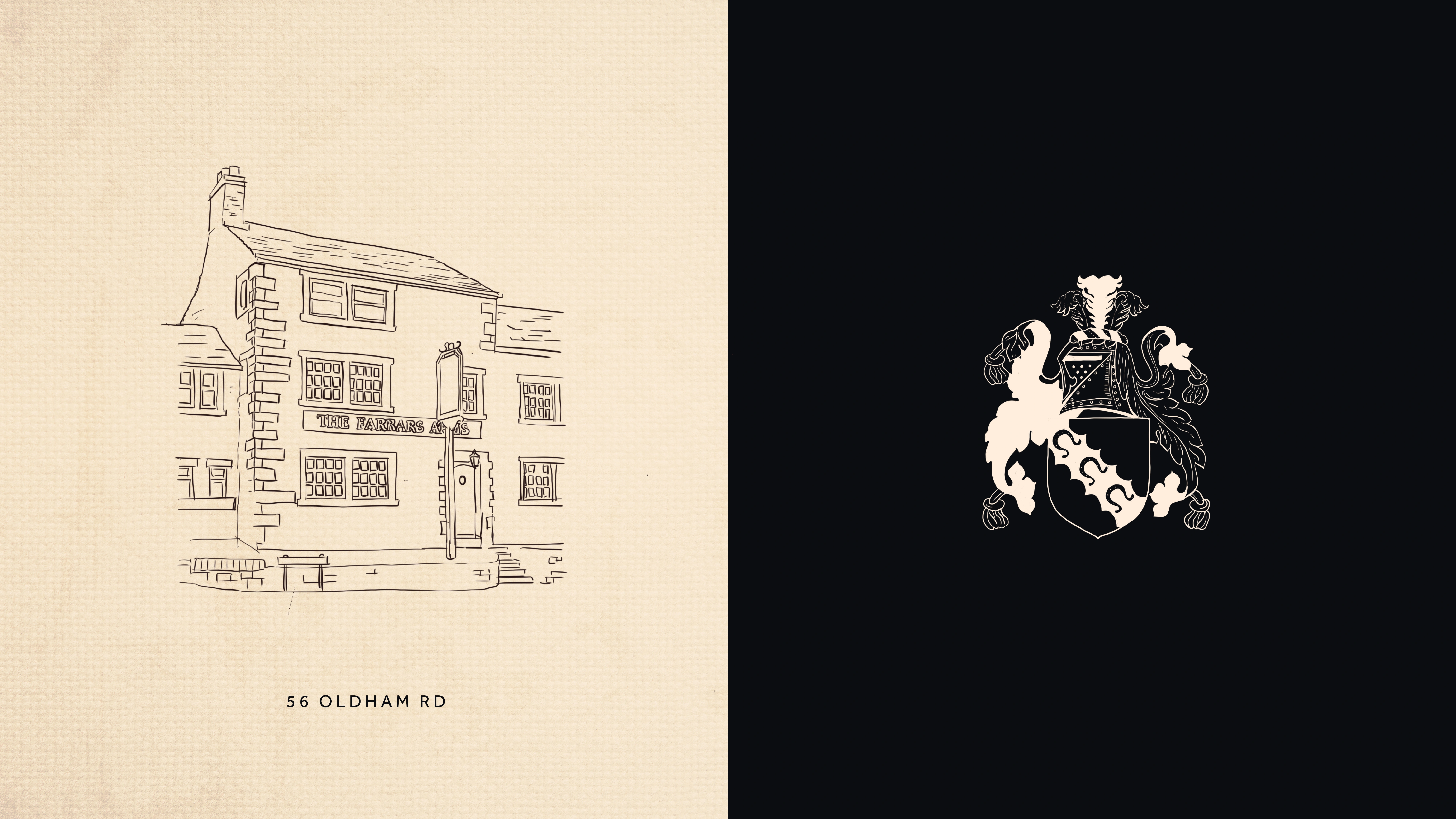
Our branding design strikes a nostalgic feel, in keeping with the building and the feel of ‘your favourite pub’. The brandmark feels familiar and confident, with typography that might be reminiscent of the work of a traditional sign-writer. The pub had an old coat of arms that had been lost over the years, which was carefully redrawn to bring back to life. A series of plaque designs within the toolkit bring a layer that celebrates old brass fixtures and worn-in charm, which are useful as housing devices across brand application. Colour palette is warm and woody, menu design is humbly handwritten and photographic tone is inviting, rustic and at times historic.
The emotional connection this brand brings is of a sense of belonging and of the humble familiar. We can almost smell the aroma of good pie!